Adobe logo history: from the stylized A to Creative Cloud
From the first wordmark to the red A and Creative Cloud: an analysis of Adobe logo evolution and brand architecture.
The Adobe logo tells an unusual story: a company born in digital printing became a global platform for creativity, documents and digital experiences. Its identity did not merely follow visual fashion. It had to remain recognizable while organizing dozens of products, from Photoshop to Acrobat, across app stores, screens, videos, events and professional interfaces.
The continuous thread is the letter A. It appeared inside the first wordmark in the early 1980s, then became isolated, simplified and turned into a corporate sign. Adobe built a second language around it: Creative Cloud, its color spectrum and its product icons. Studying that development helps clarify the difference between a logo, a brand architecture and a complete visual system.
This analysis draws on sources checked during writing: Adobe’s official Evolving Our Brand Identity article, authentic logo files preserved by Wikimedia Commons, and broad historical context from Adobe Inc.. Version dates are phrased carefully because a corporate mark, a wordmark and a product icon can change on different schedules.
1982: a company born with PostScript
Adobe was founded in December 1982 by John Warnock and Charles Geschke. Its name came from Adobe Creek, the stream that ran behind Warnock’s home in Los Altos. That choice matters: it does not describe one specific piece of software and therefore leaves room for the company to grow. The name already has texture, a sense of place and a sound that is easy to remember.
Adobe’s first major field was PostScript, a page-description language that could define type and shapes independently from the final output resolution. This origin explains much of the identity. Adobe was not only a computing company; it sat at the intersection of code, typography, page composition and graphic production. Its logo needed to feel technical without abandoning a designer’s sensitivity.
That position expanded with Illustrator and later Photoshop, Acrobat, InDesign, Premiere and many other tools. Each product serves a different community and workflow. The branding challenge consequently became twofold: preserve a stable Adobe cue and help users recognize the right tool quickly. This move from one company name to a large portfolio is what makes the logo history especially valuable for other organizations.
The first wordmark and Marva Warnock’s A
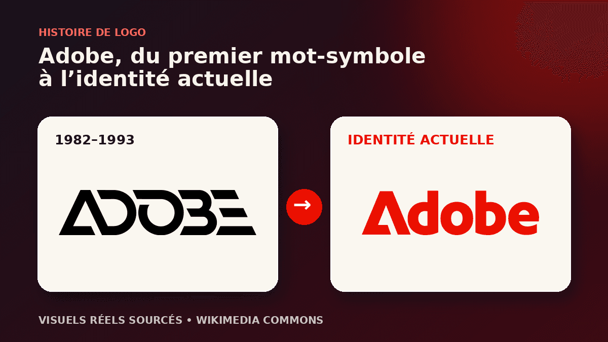
The logo used from 1982 to 1993 is credited to Marva Warnock, a graphic designer and John Warnock’s wife. ADOBE is built from sharp geometric forms. The A is not treated like an ordinary letter; its silhouette becomes a structure, almost an assembly of planes. The result suggests both vector precision and the typographic experimentation of early desktop publishing.
This first version is more complex than the current sign. It needs the complete name and, in some uses, the words Systems Incorporated. For a young company, that explicit approach makes sense. The public does not know Adobe yet, so the word must be read before the shape can become a mental shortcut. Character comes from cuts, counters and the tightly controlled rhythm between letters.
The design already carries a durable idea: a technology identity does not need a circuit, monitor or machine pictogram. Adobe chooses typography as its main material. The decision aligns with PostScript and Illustrator, yet remains abstract enough to support future products. A new brand can learn from this restraint: the best symbol is not always a picture of the profession; it may express how the organization thinks and works.
1993: the A becomes an independent signature
In 1993 Adobe adopted the basis of the mark audiences still recognize: a stylized A constructed from triangular shapes. The official 2020 article says the logo then in use had represented Adobe since 1993. That continuity is notable in an industry where products and interfaces change rapidly. Adobe chose to refine details instead of discarding accumulated recognition.
Isolating the A follows the logic of a maturing brand. Once a name becomes familiar, its initial can work alone on an icon, publication cover or event stage. The diagonals suggest upward movement, while the central negative space helps create the letter. This economy improves recall and prepared the identity for smaller digital surfaces long before mobile applications became dominant.
The wordmark still has an important function. It protects immediate reading in corporate, commercial and international contexts. Adobe can therefore combine two levels: a compact emblem and an explicit name. That architecture is more flexible than one fixed lockup. It anticipates the approach described in our responsive logo guide: prepare approved configurations rather than mechanically shrinking one detailed composition.
From Creative Suite to Creative Cloud: one logo is no longer enough
The 2003 launch of Creative Suite gathered several tools under one offer. Creative Cloud later transformed the relationship: customers no longer encountered only an isolated application but a connected set of services, libraries, synchronization features and apps. The visual problem changed. People had to recognize Adobe, understand the Creative Cloud offer and distinguish each product at a glance.
Mnemonic icons became a familiar language: Ps for Photoshop, Ai for Illustrator, Pr for Premiere Pro and Id for InDesign. The choice looks simple, but it demands strict typographic and color discipline. Letters must remain readable at small sizes, while hues help group workflows. The system can welcome another product without inventing a completely unrelated visual world each time.
The Creative Cloud symbol performs a different role from the Adobe A. It does not replace the parent brand; it identifies the creative ecosystem. Its linked loops suggest continuity, and its colorful treatment can gather the palettes of many products. This distinction is crucial: a company may keep a stable corporate logo while giving a major offer its own sign. Coherence then comes from shared rules rather than rigid repetition.
2020: consistency, color and legibility
In its May 2020 article, Adobe explained that it wanted a very broad portfolio to be easier to understand and navigate. The corporate logo moved to one color, with a warmer red described as more contemporary. The stated aim was not a dramatic break. Adobe wanted the mark to function at every size and across every surface.
Creative Cloud gained a gradient combining corporate red with colors from the product families. The outline became heavier for improved legibility and scalability. Product icons received rounded corners and lost their borders so they could fit more naturally across operating systems and devices. Adobe also extended the mnemonic system to three letters for selected family members when two characters could not communicate the relationship clearly enough.
These decisions show that a redesign can be systemic rather than spectacular. The A does not change enough to sacrifice recognition. Instead, color, weight, containers, icon relationships and portfolio rules are coordinated. Our analysis of the Microsoft logo raises a related question: how can a parent brand and a product ecosystem speak with one voice without becoming visually monotonous?
Why the Adobe system works
The first strength is continuity. The stylized A connects several decades without trapping Adobe inside its original business. It can stand for print, photography, video, documents or digital experiences because it does not depict a particular product. Its personality comes from construction rather than literal illustration. That abstraction makes the corporate brand extensible.
The second strength is hierarchy. The red A represents Adobe; Creative Cloud has an offer-level sign; applications use mnemonics. Each layer answers a different question: who provides the service, which environment does it belong to, and which tool is opening? A good system does not force one logo to perform all three tasks. It creates visible relationships between specialized signs.
The third strength is digital compatibility. Clear forms, strong contrast, monochrome versions, adjusted weight and structured icons support screen use. Yet this performance does not come from minimalism alone. It depends on practical testing: small size, light and dark backgrounds, neighboring app icons, color accessibility and interface consistency. The Samsung logo likewise demonstrates the value of a stable wordmark across a broad portfolio.
Seven lessons for building a brand identity
- Begin with a durable idea. Adobe’s first logo uses typography and construction, concepts linked to its work but broad enough to outlive individual products.
- Preserve recognized equity. The basis of the A has existed since 1993. Later refinements strengthen the cue rather than erase its memory.
- Separate brand, offer and product. The A, Creative Cloud and application icons have different jobs.
- Create extension rules. A palette, lettering system and container logic let new tools join without starting from zero.
- Test reduction. An icon must remain clear in an application bar as well as on a poster.
- Use color to guide. Color can identify a family, but it should not be the only distinguishing feature.
- Document real usage. Variations, spacing, backgrounds and minimum sizes belong in an operational brand guide.
A small business does not need a portfolio as extensive as Adobe’s. The logic still applies. A brand may need a primary emblem, a compact version, a lockup with its name and a limited code for offers. The priority is to make the system understandable for both team and customer. A polished presentation board cannot replace clean files, simple rules and tests on real touchpoints.
Create an identity that can evolve
Planning a new logo or a redesign? Describe your brand, audiences, touchpoints and required variations. A clear brief helps produce a recognizable mark and a visual system people can actually use.
Real Adobe logo artwork and sources
The cover compares two authentic files, not AI recreations: the Adobe logo used from 1982 to 1993 and the current Adobe corporate wordmark, both preserved on Wikimedia Commons with provenance and licensing details. Explanations of the 2020 system update come directly from Adobe’s official identity article.
Cover credit: Adobe Inc. via Wikimedia Commons. The cited trademarks remain the property of their owners. The files appear here for historical and editorial analysis.
Adobe logo FAQ
Who designed the first Adobe logo?
The first mark is credited to graphic designer Marva Warnock, wife of co-founder John Warnock. It combined a geometric wordmark with a highly constructed letter A.
Did the Creative Cloud symbol replace the Adobe logo?
No. The red A remains Adobe’s corporate mark. The Creative Cloud symbol identifies the creative offering and ecosystem, so the two signs perform complementary roles.
Why did Adobe simplify its identity in 2020?
Adobe said it wanted better legibility, consistency and navigation across a very broad portfolio. The corporate logo became a single red color while product families were harmonized.
What can a small business learn from this evolution?
Separate the parent brand, offers and products, then define common rules for shape, color and naming. A coherent system is often more useful than one highly demonstrative logo.