Logo color trends for 2026: palettes, examples and method
A practical guide to 2026 logo color trends: palettes, examples, accessibility, and a clear selection method.
Trendy Colors for Logos in 2026: Palettes, Examples, and Method
Choosing the color of a logo has never been a simple aesthetic choice. In 2026, it is a real strategic issue: a logo must work on mobile, in stories, in miniature, in dark mode, in print, in video, on a storefront, and sometimes on packaging. A palette that "works" on a mockup can collapse in real conditions.
Good news: the trends for 2026 show a clear direction. Brands are seeking less of the free "wow" effect and more coherence, readability, and personality. We see a return of warmer, more human colors, better-controlled contrasts, subtler gradients, and natural shades that reassure without becoming dull.
In this guide, we offer you an actionable summary of the trends observed in 2026, with examples of palettes ready to test, advice according to your sector, and a method to validate a color direction without making mistakes.
Why the Color of a Logo Matters Even More in 2026
The role of color in a logo is threefold:
- Quick Identification: in 1 to 2 seconds, color helps recognize a brand even before reading its name.
- Positioning: a cool/mineral palette does not send the same message as a warm/saturated palette.
- Differentiation: in a saturated sector, color is sometimes the quickest lever to stand out.
What has recently intensified is the multi-support constraint. A logo must remain strong:
- in small formats (favicon, avatar),
- in monochrome (stamp, engraving, embroidery),
- on light and dark backgrounds,
- with sometimes aggressive image compressions (social media).
The result: purely "trendy" but fragile palettes do not hold up over time. The best identities of 2026 are those that combine brand intention + visual performance.
What Changes in 2026 in Brand Palettes
After several years of visual excess, the trend is towards more controlled design. The design watch for 2026 shows in particular:
- A return of warm tones (earth, clay, cocoa, terracotta), which give a more human feeling and less "cold tech".
- Modernized natural shades (organic greens, mineral blues, sophisticated creams), widely used by brands that want to inspire trust.
- Bolder accents (tangerine, bright yellow, digital purple) but used in touches, not in permanent saturation.
- Subtler gradients, less "neon", better controlled and more readable.
- A search for useful contrast, particularly with the rise of dark interfaces.
In other words: in 2026, color is less a fashion effect than a system. A good palette is not limited to "a beautiful primary color." It anticipates roles: primary, secondary, accent, neutrals, dark version, light version.
7 Trendy Color Palettes for Logos in 2026
Here are 7 directions that are very present this year. The goal is not to copy, but to help you choose a color family that is coherent with your brand.
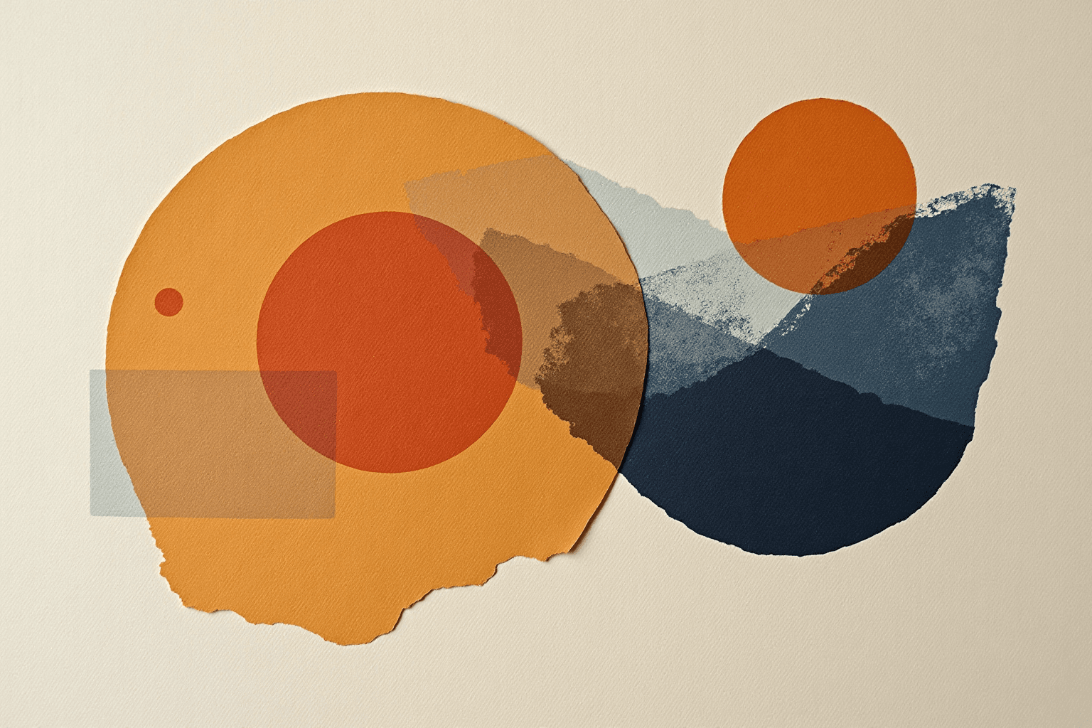
1) Warm Earth + Premium Cream
Example: cocoa brown, soft terracotta, ivory cream.
For whom: crafts, premium food, cosmetics, decoration, human-centered services.
Why it works: this palette inspires stability, closeness, and perceived quality. Very useful if you want to appear serious without being cold.
2) Mineral Blue + Night Blue
Example: slate blue, petroleum blue, subtle cyan accent.
For whom: B2B, finance, SaaS, consulting, digital health.
Why it works: blue remains a strong code of trust, but the 2026 version avoids the "generic corporate blue" thanks to deeper shades.
3) Sage Green + Forest Green + Sand
Example: desaturated sage, deep green, warm beige.
For whom: wellness, environment, responsible food, local brands.
Why it works: green retains its association with nature, but the duller variants avoid the cliché effect.
4) Digital Purple + Lavender + Graphite
Example: rich purple, bright lavender, anthracite gray.
For whom: AI, creators, digital tools, online training, tech/creative communities.
Why it works: purple brings uniqueness and modernity while remaining more elegant than an aggressive neon.
5) Energetic Tangerine + Charcoal
Example: tangerine orange, charcoal black, warm gray.
For whom: sports, events, action/performance-oriented brands.
Why it works: a very good signal of energy and accessibility. Use sparingly to maintain a premium look.
6) Monochrome Black/White + Unique Accent
Example: black, white, one accent color (blue, red, green…).
For whom: premium brands, creative studios, fashion, architecture.
Why it works: simple, memorable, easy to adapt everywhere. The secret is choosing the right accent and maintaining its consistency.
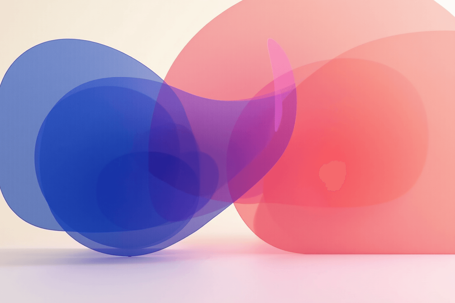
7) Soft Gradient “Sunset to Tech”
Example: coral → peach → cool pink, or night blue → indigo → cyan.
For whom: mobile apps, digital products, youth brands.
Why it works: the 2026 gradient is more mature: less abrupt transitions, better contrast, and "flat" versions designed for small formats.
Are you hesitating between several options? It’s better to test 2 to 3 solid directions than to launch a "mediocre" palette chosen too quickly.
How to Choose a Palette Suitable for Your Business
A relevant palette depends on three things: your positioning, your audience, and your competitive context.
1. Clarify Your Main Message
What do you want to primarily inspire: trust, creativity, closeness, innovation, prestige?
- Trust: mineral blues, deep greens, stable neutrals.
- Creativity: purples, bolder contrasts, bright accents.
- Closeness: warm tones, beiges, softened reds.
- Premium: reduced palette, controlled contrast, deep shades.
2. Observe the Codes of Your Market
Look at the leaders in your sector: if everyone is blue, there are two strategies:
- stay within the code but with a more distinctive shade;
- break the code with a bold signature color.
Neither approach is universally "better." It all depends on your level of notoriety and your short-term goal (to reassure vs. to stand out).
3. Think System, Not Display
Your palette must work in a complete identity: website, social media, documents, packaging, advertising. What looks good on a hero visual can become unmanageable in daily use.
If you want to frame this reflection, our article Graphic Charter: What Is It and How to Create One? helps you formalize the rules.
Accessibility and Contrast: The Rule Not to Ignore
In 2026, ignoring accessibility is no longer tenable. A color can be "trendy" and yet unreadable for some users. The minimum: check the text/background contrast for your logo variations (website, signature, banners).
The most commonly used reference remains WCAG (W3C), with a minimum contrast of 4.5:1 for standard text. Even if your logo is not always treated as "UI text," this rule provides a concrete basis to avoid obvious mistakes.
Specifically:
- avoid weak pairs (light yellow on white, medium gray on uncalibrated deep black),
- provide a light version and a dark version,
- test in real conditions (mobile in daylight, low-end screens, printing).
A readable logo is a logo that performs better commercially. Style should never sacrifice understanding.
Practical 6-Step Method to Test Your Palette
Step 1 — Define 1 Primary Color + 1 Secondary Color + 1 Accent
Start simple. Too many colors from the outset creates confusion.
Step 2 — Create 3 Saturation Variants
Strong version, moderate version, soft version. You will quickly see which one holds up best in real usage.
Step 3 — Simulate Key Supports
Round avatar, favicon, web banner, business card, PDF document. If it breaks on a single important support, adjust.
Step 4 — Test in Monochrome
If your logo loses its identity in black and white, the structure needs to be reinforced.
Step 5 — Check Contrast and Readability
At a minimum, test the main text/background pairs, and compare in light/dark mode.
Step 6 — Conduct a Mini User Test
Show 2 options to 5 to 10 people from your target audience. Ask what they feel (trust? modernity? premium?). Real feelings are worth more than your intuition alone.
Common Mistakes About Logo Color
- Choosing only "what I like": your tastes matter, but they do not replace brand logic.
- Copying a raw trend: a trendy color can age poorly if it is not connected to your positioning.
- Forgetting technical constraints: printing, embroidery, engraving, dark mode... color must survive everywhere.
- Multiplying accents: too many "strong" colors blur visual hierarchy.
- Neglecting brand cohesion: logo, UI, networks, and content must speak the same chromatic language.
To go further, you can also read:
- Logo PNG vs SVG vs AI: which format to choose?
- How to Create a Monogram for Your Logo
- Tech Startup Logo: Minimalist, Bold, or Abstract?
FAQ — Trendy Logo Colors 2026
What is the best color for a logo in 2026?
There is no universal color. In 2026, the most effective palettes are those that align brand message, readability, and multi-support coherence. Warm and natural tones are on the rise, but the best choice depends on your sector and positioning.
Are gradients still trendy for logos?
Yes, but in a more subdued version. The 2026 gradients are subtler, with better transitions and simplified variants for small formats. A gradient should always have a "flat" backup version.
How many colors should be in a logo identity?
A solid base often starts with 1 primary color, 1 secondary color, and 1 accent, complemented by neutrals. The important thing is hierarchy and consistency, not quantity.
How to check if my colors are readable?
Systematically test contrast in light/dark mode, in small format, on mobile, and in print. A good practice is to base it on WCAG recommendations to avoid too weak color pairs.
Sources and Monitoring (consulted in April 2026)
- VistaPrint — Color Trends 2026
- Digital Synopsis — Top 10 Logo Design Trends for 2026
- Jixart — Graphic Trends 2026
- W3C WAI — Understanding Contrast (Minimum)
- Pantone — Color of the Year 2025 (recent chromatic context)
Do you want a palette that is coherent with your positioning (and not just "pretty" on a mockup)? Describe your project here, and we will suggest logo ideas ready to test in real conditions.