Airbnb logo: history and controversies of the Bélo symbol
The history of Airbnb’s logo, from its early wordmark to the Bélo: meaning, 2014 controversy, design strengths and practical lessons.
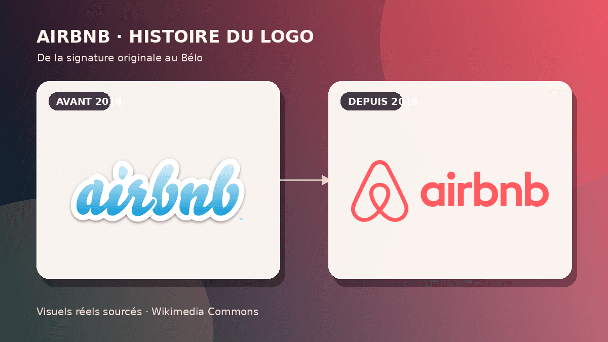
The Airbnb logo is one of the most discussed identities of the platform era. Before 2014, Airbnb used a soft, informal wordmark that suited a young peer-to-peer accommodation service. In July 2014 the company introduced the Bélo, an abstract mark built around the idea of belonging. The shift was substantial: the name gained authority, a warm coral color became a recognizable asset, and the symbol could stand alone on an app icon, a sign or an international campaign.
The launch was anything but quiet. Online audiences produced anatomical jokes, compared the shape with familiar objects, and pointed to similarities with another corporate symbol. Those reactions belong in the history of the mark, but they are not a complete design verdict. A logo must also be assessed through strategic fit, distinctiveness, small-size performance and the consistency with which an organization uses it over time.
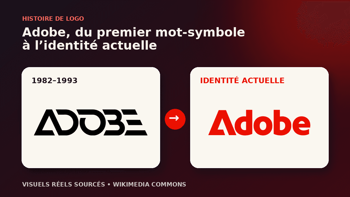
This article separates documented milestones from later interpretation. It uses Airbnb’s official timeline, authentic logo files preserved by Wikimedia Commons, and a contemporary review of the redesign. The cover compares real pre-2014 and Bélo artwork; no Airbnb mark was recreated with generative AI.
Before the Bélo: the identity of a young marketplace
Airbnb’s story begins in 2007, when Brian Chesky and Joe Gebbia hosted travelers in their San Francisco home. AirBed & Breakfast officially launched in 2008, and the shortened Airbnb name arrived in 2009 as the offer expanded beyond air mattresses and breakfast. The early identity reflected its moment: friendly, web-native and intentionally less formal than a hotel group.
The older wordmark used rounded, relaxed lettering. It made a new and potentially uncomfortable transaction feel more human: sleeping in a stranger’s home. That informality differentiated the service from traditional hospitality. Yet a wordmark alone offered limited material for a compact mobile icon. As the app became central and the platform entered more markets, Airbnb needed an asset that could be recognized without spelling out a relatively long name.
This was therefore a business problem rather than a decorative request. The company had to unite hosts and guests, communicate trust across cultures and occupy many digital and physical touchpoints. A cheerful signature can help at launch, but a global marketplace needs a stronger architecture. The Bélo was designed to become that shared anchor.
The 2014 redesign and the language of belonging
Airbnb’s official company history records the introduction of the Bélo in July 2014. Developed with DesignStudio, the identity was framed around a central promise: belonging anywhere. The name Bélo refers to “belong,” and Airbnb explained the drawing through four connected ideas: people, places, love and the A of Airbnb. This layered story gave the mark material for internal culture, host communication and advertising.
The shape uses one continuous, rounded gesture. It can suggest a location pin, a heart, a person with raised arms and a letter A, without becoming a literal picture of any one object. That controlled openness is useful for a marketplace combining space, relationship and movement. A house or bed would explain the initial category more quickly, but it would also limit the company’s future narrative.
Color did as much work as geometry. The coral tone avoided the technology sector’s crowded field of blues and brought warmth to interfaces and photography. The mark remained usable in one color, while the revised wordmark provided clarity where recognition was not yet sufficient. Together, these parts moved Airbnb from start-up informality toward a mature consumer brand without adopting the cold authority of a hotel chain.
Why the Bélo triggered controversy
The most visible reaction involved anatomical interpretations shared on social media. Viewers also compared the drawing to a pretzel, a paper clip and other familiar forms. This response is predictable when a simple, symmetrical, enclosed mark receives enormous attention. Abstract symbols leave interpretive space, and the internet rapidly turns that space into parody.
A more concrete issue was the perceived similarity to the logo then used by Automation Anywhere. The companies publicly defused the situation, and the automation company later changed its identity. The episode does not prove that every neighboring curve is plagiarism; simple symbols inevitably share geometric building blocks. It does demonstrate why visual and legal clearance should occur before launch across relevant categories and territories.
Critics also questioned the elaborate four-part explanation. A brand story can feel over-engineered when audiences need a diagram to understand it. However, a logo is not a puzzle with a single correct answer. The Bélo first succeeds or fails as a memorable silhouette. The belonging narrative provides an additional layer for campaigns and community programs rather than a decoding requirement for every guest.
Controversy gave the reveal extraordinary reach, but deliberately seeking ridicule is not a dependable strategy. Negative attention can damage trust when a mark is offensive, confusing or legally vulnerable. Airbnb’s symbol survived because its construction was simple and its rollout was disciplined. Repeated use gradually replaced the initial shock.
A flexible identity system rather than one static picture
Airbnb invited community members to personalize versions of the Bélo, connecting the visual identity to participation. That idea expressed belonging in practice, yet it also exposed a classic branding tension. Openness can encourage ownership, while uncontrolled variations weaken recognition. A successful flexible identity needs a stable core—official proportions, silhouette and primary applications—plus clear boundaries for creative expression.
The redesign performs across very different sizes. The Bélo fits an app tile, appears on printed material, scales onto event environments and can become a repeated pattern. The Airbnb wordmark remains available when clarity is required; the symbol can work alone once context provides recognition. This is the logic of a responsive logo system: coordinated configurations, not one master file forced into every space.
Photography, typography, tone of voice and interface behavior reinforce the symbol. The photography emphasizes people and places; the palette stays warm; the typography remains readable. None of these elements replaces the logo, yet together they make its promise believable. Brand identity organizes a repeated experience, from discovery and booking to arrival and review.
Why the symbol still works more than a decade later
The Bélo’s first strength is silhouette. Its outline remains recognizable without color or a wordmark. It contains enough peculiar structure to be memorable and few enough details to survive reduction. That economy matters on mobile, where an icon competes with dozens of other marks. It also prevents the identity from depending on a short-lived visual effect.
Its second strength is strategic fit. An accommodation marketplace could use a house, key or bed. Those pictograms would describe the sector, but they would reduce the brand to a transaction. The Bélo points toward relationship and belonging instead. This abstraction gave Airbnb room to talk about experiences, services and community while retaining one visual anchor.
The third strength is consistency. Airbnb did not discard the Bélo whenever its product changed. It adapted the mark to animation, interfaces and new campaigns while preserving its core. Repetition creates equity that no drawing possesses on launch day. Many redesigns fail because organizations deploy them inconsistently or replace them before audiences have learned them.
Practical lessons for founders and brand teams
First, connect redesign to a business need. Airbnb required a global icon, a community language and a mobile-ready system. Without that diagnosis, the project would have been cosmetic. Before changing your identity, document where the current one fails: tiny sizes, international use, similarity to competitors, missing variations or a mismatch with the actual offer.
Second, test ambiguity without explaining the concept. Show candidate symbols to people outside the project and ask what they see, feel and expect from the business. Unexpected associations do not automatically disqualify a design. Their frequency, intensity and impact on trust should inform the decision. Testing is not a vote; it is evidence for managing risk.
Third, clear the mark properly. A visual web search is not a substitute for legal trademark work. Relevant registrations, commercial classes and countries must be examined by qualified specialists. The simpler the symbol, the more likely it is to approach existing geometry. Clearance before a public reveal is less expensive than an emergency redesign.
Fourth, deliver a complete system. Request horizontal, vertical, symbol-only, monochrome, reversed and small-size variants. Define clear space, minimum sizes and prohibited uses. The Airbnb case belongs in our famous logo analyses because it shows that deployment quality can be as important as the original sketch.
Conclusion: from launch controversy to brand asset
The Bélo did not remove every ambiguity, and its reception remains a classic example of unpredictable public interpretation. Nevertheless, it achieved its primary task: giving Airbnb a self-contained, international and mobile-compatible icon. The first wave of jokes faded while the silhouette, coral color and belonging narrative accumulated recognition.
Two easy conclusions should be avoided. Public criticism does not automatically prove that a logo is bad, and a large branding budget does not automatically make a form successful. Airbnb demonstrates a combination of clear strategy, distinctive shape, coherent system, necessary risk checks and long-term repetition. That combination—not the 2014 buzz alone—explains the Bélo’s durability.
Visual sources and references
Build a distinctive symbol without losing clarity
A strong identity must work small, in one color and across real touchpoints. Start with a precise brief before exploring form.
Frequently asked questions
What does Airbnb’s Bélo logo mean?
Airbnb presents it as a combination of people, places, love and the letter A, united by the idea of belonging.
When did Airbnb introduce the Bélo?
Airbnb’s official timeline dates the introduction to July 2014.
Why was the logo controversial?
Its abstract shape prompted anatomical jokes and comparisons with another company’s symbol. Those reactions were strongest during the reveal.
Was the Airbnb logo generated by AI?
No. The 2014 identity was developed with DesignStudio. This article uses authentic logo files sourced from Wikimedia Commons.
What can a small business learn from it?
Start with a strategic need, test visual associations, conduct proper clearance and prepare responsive variations for real touchpoints.