Photographer logo: capture your identity at a glance
How to create a photographer logo that is readable, distinctive and ready for websites, social profiles, client galleries and trust-building touchpoints.
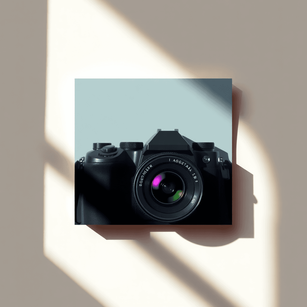
A photographer logo is not just a decorative mark placed under a picture. It is often the first trust signal seen by a couple looking for a wedding photographer, a brand preparing a product shoot, a family comparing portfolios or a company booking corporate portraits. In a profession where the images already speak loudly, the identity has to stay discreet enough not to compete with the work, yet distinctive enough to make the name memorable.
Recent research into photography logos and 2026 design trends points in the same direction: over-decorated signatures are losing ground, flexible identity systems are becoming more useful, and photographers need marks that can live on a website, Instagram profile, client gallery, PDF estimate and sometimes a subtle watermark. Current resources from Pixels Mark, Pro Photography Class, Venngage and Zeka Design all emphasize legibility, white space, typography, vector formats and responsive use. The real challenge is not to draw the most realistic camera icon; it is to build a brand system that supports the eye.
A useful benchmark is to imagine the logo before the client has seen the best images. Does it already communicate calm, precision, energy or intimacy? Then imagine it after the client has received the final gallery. Does it still feel like a natural signature rather than a commercial sticker? Strong photography branding lives between those two moments: it opens the relationship, then quietly confirms it.
Why a photographer logo matters
Photography is a trust-based business. Before booking, clients evaluate a style, a level of professionalism, emotional sensitivity and the ability to tell their story. The logo contributes to that judgment in a few seconds. An elegant monogram can suggest a premium editorial approach. A warm wordmark can reassure families. A sharper symbol may fit concerts, sports or fashion photography. A generic camera pictogram, on the other hand, can make even a strong portfolio feel template-based.
The logo also creates continuity across a scattered journey. A prospect may discover one picture on Instagram, visit the site on a phone, return through Google, download a pricing guide and receive an email a week later. If the name, colors, typography and mark remain consistent, the studio feels more established. This is the same principle described in our guide to the responsive logo: a modern logo is not one frozen file but a small family of versions.
For that reason, the best brief is not purely visual. It should mention price level, booking process, client emotions, delivery experience and the kind of projects the photographer wants more often.
Start with positioning before style
Before choosing a font or icon, clarify what the photographer really sells. A wedding photographer sells presence, discretion, emotion and lasting memories, not only sharp images. A real-estate photographer sells clarity, volume and fast visual impact. A food photographer sells appetite and texture. A corporate portrait photographer sells credibility. These differences should shape the identity.
The useful question is not “which logo looks pretty?” but “which sign helps the right client recognize themselves?” If the positioning is premium, a limited palette, refined typography and generous white space will usually outperform visual effects. If the activity is creative and editorial, a more expressive mark can work. If the business is built on local trust, a human and readable identity is often better than something cold and overly abstract.
This step also prevents the usual clichés: aperture icons, lens rings, vintage cameras and illegible signatures. These can work when they are stylized with restraint, but they quickly become interchangeable. A strong photographer logo may come from a more personal detail: initials, a framing device, light, rhythm in the letterforms, a reference to a region or a particular way of composing images.
Visual codes that work in 2026
Three directions dominate photographer identities. The first is the minimal wordmark: the studio name becomes the logo through a carefully chosen and sometimes customized typeface. It is robust for photographers who want to feel timeless and let the images carry emotion. The second is the monogram, especially useful when the name is long or the initials are memorable. It can become an avatar, favicon or discreet gallery mark. The third is an abstract symbol inspired by framing, light or motion rather than by a literal camera.
Design trends for 2026 add useful nuances: organic shapes, modern seals, stronger type contrasts, sharper geometry, natural palettes and more handcrafted details. For photographers, trends should not be copied mechanically. A seal may suit an editorial wedding studio but feel heavy for product photography. A serif typeface can signal elegance but become fragile in a tiny story avatar. A fluid shape may convey sensitivity but lack precision for a B2B studio.
Color deserves special attention. Photographers often choose black, white, warm gray, beige, sage green or deep blue because those tones do not fight the images. A small accent color can aid memory, but it must remain compatible with highly varied photos. The simple test is to place the logo over a dark portrait, a very bright image, a colorful frame and a plain background. If it holds up in all four cases, the system is already more reliable.
Design for website, watermark, social and files
A photographer uses a logo in more contexts than expected. On the website, it has to fit a thin header. On Instagram, it has to work inside a circle. In a client gallery, it should reassure without disturbing the viewing experience. On a quote, invoice or contract, it should look professional. As a watermark, it must stay extremely discreet because the photograph remains the hero.
That is why several versions should be planned from the beginning: a horizontal logo with the full name, a compact version, a monogram, a light version, a dark version and vector files. Our guide to the ecommerce logo explains how mobile, email and thumbnails change logo perception; the same applies to photography. A mark that looks beautiful on a large homepage can become unusable as a small avatar.
Delivery formats matter as much as the design. A final logo package should include SVG or vector PDF, transparent PNG files in several sizes, color and black-and-white variants, spacing rules, color values and font information. These files prevent later improvisation: stretching the logo, placing it too close to an edge, using it on an unreadable background or exporting a blurry image.
A 7-step method for creating a photographer logo
- Define the specialty. Wedding, portrait, fashion, real estate, corporate, food or events: every field has different expectations.
- Choose three brand words. For example: luminous, editorial, discreet; or bold, urban, spontaneous.
- List real touchpoints. Website, cards, gallery, estimate, social networks, watermark and email signature.
- Remove weak clichés. A generic camera icon is acceptable only if it brings a fresh idea.
- Explore typography and symbol separately. The wordmark should already work without the icon.
- Test extreme sizes. 48-pixel avatar, mobile header, large homepage and printed PDF.
- Write a mini brand guide. Colors, spacing, prohibited uses and examples.
If you want to speed up this step while keeping a structured brief, you can start a project on Wilogo: create a logo brief. The goal is not to replace your photographer's vision, but to make it clear enough to compare coherent directions.
Common mistakes to avoid
The first mistake is confusing personal signature with legibility. A handwritten signature can look elegant, but if the name cannot be read, memorability suffers. The second is making the logo too detailed. Lenses, reflections, focus rings and camera silhouettes disappear at small sizes. The third is following a trend that does not match the clientele. A brutalist style may attract attention, but it may not reassure families or corporate buyers.
The fourth mistake is ignoring the relationship with the images. A very colorful logo can compete with the portfolio. A logo that is too neutral can disappear if the brand needs a stronger presence. The fifth is designing only for a watermark. A good photographer logo should also sell, guide, reassure and structure the complete brand experience.
FAQ — photographer logo
Does a photographer logo need a camera icon?
No. A camera can work if it is highly stylized, but typography, a monogram or an abstract sign can be more distinctive.
What style fits a wedding photographer?
Wedding brands often use elegant typography, soft palettes and plenty of white space. The style should feel emotional without becoming sugary.
Should the logo be used as a watermark?
It can have a watermark version, but that is not its only role. It must also work on the website, social channels, commercial documents and galleries.
How many versions should be created?
At minimum: horizontal version, compact version, monogram, light version, dark version, transparent PNG and vector files.
How do I know if the logo is too generic?
Hide the name and ask whether the sign could belong to ten other photographers. If yes, strengthen the positioning, typography or distinctive detail.