Wellness coach and sophrology logo: create a reassuring brand identity
A practical guide to designing a wellness coach or sophrology logo that feels calm, professional and distinctive without clichés.
A wellness coach or sophrology logo has to express a delicate promise: calm without vagueness, empathy without amateurism, sensitivity without falling into the usual lotus, meditation silhouette or generic leaf. In this field, visual identity often appears before the first conversation. It is seen on search results, booking pages, Instagram, business cards, workshop PDFs, a shared practice door or a company wellbeing proposal. In a few seconds, it should make a potential client feel that contacting you is safe and clear.
The challenge is positioning. Wellness covers many practices: sophrology, life coaching, stress management, breathing, relaxation, mental preparation, sleep support, perinatal guidance, gentle performance, workplace wellbeing and preventive routines. A logo that looks too medical may intimidate. A logo that feels too mystical may push away clients looking for structure. A logo that is only soft may be forgettable. The right identity balances calm, competence and distinction.
Recent research makes this balance more important. The Global Wellness Institute describes wellness as a large global economy connected to physical activity, mental wellbeing, healthy living, workplace wellness and prevention. The World Health Organization also emphasizes mental health promotion, prevention and supportive environments. For an independent practitioner, these trends do not replace trust or ethics; they show that clients compare approaches, promises and clarity more carefully than before.
Sophrology has its own vocabulary. The French Chambre Syndicale de la Sophrologie presents it as a mind-body approach that uses breathing, muscle relaxation and positive visualization. That progressive and practical dimension should influence the brand identity. The goal is not to promise a magical cure, but to make a structured, accessible and reassuring method visible.
What a wellness logo really does
In wellness, a logo is not just decoration. It is the first emotional filter. A person looking for support may be tired, overwhelmed, changing direction or trying to regain a sense of control. They are not only choosing a service; they are choosing a setting, a tone and a person they may trust with something personal. The logo should reduce uncertainty, suggest safety and prepare the first contact.
This role requires restraint. A mark overloaded with symbols, gradients or spiritual promises can create suspicion. On the other hand, a neutral mark can disappear among local coaches and practitioners. A strong visual direction shows that the practice is serious but not cold, sensitive but not vague, personal but not confusing.
The gym and personal trainer logo guide is useful here because both fields deal with progress, motivation and support. Wellness is calmer, but clients still want to feel movement. The daycare logo guide also illustrates the importance of reassurance: when people need trust quickly, small visual decisions matter.
Clarify your positioning first
Before choosing shapes, write your promise in one sentence. Do you help stressed professionals breathe and recover? Do you guide students before exams? Do you work with companies on burnout prevention? Do you offer individual sophrology sessions, group workshops, online programs or mental preparation for performers? Each answer changes the visual identity.
A sophrologist focused on mental preparation can use a more structured identity: stable lines, precise type, deeper colors. A wellness coach centered on sleep may choose slower shapes, darker blues and enveloping forms. A practitioner working with perinatal support may need warmth without looking childish. A corporate wellbeing consultant will need stronger legibility and a more professional tone.
Positioning also defines what the brand should not be. If you do not want to look medical, avoid crosses, clinical blue and health pictograms. If you do not want to look mystical, avoid esoteric symbols, complex mandalas and visual promises of instant transformation. If you do not want to look generic, avoid the green leaf placed next to a meditating figure.
Visual codes: calm without clichés
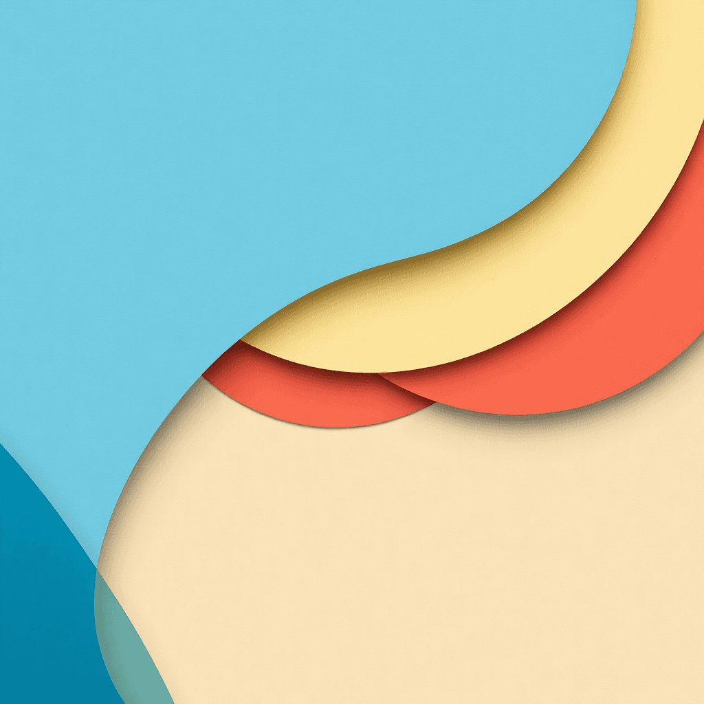
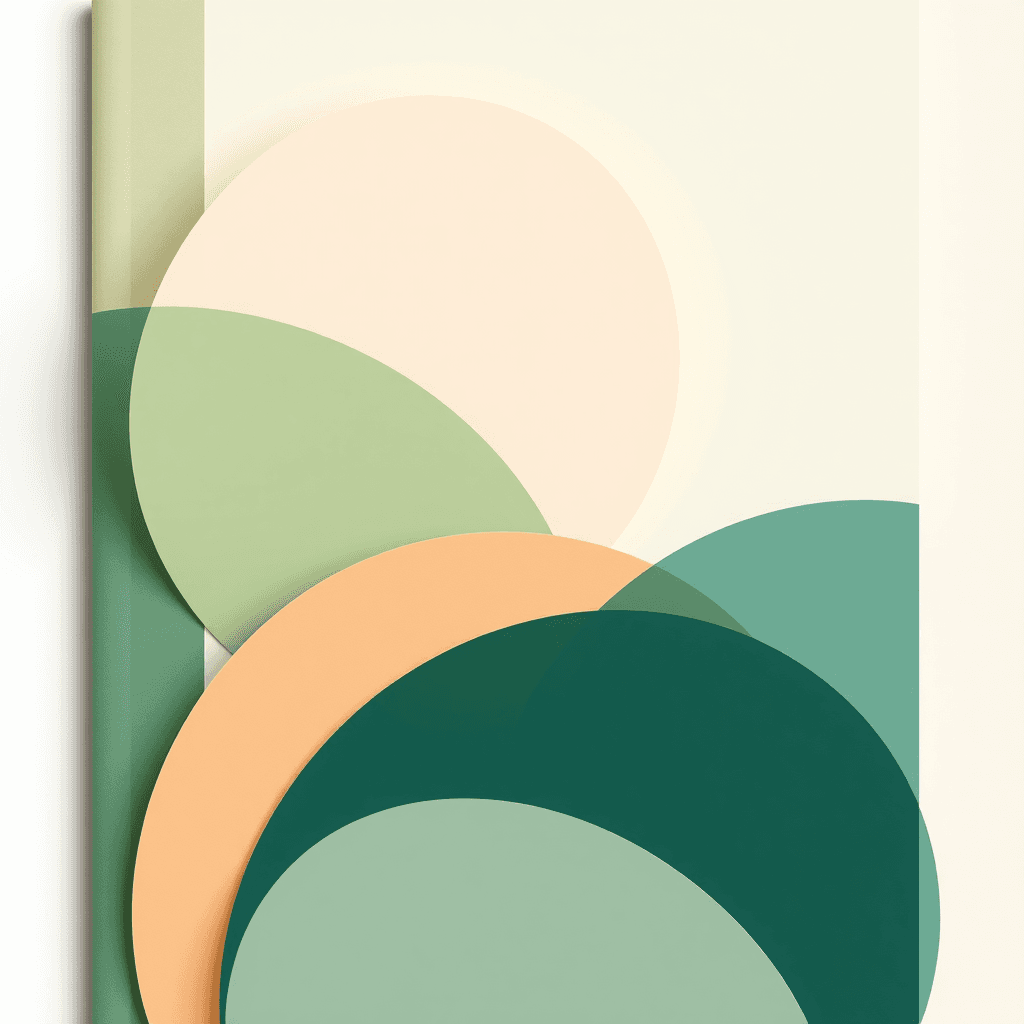
Wellness codes are easy to recognize: leaves, circles, waves, hands, silhouettes, lotus flowers, sunrise shapes, stones and spirals. They are not forbidden, but they become weak when they are used automatically. A better logo starts with a precise idea. An opening line can evoke breathing. A slightly interrupted circle can suggest cycles and progress. A soft monogram can create a personal signature without a literal icon.
Simplicity is essential. People should recognize the identity in an Instagram avatar, on a practice sign or in an email signature. A detailed posture, landscape or face will lose strength at small sizes. The logo can feel sensitive without being figurative: line rhythm, balanced proportions, softened angles, measured contrast and generous white space around the name.
Do not ask the logo to explain everything. The wider visual system can add nuance through photography, secondary patterns, editorial tone, testimonials, exercise sheets and background colors. The logo is the core, not the full story. The logos by sector archive shows the same principle across different professions: codes help recognition, but interpretation creates memory.
Colors, type and texture
Natural wellness palettes often use sage green, beige, clay, deep blue, cream or dusty rose. They suggest calm, breathing and closeness. They still need contrast. A logo that is too pale may fail on mobile screens, printed flyers or signage. Prepare a dark version, a light version and a monochrome version from the start.
Typography carries much of the personality. An elegant serif can suggest depth and a premium one-to-one service. A rounded sans-serif feels accessible and friendly. A handwritten style may feel human, but it becomes fragile when it is hard to read or too decorative. The best choice is often a simple typeface with one distinctive detail: a soft ending, generous spacing or a quiet rhythm.
Texture can enrich the identity: paper grain, soft blocks of color, breathing lines, translucent layers and subtle gradients. Avoid effects that are too fashionable. A practitioner’s identity should last for years, not depend on a passing social-media filter. Always test the logo on white, on color, over a practice-room photo, on an A4 poster, a business card, a story and a PDF handout.
Design for real touchpoints
A wellness coach uses many modest but important touchpoints: booking page, website, newsletter, social profiles, local flyer, exercise worksheet, workshop deck, company proposal, invoice, gift card, door sign or shared practice signage. The logo should exist as a horizontal version, a compact version, an icon, a black-and-white version and sometimes a signature with a short tagline.
A tagline can be useful at launch: “sophrology and stress management”, “workplace wellbeing coaching”, “breathing, sleep and balance”. It should not be too long. If the tagline is the only reason people understand the activity, the visual sign needs more clarity. Also define simple usage rules: minimum size, clear space, approved colors and backgrounds to avoid.
Think carefully about social avatars. A long name such as “Sophrology and wellness coaching practice” will be unreadable in a small circle. A refined initial, abstract mark or compact version can solve the issue. For printed materials, check black-and-white output and low-cost paper. A calm identity still needs practical durability.
Creative brief and mistakes to avoid
A useful brief gives the designer concrete information: main practice, audiences, locations, session format, desired tone, local competitors, priority touchpoints, words to avoid, colors you like and colors you reject. Add opposite adjectives. For example: “calm, clear, grounded” but not “clinical, mystical, childish”. These boundaries help the designer create a precise identity.
Common mistakes are easy to spot: choosing a wellness symbol seen everywhere, using so many pastel colors that contrast disappears, selecting an unreadable script font, confusing softness with lack of structure, implying a therapeutic result that the practice cannot guarantee, or creating a logo that resembles many other local practitioners. Ethical clarity matters: the visual identity should not overpromise care, healing or certainty.
The final test is simple. Show the logo to someone who does not know your work and ask what they feel in five seconds. If they mention calm, trust, support, breathing and professionalism, the direction is promising. If they only say “spa”, “yoga” or “medicine”, the territory needs sharpening. A good identity should create the right expectation before the first appointment.
Create a wellness coach logo from a clearer brief
Want to explore a calm, professional and distinctive identity? Define your audience, touchpoints and tone, then launch a logo brief on Wilogo.
FAQ
What symbol works for a sophrology logo?
Choose a symbol linked to your method rather than a cliché. A breathing line, open circle or soft monogram can be more distinctive than a lotus or a meditation silhouette.
Which colors suit a wellness coach?
Sage, beige, deep blue, clay and cream tones work well when they keep enough contrast for web, print and small formats.
Should a wellness logo look very zen?
Not always. The logo should match your audience. Corporate wellbeing may need more structure, while sleep or relaxation support can use a softer atmosphere.
Why avoid detailed logos?
Detailed marks become hard to read in avatars, favicons, business cards and email signatures. A simple, adaptable identity is more professional in daily use.