Wedding planner logo: elegance and emotion
How to design a wedding planner logo that feels elegant, emotional and trustworthy across web, social, print and proposals.
Logo par secteur
Wedding planner logo: elegance and emotion
A wedding planner logo must express taste, calm and professional control. Here is a practical guide to creating a brand identity that feels elegant without becoming generic.
A more personal wedding market needs a clearer brand
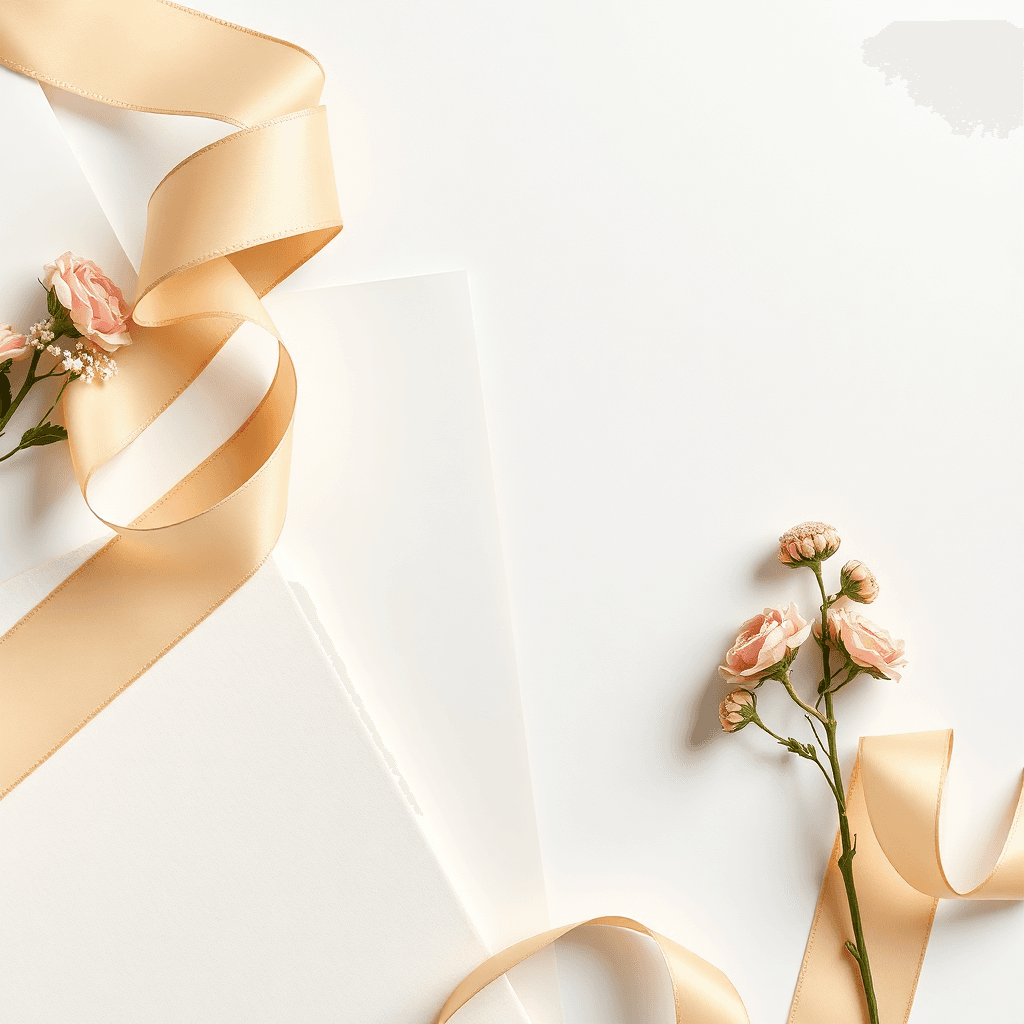
Couples are no longer looking only for a coordinator. They want a calm partner, a creative eye and a professional who can turn private stories into seamless experiences. Current wedding trend reports emphasize personalization, immersive guest experiences, multi-day celebrations and stronger color choices. That makes the first impression of a wedding planner brand more important than ever.
A wedding planner logo has to carry two messages at once: emotion and reliability. It should feel warm enough for a once-in-a-lifetime moment, yet structured enough to suggest budgets, timelines and supplier management. The logo will appear on a website, Instagram avatar, proposal, PDF quote, moodboard, email signature, welcome sign and sometimes printed stationery. A fragile mark quickly breaks in those uses.
Start with positioning, not decoration
Before drawing rings, flowers or arches, define the promise. Are you the luxury destination planner, the calm day-of coordinator, the bold creative director, the multicultural wedding specialist or the eco-conscious partner? The answer changes the typography, colors and symbol much more than a generic wedding icon can.
Write five words the client should feel when seeing your brand: calm, refined, precise, joyful, intimate. Then write the words to avoid: cheap, cold, childish, overloaded, generic. This short exercise prevents the common mistake of collecting romantic clichés instead of building a memorable identity.
Use romantic symbols with restraint
Wedding symbols can work when they are abstracted. An arch can become a soft curve, a floral detail can become a pattern, two initials can suggest union without becoming a couple monogram. One strong sign is usually better than a mix of ring, heart, bouquet and gold script.
For a high-end planner, the best symbol may even be no symbol at all. A precise wordmark with elegant spacing can feel more premium than an illustrative icon. If you choose a mark, make sure it still reads when reduced to a social profile image.
Typography: romantic, readable, modern
Script fonts are associated with weddings, but they need discipline. A refined calligraphic accent can feel intimate; an ornate script can become hard to read and dated. Many contemporary identities combine an editorial serif with a clean sans-serif, or reserve handwriting for a secondary detail.
Test the name in small sizes. Long brand names, accents, and baselines such as “destination weddings in France” can quickly become crowded. Our guide on the creative brief can help you describe these constraints before design starts.
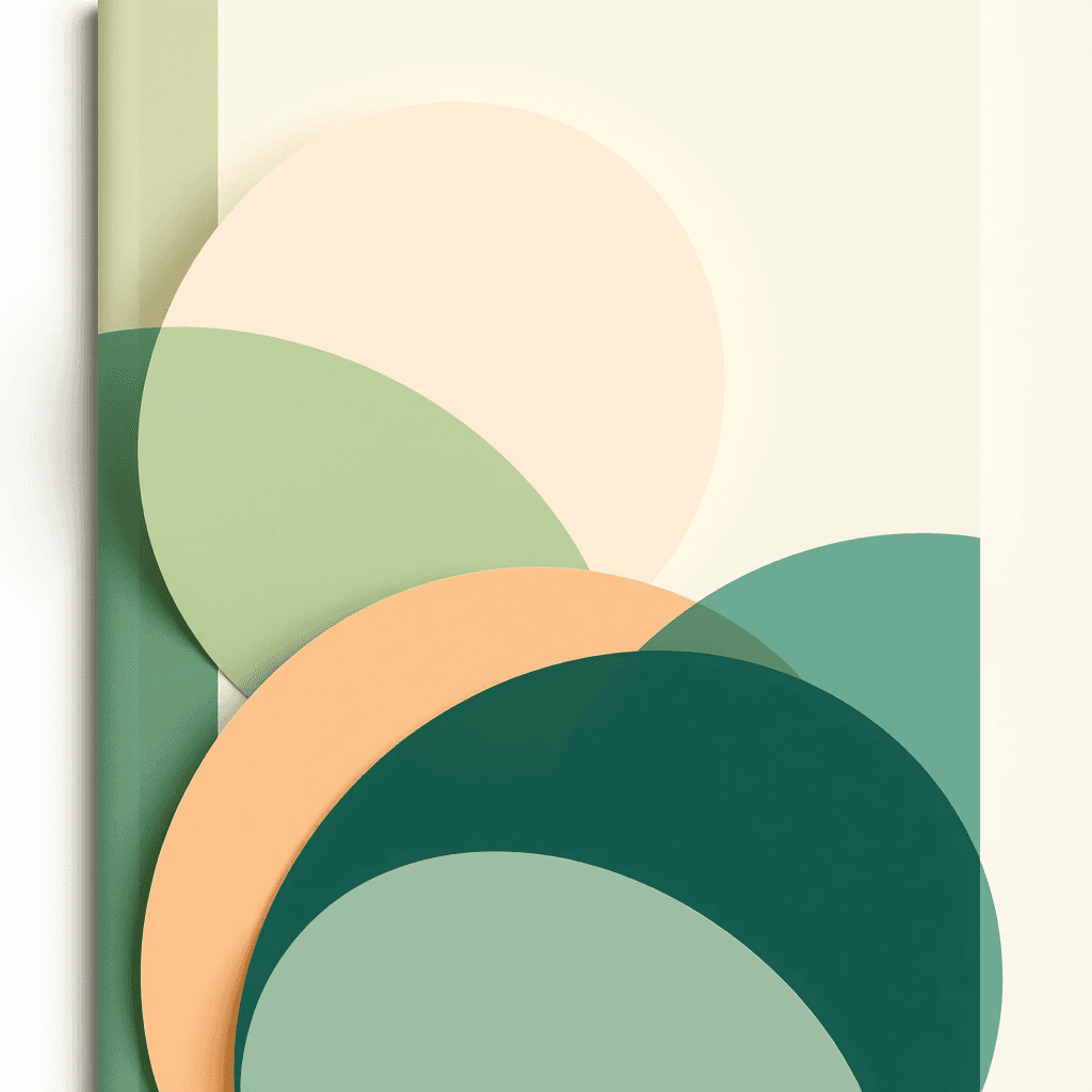
Color: soft does not have to mean pale
Ivory, blush, champagne and beige are natural wedding codes, but they are also common. A signature shade — sage green, midnight blue, muted terracotta, warm cocoa, deep plum or soft black — can make the brand more recognizable while staying elegant.
Always check contrast. Pastel palettes look beautiful in a moodboard but can fail on a website or a PDF proposal. If you want inspiration, the French Wilogo article about logo color trends in 2026 is a useful reference.
Think in brand system, not in one file
A wedding planner needs a main logo, a simplified version, a compact mark or monogram and a monochrome version. The system should work on proposals, stationery, social media, signage and printed details. Similar to a photographer logo, it must communicate taste and trust quickly.
Define clear rules: minimum size, safe area, approved backgrounds, color combinations and when to use the baseline. Consistency often makes a brand look more premium than complexity.
Mistakes to avoid
Do not confuse elegance with unreadable thin lines. Do not copy another planner’s visual universe. Do not choose a trend so strong that it will feel old after one wedding season. And do not ask the logo to say everything: photography, copywriting, client testimonials and portfolio carry much of the emotional proof.
The best wedding planner logo promises a sensitive, reliable presence. It does not need to promise a perfect wedding; it needs to make couples feel that you can guide an important moment with care.
What to include in the creative brief
A useful brief explains the client segment, the price level, the geography, the type of weddings you want to attract and the emotional tone of the service. Add competitors, references outside the wedding industry and examples you dislike. A boutique hotel, a perfume label or an editorial magazine can describe your taste better than a vague word such as “chic”.
Also mention practical constraints: long or short name, multilingual audience, need for a compact avatar, printing on textured paper, use on dark photography or frequent PDF proposals. Designers can only solve constraints they know. A precise brief does not limit creativity; it gives the logo a stronger target.
How to choose between several logo routes
When you receive logo concepts, test them in context before deciding. Place each route on a website header, an Instagram profile, a commercial proposal and a welcome sign. Reduce the mark to a small size and print it in black and white. The strongest route is not always the most decorative one; it is the one that keeps its meaning in real use.
Score each option against five criteria: fit with positioning, memorability, readability, differentiation and ability to become a full visual system. If a concept is beautiful but needs a long explanation, it may not be direct enough for a couple comparing several planners online.
Need a logo for your wedding planning brand?
Wilogo turns your positioning, visual references and constraints into clear creative directions for a refined identity.
FAQ
What makes a good wedding planner logo?
A strong wedding planner logo balances emotion, readability and professional trust. It should be elegant, simple and usable across web, social, print and signage.
Should a wedding planner logo use a script font?
Only if it stays readable. Many premium brands use a serif or clean sans-serif and keep script details for accents.
Which colors work well for wedding planner branding?
Ivory, champagne, sage, midnight blue, terracotta, blush and soft black can work well when contrast is checked.
How many logo versions are needed?
Plan a main logo, a simplified version, a compact mark or monogram and a monochrome version.