Gradient logos: why tech brands love gradients
Gradient logos are no longer a gimmick. In tech, they help brands signal motion, modernity, and visual richness without losing the clarity of a memorable mark.
Gradient logos: why tech brands love gradients
Reading time: about 9 to 11 minutes.
For a long time, gradient logos were associated with flashy effects and dated aesthetics. That is no longer the case. In 2026, gradients are back for a much more strategic reason: brands are primarily experienced on screens. A logo now has to live inside mobile apps, dark mode dashboards, product videos, landing pages, software interfaces, social avatars, and animated touchpoints. In that environment, gradients can express digital energy in a way flat color sometimes cannot.
That is why so many tech brands love them. A well-crafted gradient can suggest movement, flexibility, innovation, and depth while keeping the mark simple enough to remember. Used badly, it becomes decorative noise. Used well, it turns a minimal symbol into something more atmospheric and alive without sacrificing clarity.
In this article, we look at why tech brands love gradients, what this trend says about digital branding, and how to decide whether it makes sense for your own startup or product identity. If you want more context on adjacent visual directions, you can also explore our French articles about startup logo styles, logo color trends for 2026, and 3D logo trends.
Why gradients are back
The comeback of gradients starts with context. Logos used to be designed mainly for print, packaging, signage, or stationery. Today, the first encounter with a brand often happens on a phone screen. Screens make subtle transitions, glows, and layered color feel natural. What was once expensive, inconsistent, or difficult to reproduce has become easier to control across modern design systems.
There is also a broader trend at work. After years of hyper-minimal brand identities, many companies are searching for ways to look distinctive again without returning to clutter. Gradients solve that problem surprisingly well. They preserve a clean shape while adding warmth, motion, and personality. That is why recent trend roundups keep pointing to more expressive color systems as part of the next branding cycle.
Design tools have also matured. Teams can now define accessible palettes, dark and light variants, motion behaviors, and product UI extensions with far more precision. In that sense, gradients are no longer just decorative effects. They can be managed as part of a larger visual system.
Why tech loves this visual language
Tech brands need to look forward-thinking without losing trust. A good identity in software, AI, fintech, or digital products has to communicate innovation and reliability at the same time. Gradients help balance those signals. A flat color may feel overly corporate or cold. A complex symbol may feel hard to parse. A simple shape enriched by a controlled gradient can feel modern without becoming chaotic.
Tech products are also inherently dynamic. They are updated constantly, personalized, connected, multi-device, and often animated. A gradient naturally suggests flow and transformation because one state moves into another. That makes it a particularly strong fit for companies whose value proposition is about progress, intelligence, collaboration, or real-time interaction.
Another reason is environmental fit. In digital products, the logo lives inside interfaces. Buttons glow, charts animate, onboarding flows move, and screens shift between themes. A gradient logo can bridge the identity and the product world more smoothly than a rigid flat mark. This is one reason gradients appear so often in app icons, SaaS branding, and AI product visuals.
What gradients communicate about a brand
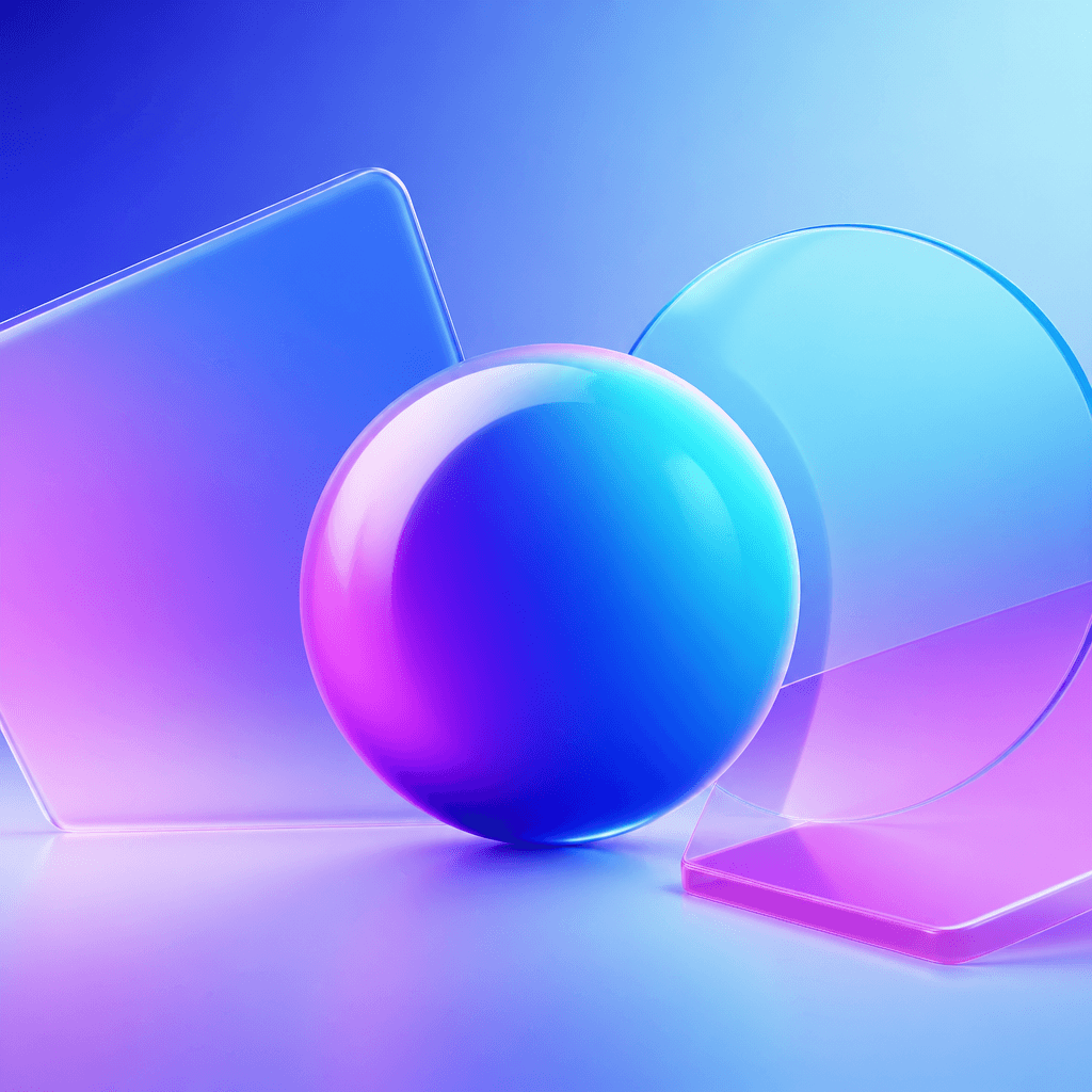
A gradient does not send one universal message. Its meaning depends on the colors, the transition, and the form beneath it. Blue-to-violet blends often feel digital, inventive, and slightly futuristic. Pink-to-orange transitions can suggest creative energy, culture, and community. Cooler metallic gradients may imply precision, high performance, or premium technology.
That is visible in major digital brands. Instagram has explicitly described its updated gradient and palette as part of a brand refresh shaped around its evolving creator community. The gradient is not just an effect; it becomes an emotional signature. The story of Firefox shows another useful pattern: tech identities often evolve toward more luminous, fluid treatments as they expand across screens, products, and ecosystems.
Still, color treatment is never a substitute for concept. A weak symbol does not become memorable just because it has a nice gradient. Strong brand systems start with a clear idea and use the gradient to reinforce that idea, not to hide the lack of one.
When a gradient logo actually works
Gradient logos work best when the brand genuinely belongs to a digital, creative, or product-led environment. They often make sense for software startups, consumer apps, AI tools, collaborative platforms, and tech-enabled services that want to feel current without looking generic.
They also work when the underlying mark is simple. The cleaner the shape, the more room the color transition has to create depth without causing visual clutter. Geometric icons, monoline symbols, rounded marks, abstract ribbons, and compact app-style pictograms often pair well with gradients.
Most importantly, they work when the broader identity can support them. If the logo is the only element using gradients while the rest of the brand is flat and disconnected, the effect can feel arbitrary. The strongest systems extend the logic into hero visuals, interface accents, illustration, motion, and presentation assets.
Mistakes that make gradients look cheap
The first mistake is overcomplicating the palette. A useful gradient does not need six colors. Two anchor colors and maybe an intermediate tone are often enough. Too many stops make the mark harder to remember and easier to date.
The second mistake is ignoring real-world usage. Logos must work as favicons, social avatars, slides, print documents, and monochrome assets. If the brand only looks good in one polished hero banner, the system is incomplete. A gradient logo should always come with flat and single-color versions.
The third mistake is chasing trend over clarity. Some brands try to look “innovative” by piling on glow, blur, and color drama. The result may look current for a month but weak in everyday use. Innovation in branding still depends on recognition, hierarchy, and consistency.
A final mistake is imitation. Copying the emotional intensity of a consumer social platform may not help a B2B infrastructure product. The right gradient strength depends on positioning, audience, and trust expectations.
A practical method for building a strong gradient logo
1. Start in black and white. If the core symbol does not work without color, the gradient will only mask the problem. Shape comes first.
2. Define the brand intention. Are you trying to express speed, creativity, warmth, intelligence, trust, or premium performance? The gradient should follow that strategic choice.
3. Limit the palette. Fewer colors are easier to deploy and easier to remember. Restraint usually improves brand longevity.
4. Test real contexts. Check the logo on mobile, dark backgrounds, tiny icons, and static export formats. Do not judge it only inside the design file.
5. Build a full asset set. Create a primary gradient version, a flat version, a monochrome version, and a simplified icon. That is what makes the identity operational, not just attractive.
6. Choose clarity over spectacle. The goal is not to impress designers for five seconds. It is to build a mark that earns trust and remains legible over time.
In short, gradients work best when the form stays simple and the system around it is disciplined. For tech brands, that combination can feel both expressive and credible, which explains why the trend keeps growing instead of disappearing.
Should your brand use a gradient logo?
If your company lives in a digital, product, or creative environment, a gradient logo may be a strong direction—as long as it is treated as a real brand system, not just a fashionable surface effect. If you want to explore that route with a structured brief, start here: create your logo brief on Wilogo.
FAQ: gradient logos in tech branding
Are gradient logos always modern?
No. They can look very current when the underlying shape is simple and the palette is controlled, but they can also look dated if they rely on gimmicky effects.
Can B2B tech brands use gradients?
Yes. In B2B, subtle gradients often work better than loud ones. The key is to preserve trust, hierarchy, and legibility.
Do I need a non-gradient version?
Absolutely. A flat or monochrome version is essential for print, small sizes, and any context where the gradient cannot reproduce well.
How do I know if a gradient fits my logo?
Validate the symbol in black and white first, then test the gradient in real usage scenarios such as favicons, social profiles, decks, and product UI.