LEGO logo: how a universal icon evolved
The documented history of the LEGO logo, from the 1936 workshop mark to the universal red-square identity refined in 1998.
The LEGO logo belongs to the small group of marks people can recognize before they can read. Its red square, thick white letters, black outline and yellow keyline create a cheerful, compact signature that stands out instantly. Yet that apparent simplicity took decades to build. Before LEGO became a global emblem of play, the company used restrained marks on wooden toys, then increasingly expressive identities as plastic bricks and the System in Play became central.
The history of the LEGO logo is therefore more than a parade of styles. It shows how a family company in Billund clarified its name, promise and visual system without erasing its origins. Early marks mainly identified a manufacturer. Postwar versions developed personality. The modern logo, refined at the end of the twentieth century, has to work on a box, a brick, a shopfront, a screen, a film and a theme park. Its strength lies in remaining unmistakably itself across very different settings.
1932-1936: from workshop to the LEGO name
The story begins in Billund, Denmark, where Ole Kirk Kristiansen started a business in 1932 that made wooden goods including toys. The name LEGO was adopted in 1934 from the Danish expression “leg godt,” usually translated as “play well.” This was a decisive branding move: two syllables, four letters, an easy rhythm and a positive idea connected to play. The future logo already had exceptional verbal material, memorable enough to travel and broad enough to cover products that did not yet exist.
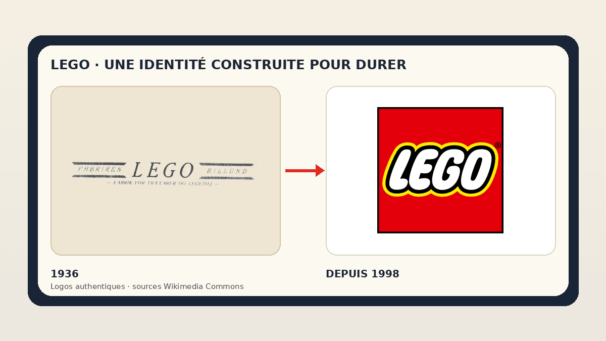
At that point, the priority was not to create a global advertising icon. The mark needed to identify a workshop and reassure buyers. The 1936 file preserved on Wikimedia shows an extended typographic composition with references to the Billund factory. The name was not yet isolated; it sat inside a manufacturer's signature. That distinction matters. A young brand often needs to explain who it is, while an established brand can reduce its message to a few familiar letters.
The early logo looks quiet next to the current red square, but it contains a lasting lesson: the name is the core asset. Ornaments, frames and supporting words may change; LEGO remains. That verbal continuity allowed the company to test several visual styles without losing every trace of recognition. During a redesign, keeping one stable element — a name, color, shape or rhythm — helps audiences connect the old identity to the new one.
Early logos in the wooden-toy era
Wooden toys impose different constraints from screens. A mark can be printed, stamped, burned, engraved or placed on a label. Fine details and horizontal compositions remain practical because buyers inspect the physical object at close range. Early versions therefore relied on type and a craft or industrial character rather than on a standalone symbol.
During the 1940s, signatures became more contrasting and present. The commercial reason is clear: a name needs to be noticed on packaging and distinguished in a catalogue. The logo began to move beyond a simple origin mark and toward a promise. The group motto, “Only the best is good enough,” places quality at the center of the story. A logo can never prove quality by itself, but consistent use can make the promise more credible.
This period also explains why the LEGO identity should not be reduced to the plastic brick. The brand predates its most famous product. It grew around play, imagination and careful making, then found an extraordinary vehicle in the brick. The lesson for a business is important: a logo designed too literally around one current product can become restrictive when the offer expands.
Plastic brings a more playful identity
The official timeline places the first LEGO plastic products in 1949. Moving from wood to plastic opened a different visual language: stronger colors, repeatable components, molded surfaces and modular construction. The logo had to follow. Rounder and more contrasting versions appeared, with lettering that felt less institutional and more closely connected to childhood and pleasure.
The word LEGO gradually became a shape in its own right. Thick letters improved visibility, outlines separated them from colored backgrounds, and compact compositions made printing easier across boxes of many sizes. This work anticipated the principle behind the current logo: several layers of contrast that stay legible over a colorful model photograph, a busy retail shelf or a complex themed scene.
It is tempting to describe the transition as one instant flash of genius. The visual evidence is more useful than that myth. The identity progressed through trials, corrections and simplifications. Durable brands are rarely complete at birth. They test what truly belongs to their character, remove what ages badly and preserve what audiences identify. LEGO turned a manufacturer's signature into a sign of play through accumulated decisions.
1955-1973: designing an international system
In 1955, the LEGO System in Play organized products as a coherent system rather than an unrelated collection. The modern stud-and-tube brick principle was patented in 1958. For the identity, this system logic changed the assignment: the logo no longer signed one object; it had to connect boxes, themes, instructions and markets. A consistent visual architecture became as important as the drawing of the word itself.
Logos from this era explored containers, ovals and brighter colors. White letters surrounded by contrasting outlines moved closer to the personality known today. The brand became friendly without appearing fragile. It addressed children while also needing to reassure parents and retailers. This balance helps explain why the master logo does not depend on one mascot: the name can host many worlds without being tied to one product range.
International growth also demanded a stable pronunciation and silhouette. A short name helped, but the graphic shape had to remain coherent across languages and formats. LEGO did not translate its main emblem. The same visual block became a shared anchor while commercial copy changed around it. This is one reason a distinctive wordmark can be more flexible than a slogan built into the logo.
1973-1998: the modern formula takes shape
The logo adopted in the early 1970s established the now-familiar ingredients: a red field, rounded white letters, a black outline and a yellow keyline. The contrast is intentionally spectacular. Red attracts attention, yellow adds warmth and energy, black provides structure, and white protects readability. Every layer has a job. On a box full of color, the square remains visible because it forms a small self-contained visual stage.
In 1998, the design was adjusted rather than replaced. Proportions and letters became tighter and more contemporary, but the visual family stayed instantly recognizable. This is a strong example of continuity-led redesign: audiences see a cleaner brand without having to relearn its sign. The changes support reproduction and consistency instead of chasing a short-lived publicity effect.
Stability creates cumulative value. Every box in a bedroom, every instruction booklet, store and screen appearance strengthens the same association. A radical change would have spent some of that memory. LEGO shows that an identity can evolve by correcting spacing, tension and usage before discarding its central idea. The history of Airbnb's Bélo illustrates another path: a new symbol can become powerful, but it requires a more visible learning period.
Why the current logo is so memorable
The first strength is silhouette. The red square provides a simple boundary that is easy to place and spot from a distance. Inside, the word creates a lively, uneven rhythm. The letters do not feel arranged with cold geometric precision; they appear soft and almost inflated. The tension between a stable frame and playful type summarizes the LEGO proposition: construction rules that release imagination.
The second strength is contrast. White on black would already be readable; yellow adds vibration and keeps the mark from feeling severe; red separates the unit from its surroundings. Layering makes the logo resistant to complex backgrounds. This is not pure minimalism, but it is disciplined economy: four colors and one word, without an illustration or tagline.
The third strength comes from deployment. The logo is repeated consistently across products and experiences while secondary worlds are free to change. That hierarchy protects the master brand. A successful identity does not ask the logo to narrate every theme. It gives the mark the job of recognition, then lets palettes, photography, characters and layouts express variety. The Samsung logo story also demonstrates wordmark stability, although its visual codes are very different.
Branding lessons for any business
First, choose a strong name before searching for a graphic trick. LEGO is short, distinctive and connected to a brand idea. A brilliant drawing cannot fully rescue a name nobody remembers. Second, let the logo evolve with real business change. LEGO's visual stages accompany materials, the product system and international growth; they are not isolated decorative updates.
Third, build a hierarchy. The master logo should stay clear while the broader identity carries variety. Prepare a primary version, a compact version, spacing rules, colors, behavior over photography and minimum sizes. Test the mark on screens, packaging, invoices, signage and avatars. A logo that looks attractive in a presentation but fails in ordinary use is unfinished.
Finally, protect continuity. Before redesigning, list the elements customers already recognize. Decide which should survive and why. Modernizing does not mean erasing. The LEGO story suggests that a brand asset becomes universal through the accumulation of thousands of coherent experiences, not through one spectacular launch announcement.
Build a clear and durable identity
Preparing a new logo or a brand evolution? Gather your story, touchpoints, constraints and the elements your audience already recognizes. A precise brief creates room to explore without losing direction.
LEGO logo FAQ
What does the name LEGO mean?
The name was formed in 1934 from the Danish expression “leg godt,” commonly translated as “play well.” Its brevity and direct connection with play helped it travel internationally.
Has the LEGO logo always been red and yellow?
No. Early signatures were mostly typographic and often monochrome. Strong colors and multiple outlines appeared gradually. The familiar red, white, black and yellow formula arrived in the early 1970s and was refined in 1998.
Why does the current logo work so well on packaging?
The red square forms an autonomous area, black and yellow outlines separate the white letters, and the compact composition survives colorful photography. It remains visible at small size and across a crowded retail shelf.
Who designed the current LEGO logo?
Public sources mainly document an identity that evolved inside the company rather than a simple story built around one famous designer. It is safer to describe the 1998 version as a refinement of a formula established in the 1970s.
Can anyone use the LEGO logo freely?
The presence of files on Wikimedia Commons does not cancel trademark rights. Editorial use should remain descriptive, accurately sourced and should never imply a partnership. Commercial use requires checking the brand's rules and applicable law.