Association logo: complete guide to creating an engaged visual identity
How to create an impactful association logo? Complete guide with color advice, symbols, typography and errors to avoid for 1901 law associations.
Why a logo is essential for an association
A 1901 law association, whether sporting, humanitarian, cultural or environmental, needs a strong visual identity to exist in the public space. The logo is the cornerstone of this identity: it is the first element that your future members, donors, partners and volunteers will see.
Unlike a commercial enterprise, an association has a cause. Its logo does not sell a product — it embodies a mission, values, a collective commitment. This is what makes creating an association logo both exciting and demanding: it must speak to the heart as well as the mind.
A well-designed logo for your association allows you to:
- Gain credibility with institutions, town halls and financiers
- Unite your members and volunteers around a common symbol
- Communicate effectively on your media (posters, website, social networks, official letters)
- Differentiate yourself from other structures in the same sector
- Inspire confidence in donors and potential partners
In France, there are more than 1.5 million active associations. In this dense ecosystem, a distinctive logo is not a luxury — it's a necessity to capture attention and anchor your message.
The specificities of the associative logo
The logo of an association does not obey exactly the same rules as that of a company. Here's what sets it apart:
Mission before profit
Where a commercial logo seeks to seduce in order to sell, an associative logo must mobilize for a cause. It must make you want to get involved, to give your time or your money. The emotional dimension is therefore particularly important.
Various audiences
Your logo will be seen by very different profiles: field volunteers, local elected officials, institutional funders, general public. It must be understandable and attractive to all these audiences, which requires an accessible and universal design.
Often limited budgets
It's a reality of the associative world: resources are limited. But limited budget does not mean cheap logo. Accessible solutions exist to obtain a professional result without straining your cash flow (more on this below).
Sustainability
An association is often long-term. Your logo must be timeless enough to accompany your structure for years, even decades. Avoid excessive fashion effects.
Symbols and iconography: what works
The choice of symbol is crucial for an association logo. It must visually translate your mission into a simple and memorable image.
By type of association
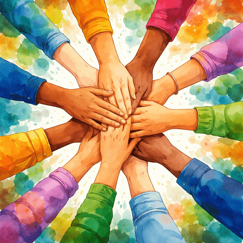
Humanitarian and social associations: outstretched hands, hearts, human silhouettes, circles (symbolizing inclusion) and bridges (links between communities) are effective classics. The globe works for organizations with an international reach.
Sports associations: Coats of arms and crests remain essential for clubs. We often integrate the animal or symbol of the city, local colors, and elements linked to the discipline. The shield shape provides a reassuring institutional side.
Cultural associations: elements linked to art (brushes, musical notes, books, masks), organic shapes and dynamic compositions reflect creativity. Typography plays a central role here in asserting an artistic identity.
Environmental associations: leaves, trees, water drops, animals and natural elements are the most relevant. The circular shapes evoke the cycle of nature and renewal.
Educational and youth associations: books, stars, rockets, light bulbs (ideas), trees (growth) and paths (routes) work well. Brighter colors add a touch of dynamism.
Universal symbols of commitment
Certain symbols transcend sectors and naturally convey the idea of commitment: the circle (community, inclusion), the joined hands (solidarity), the star (aspiration, excellence), the flame (passion, energy) and the ribbon (awareness, support).
Choose the right colors according to your cause
Color is a powerful vector of emotion. In the associative world, it takes on an additional dimension because certain colors are culturally associated with specific causes.
Green: environment, health, nature
The most natural choice for environmental, ecological or outdoor associations. Green also evokes growth, hope and renewal. Be careful not to fall into the “all green” cliché if your association is not directly linked to the environment.
Blue: trust, institution, solidarity
Blue is the most used color in the world in logos, and for good reason: it naturally inspires confidence and seriousness. Perfect for associations with a social, educational or institutional vocation. Dark blue brings authority, light blue brings accessibility.
Red: urgency, passion, action
The color of action and energy, red is suitable for emergency aid, fight (against illness, injustice) or sports associations. It immediately attracts attention but must be measured so as not to appear aggressive.
Orange and yellow: optimism, youth, accessibility
These warm tones evoke friendliness and openness. Excellent for youth associations, integration structures or festive community projects. Yellow is associated with hope and light.
Violet: creativity, dignity, spirituality
Less common, purple is easily distinguished. It is suitable for cultural, artistic or well-being related associations. It also conveys an image of wisdom and dignity.
Practical advice
Limit yourself to 2 main colors (3 maximum). Your logo will often be printed in small size on administrative documents, t-shirts or banners: readability is key. Also consider the monochrome version, essential for official stamps and black and white documents.
Typographies adapted to the associative world
The typography of your logo says a lot about your association. Here's how to choose:
Sans-serif (Helvetica, Montserrat, Open Sans…)
Modern, readable, accessible. It is the most versatile choice for associations. They work on all media and convey a contemporary and professional image without being too corporate.
Serif (Georgia, Playfair Display…)
More traditional and institutional. Suitable for historical, heritage or academic associations. They add a touch of prestige and long-term anchoring.
Handwritten or script
They bring human warmth and closeness. Well suited to mutual aid, neighborhood or strong human dimension associations. Please note: they must remain perfectly readable, even in small sizes.
Bold and rounded
For sports or youth associations, bold, rounded fonts convey energy and dynamism. They catch the eye and give an impression of solidity.
Golden rule: never mix more than two typographies in a logo. One for the name, possibly a second for the baseline or subtitle. Visual consistency is essential.
The main styles of association logos
The coat of arms / crest
The classic for sports associations and clubs. The shape of the shield or crest encloses the identity elements (colors, symbols, name, date of foundation). It is a reassuring format that inspires tradition and belonging. It works great on jerseys, banners and flags.
The combined logo (symbol + text)
The most versatile and recommended format for associations. The symbol ensures quick visual recognition, while the text clearly identifies your structure. This format easily adapts to all media.
The monogram
The use of the association's initials in a graphic design. Effective when the name is long (which is common in the associative world). For example, an “Association for the Protection of Natural Spaces” could become a graphically worked “APEN” monogram.
The typographic logo
The name of the association is itself the logo, thanks to careful typographic work. Simple and effective, but it works best with short, memorable names.
The circular emblem
The name encircles a central symbol. This format is reminiscent of official seals and stamps, which provides institutional credibility. Widely used by long-established associations.
Mistakes to absolutely avoid
Here are the most common pitfalls in creating an association logo:
1. Too complex design
This is mistake number one. Many associations want to say everything in their logo: the cause, the beneficiaries, the location, the values… Result: an overloaded and illegible visual, especially in small sizes. Your logo is not a summary of your status — it is a symbol. Keep it simple.
2. Copy the style of a large NGO
Taking inspiration from the Red Cross or WWF is tempting. But imitating their style will make you invisible by comparison and may cause legal problems. Find your own graphic path.
3. Neglect the declination
Your logo must work both large (3 meter banner) and very small (website favicon, profile photo on networks). If details disappear in small format, simplify.
4. Use generic royalty-free images
A retouched clip art does not constitute a professional logo. Your identity must be unique and recognizable. Stock images are by definition shared by others.
5. Forget the administrative aspect
Your logo will appear on official documents (letters to the prefecture, grant files, conventions). It must remain readable and professional in a formal context, not just on Instagram.
6. Follow passing fashions
Multicolored gradients, 3D effects, ultra-trendy styles... These choices may appeal today but will age poorly. Prefer a timeless design that you won't need to redo in 3 years.
Budget and solutions for associations
The question of the budget is central in the associative world. Here's an honest overview of the options:
Freelance graphic designer or agency (€300 to €3,000+)
This is the most personalized solution. A professional graphic designer analyzes your needs, suggests several creative avenues and delivers a tailor-made result. The result is generally excellent, but the cost can be prohibitive for a small association. Some graphic designers offer reduced rates for associations — don't hesitate to ask.
Graphic designer volunteer
If you are lucky enough to have a design-skilled member, this is a free option. Be careful, however: volunteering does not guarantee deadlines or professional quality, and it can be difficult to request changes. Always value this voluntary work.
Free online tools (Canva, etc.)
Accessible but limited in originality. The risk is to obtain a logo that resembles thousands of others. For a temporary logo or a very first project, this can help. For a lasting identity, this is insufficient.
AI-assisted creation platforms
Platforms like Wilogo allow you to obtain a professional logo at an affordable price, with several personalized proposals. It is a good compromise between quality and budget for associations which want a neat result without investing hundreds of euros.
Whatever solution you choose, keep in mind that your logo is a long-term investment. A good logo will serve you for years on all your communication media.
Create your association logo with Wilogo
Wilogo is a logo creation platform that combines artificial intelligence and artistic direction. The process is designed to be simple, quick and accessible — even for associations with a tight budget.
Here’s how it works:
- Describe your association: mission, values, sector of activity, target audience, desired style
- Receive proposals: our AI graphic designers analyze your brief and generate personalized designs
- Refine your choice: select your favorites, request color or typography adjustments
- Upload your files: High-definition PNG, vector PDF and SVG — all the formats you'll need
It all takes a few minutes and you get a unique, professional and ready-to-use logo for your association.
🎨 Create the logo of my association
Frequently asked questions
Is an association required to have a logo?
No, no legal obligation. But in practice, a logo is almost essential to communicate effectively, submit credible grant applications and unite your members around a common identity.
Can you protect your association's logo?
Yes, by registering it as a trademark with the INPI (National Institute of Industrial Property). The deposit costs from €190 for a class and protects your logo for 10 years, renewable. This is recommended if your association has a significant reputation or if you sell derivative products. To find out more, consult our complete guide to trademark registration at the INPI.
What file formats should I request for an association logo?
At a minimum: a high definition PNG (for the web and documents), a vector PDF or SVG (for large format printing and personalization), and a monochrome version (for black and white stamps and documents). To understand the differences between formats, consult our vector logo guide.
Should the word “association” be included in the logo?
This is not necessary, especially if your name already speaks for itself. On the other hand, adding a baseline such as "Association law 1901" or a short description of your mission can help understanding, especially for a young structure.
How to choose between a coat of arms and a modern logo?
The coat of arms is suitable for sports clubs, historical or heritage associations, and structures attached to tradition. The modern logo (combined or typographic) is more suited to recent associations, innovative projects or structures targeting a young audience. The important thing is that the style matches your identity and your audience.