Sports Club Logo: How to Create a Modern and Unifying Emblem
A comprehensive guide to creating your sports club logo: from traditional emblems to modern designs, colors, typography, mascots, and variations. Practical tips and inspiring examples.
The Club Logo: Much More Than an Image
The logo of a sports club is its flag. It’s what supporters wear on their hearts — literally, as it adorns jerseys. It’s displayed at the stadium entrance, on social media, on invitations, and banners. A good club logo creates a sense of belonging and collective pride. A bad logo, on the other hand, goes unnoticed — or worse, makes people smile.
Whether you are the president of a small amateur club, a coach in a sports association, or the communication manager of a larger organization, the logo is the first visual identity element people see. It must work as well embroidered on a jersey as it does in miniature on an Instagram profile.
And contrary to what one might think, creating a good sports logo does not require a huge budget. It mainly requires thought, an understanding of industry codes, and some well-considered graphic choices.
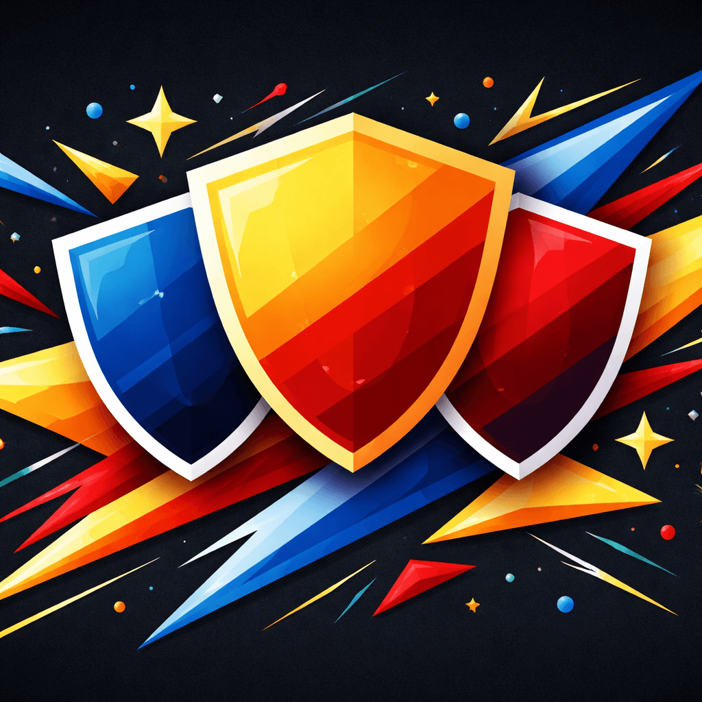
Emblem, Crest, Badge: Which Format to Choose?
In sports, we don’t just talk about a “logo” — we talk about a crest, a badge, or an emblem. These terms are not interchangeable, and the format you choose sends a message.
The Traditional Crest
This is the most classic shape: a shield (pointed, rounded, or straight) that contains the club's identity elements. Historically inspired by heraldry, the crest evokes tradition, local roots, and history. It’s the choice of the majority of football, rugby, and handball clubs in France. Think of PSG, OL, or OM — all use a crest, even after their respective rebrandings.
When to choose it: if your club has a long history, strong local roots, or if you want to position yourself within a noble sports tradition.
The Round Badge
A circular format, often used by clubs that want a more modern look while still adhering to sports codes. Manchester City, Inter Milan, or Middlesbrough (which just returned to the round badge for its 150th anniversary in 2026) use this format. The circle works well in small sizes — social media avatar, favicon, embroidery.
When to choose it: if you want a compact, modern logo that naturally works on digital media.
The Graphic Emblem
Some clubs opt for a pure symbol, without a crest outline: an animal, an abstract shape, a stylized letter. This is rarer in traditional sports but common in emerging sports (esports, crossfit, urban sports). The Juventus logo (the black and white J adopted in 2017) is the most famous — and controversial — example.
When to choose it: if you want to radically stand out from sports conventions, at the risk of losing perceived “authenticity.”
Key Elements of a Sports Club Logo
Regardless of the chosen format, a sports club logo generally contains several recurring elements. There’s no need to use them all — but knowing the palette allows you to make informed choices.
The Club Name
This is the foundation. The full name or its abbreviation (FCN, ASSE, RCT…) almost always appears in the logo. The question is: written in full or in initials? Initials work better in small formats; the full name reinforces identity for lesser-known clubs.
The Year of Establishment
Including “Founded in 1923” or simply “1923” in the logo is a classic in sports. It anchors the club in time, saying “we’ve been here for a long time, we’re not a fleeting project.” If your club was founded less than 5 years ago, you can skip this without issue.
A Local or Identity Symbol
Many clubs incorporate a geographical or symbolic element: the Eiffel Tower for PSG, the lion for OL, the lily flower for clubs in the north. It can be a monument, a local animal, or an element from the city’s coat of arms. This is what makes the logo unique and rooted in a territory.
The Club Colors
We will revisit this in detail, but colors are the most immediately identifiable element. Even before reading the name, one recognizes a club by its colors — the blue and red of Barça, the black and white of Juve, the green of ASSE.
A Sports Element
Ball, racket, stick, boxing gloves… Some clubs incorporate an element related to their discipline. This is useful for single-sport clubs, less relevant for multi-sport clubs that practice several disciplines.
Colors: The Identity That Stands Out
The colors of a sports club are sacred. You don’t change a club’s colors like you change a corporate graphic charter — just ask Burnley supporters what they thought of the switch to purple in 2023. Colors are the emotional DNA of the club.
Choosing Foundational Colors
If your club already exists, its colors are probably set. If you are creating a new club, here are some principles:
- 2 colors maximum for the main duo (+ white or black as a complement). Major sports identities work in pairs: blue-white, red-black, green-white, yellow-blue.
- Check local competition: if the neighboring club is already in red and black, choose another duo to avoid confusion.
- Think about visibility: a logo must be readable from a distance, on a moving jersey. Strong contrasts (light/dark) work better than subtle harmonies.
To delve deeper into the psychology of colors applied to branding, check out our complete guide on logo colors.
Mandatory Monochrome Version
A good sports logo must work in a single color — white on a dark background, black on a light background. This is essential for engraving, embroidery, stamps, administrative documents, and the vector format in general. If your logo loses all meaning without its colors, it lacks graphic structure.
Typography: Readability First
The typography of a sports logo must meet a non-negotiable criterion: it must be readable under all circumstances. On a jersey photographed from afar, on an A3 poster, on a 16-pixel favicon.
Font Families Suitable for Sports
- Bold Sans-serif (Montserrat, Bebas Neue, Oswald): modern, dynamic, very readable. The safest choice for a contemporary club.
- Classic Serifs (Garamond, Times): evoke tradition and institution. Suitable for centenary clubs that want to assert their history.
- Display/Sport Fonts (fonts specifically designed for sports): impactful but may date quickly. Use with caution.
Golden Rule: never use more than two fonts in a club logo. One for the name, possibly a second for the city or founding date. To learn more, check out our typography guide for logos.
Mascot: Should You Have One?
The mascot is a standalone topic in a club's identity. Some iconic clubs are inseparable from their mascot (Tottenham's cockerel, Benfica's eagle, OL's lion). Others do just fine without one.
Advantages of a Mascot
- Personification: a mascot gives a face to the club, making it more human (or animal).
- Engaging Young Audiences: children love mascots. If your club has a sports school, this is a plus.
- Merchandising: plush toys, pins, stickers… the mascot can be adapted infinitely.
- Animation: during matches, the costumed mascot creates atmosphere and attachment.
Precautions
- The mascot does not replace the logo — it complements it. The crest remains the official identity; the mascot is an ambassador.
- A poorly drawn animal can harm the club's image. Better to have a well-executed mascot or none at all.
- Choose an animal or character that has a connection to the club, the city, or the discipline. A shark for a swimming club, a falcon for a mountain club — coherence matters.
2026 Trends: Simplifying Emblems
The sports world has been experiencing a wave of logo simplification for several years, and 2026 confirms this trend. Several major clubs have recently revised their emblems:
- Olympique de Marseille unveiled a new emblem in April 2026: rounded shape, more streamlined, designed to be readable on digital media.
- Middlesbrough FC returned to the round badge format for its 150th anniversary, with a modernized design.
- Stoke City revived its badge from 1977-1992 in a refreshed version after consulting supporters.
- Newcastle United announced a redesign for the 2026-27 season, describing its current emblem as “outdated for modern digital use.”
What This Means for Your Club
The trend is clear: fewer details, more readability. Logos that worked engraved in stone or printed in large formats must now function in 32×32 pixels on a WhatsApp profile. This doesn’t mean abandoning all tradition — it means keeping the essentials and removing the superfluous.
The clubs that successfully modernize are those that consult their supporters and “refine” rather than “revolutionize.” A good sports rebranding is a logo that old fans recognize and new fans find modern. To understand this philosophy of minimalist design applied to logos, we dedicated an entire article to it.
Adapting Your Logo Across All Media
A sports club logo is likely one of the most requested logos in terms of adaptations. It must work on:
- Jerseys and Textiles: embroidery, flocking, sublimation. Test your logo in embroidery before finalizing it — overly fine details disappear.
- Social Media: round avatar (Instagram, WhatsApp), rectangular banner (Facebook, Twitter/X).
- Administrative Documents: licenses, invitations, letters to the town hall or federation.
- Signage: signs at the stadium or gym, sponsor banners.
- Merchandising: scarves, mugs, stickers, caps.
This is why a sports logo must exist in vector format (SVG or AI). Vector allows you to resize the logo infinitely without loss of quality — from favicon to 4×3 meter banner.
Consider Simplified Versions
Major clubs often have 2 or 3 versions of their logo: the complete version (for official uses), a reduced version (initials or monogram for small formats), and a monochrome version. If you are creating your club's logo, plan these adaptations from the start.
Common Mistakes to Avoid
We wrote a complete article on logo mistakes, but here are the most common in the sports world:
- Too Many Details: a logo with 8 different elements (animal, ball, stars, motto, year, city, ribbons…) will never be readable in small sizes. Choose a maximum of 3-4 elements.
- Copying a Major Club: drawing inspiration is legitimate, but plagiarism is not. If your logo looks too much like PSG or Barça, you will lose credibility.
- Neglecting Black and White: if your logo doesn’t work in monochrome, it has a structural problem.
- Following a Trend: 3D effects, gradients, drop shadows… All of that is dated. A sober and well-constructed logo will last for decades.
- Forgetting Digital: test your logo in 64×64 pixels. If it becomes a color mush, simplify.
- Not Consulting Members: a club logo does not belong to the president or the designer — it belongs to the community. Successful rebrandings involve supporters from the beginning.
Steps to Create Your Club's Logo
Here’s a concrete process, suitable for both amateur clubs and larger organizations:
1. Define the Club's Identity
Before touching a pencil or software, answer these questions:
- What are the club's values? (competition, friendliness, training, inclusivity…)
- What is the club's history? Is there a historical symbol to retain?
- What is the geographical anchoring? A local element to integrate?
- Who is the target audience? (youth, families, competitors…)
2. Analyze the Competition
Look at the logos of other clubs in your discipline in your region. The goal is not to copy but to differentiate. If everyone uses dark crests, maybe a colorful round badge will set you apart.
3. Write a Creative Brief
Whether you hire a professional designer or use a creation tool, a precise brief is essential. Specify desired colors, mandatory elements (name, date, symbol), the intended style (classic or modern), and priority media (jersey, digital, print). To learn how to structure an effective brief, check out our graphic charter guide.
4. Explore Multiple Directions
Don’t limit yourself to a single idea. Request or create at least 3 different graphic directions before converging. This is the method used by professional studios — and it’s also the philosophy of Wilogo, where multiple designers propose their interpretation of the same brief.
5. Test and Validate
Before finalizing:
- Test the logo in small format (avatar, embroidery)
- Test in black and white
- Show it to club members — gather feedback
- Ensure it’s not too close to an existing logo
6. Deliver in Vector Format
The final deliverable should include the logo in SVG or AI (vector), in high-resolution PNG (with a transparent background), and adaptations (monochrome, reduced version). Without a vector file, you will be stuck at the first jersey order.
Create Your Club's Logo with Wilogo →
FAQ
How much does it cost to create a sports club logo?
Prices vary greatly depending on the chosen solution. A free online tool or an AI generator like Wilogo can provide a professional logo at a lower cost. A freelance designer typically charges between €200 and €1,500 depending on their reputation and the project's complexity. A branding agency can charge €5,000-15,000 for a complete visual identity including graphic charter, adaptations, and usage guides.
Should I register my club's logo with the INPI?
It’s not mandatory for an amateur club, but it’s recommended if the club develops merchandising or wants to protect its identity. Registering a trademark with the INPI starts at €190 and protects the logo for 10 years. For detailed steps, check out our complete guide to trademark registration with the INPI.
What is the difference between a logo and a club crest?
The term “logo” is generic and refers to any graphic sign identifying an entity. The “crest” is a specific format inherited from heraldry, shaped like a shield or badge. In sports, the two terms are often used interchangeably, but technically the crest is a type of logo among others (round badge, emblem, monogram…).
Can a club logo be modernized without losing its identity?
Yes, and this is even the best approach. The most successful sports rebrandings (Manchester City, OM in 2026, Stoke City) follow a logic of “refining rather than revolutionizing.” The idea is to keep the fundamental elements (colors, main symbol, overall shape) while simplifying details to improve digital readability. Consulting supporters during the process is essential to avoid controversies.
What file format should I request for my club's logo?
The vector format (SVG or AI) is essential — it allows resizing the logo without quality loss for jerseys, banners, and other large format media. Also request a high-resolution PNG with a transparent background for the web and social media, and a PDF version for printed documents.