Hairdresser Logo: The Complete Guide to Creating Your Salon's Visual Identity
Scissors, elegant typography, trendy colors… Everything you need to know to create a hairdresser or salon logo that attracts and retains customers. Practical guide 2026.
Why a logo is essential for a hairdresser
In the hairdressing sector, image is everything. Even before entering your salon, a potential client will judge you based on your window display, your sign, your logo. A well-crafted visual identity immediately communicates what words struggle to express: your positioning (luxury or accessible?), your style (classic or avant-garde?), your target clientele (men, women, families, youth...).
Hairdressing is one of the most competitive sectors in France. There are over 80,000 hair salons across the country, which means one salon for about 800 inhabitants. In this context, a memorable logo is not a luxury — it’s a business tool. It differentiates you on Google Maps, on social media, on your business cards, on your professional attire.
This guide walks you through the steps to create an effective and professional hairdresser logo, whether you are a home-based independent, a salon manager, or just starting out.
Essential symbols of the hairdresser logo
Before choosing your colors and typography, you need to decide on the graphic symbol (or "icon") that will accompany your name. In hairdressing, certain symbols have become classics — sometimes overused, but effective when well executed.
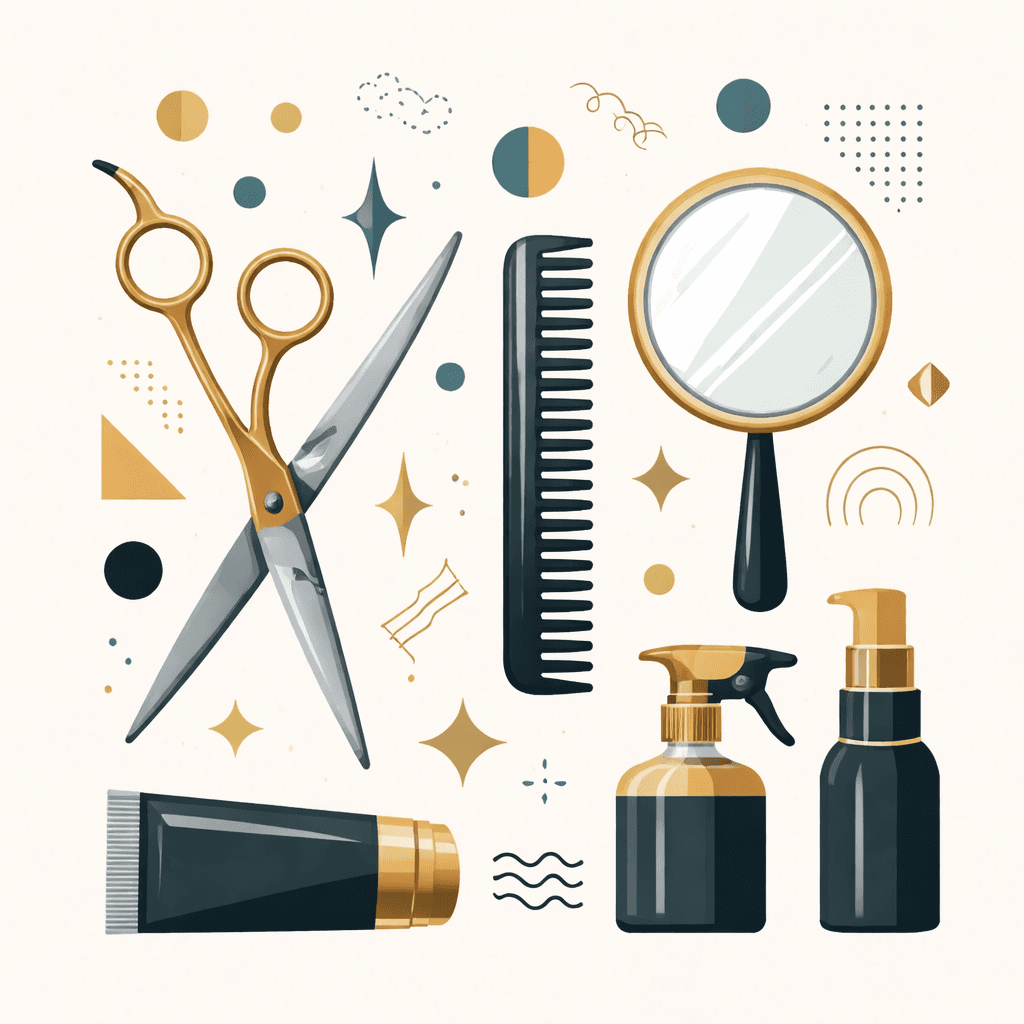
Scissors
This is the most used symbol in hairdressing. And for good reason: it is universal, immediately understandable, and can be adapted infinitely (open scissors, crossed, stylized, minimalist...). The risk? Overkill. If you choose scissors, the key is to treat them in an original way — a clean cut, an unexpected angle, an integration into the typography.
The comb
More discreet than scissors, the comb is often associated with traditional salons and barbers. It can be combined with other elements to form a richer composition.
The female or male silhouette
A stylized profile, a silhouette with hair in motion — this is a classic of logos for women’s hair salons in particular. Beware of sophistication: a silhouette that is too detailed loses its readability in small formats.
The crown or the floral crown
Popular in high-end salons, the crown evokes luxury, care, and preciousness. Used with refined typography, it immediately positions your salon in the premium segment.
Flowers and natural elements
Lotus, leaves, roses, feathers... These motifs work very well for salons that position themselves on natural, organic, and wellness themes. They communicate softness and femininity without falling into the clichés of conventional beauty.
The monogram
For a high-end positioning, the monogram (your stylized initials) can be a powerful alternative to the icon. It allows you to create something truly unique, difficult to copy. To delve deeper into this topic, check out our guide on logo formats that explains why vector graphics are essential for this type of design.
Negative space
A less common but very effective technique: using negative space to hide a shape in your logo. A hairdresser could hide a pair of scissors or a comb in the letters of their name — like the FedEx logo that hides its famous arrow. This is a rare level of sophistication in the industry that leaves a lasting impression.
Create my hairdresser logo with Wilogo →
What colors to choose for your salon?
Color is probably the most important decision in your logo. It defines the emotion you convey even before the client has read your name. Here are the palettes that work best in hairdressing.
Black and gold — luxury positioning
A classic and timeless combination. Black evokes elegance, seriousness, sophistication. Gold (or copper) adds a precious and high-end dimension. This is the palette for salons targeting an affluent clientele willing to invest in quality care. Advantage: this combination ages very well and never goes out of style.
Pink and nude — soft femininity
Powder pink, nude, terracotta, and old rose shades dominate the logos of contemporary women's salons. They communicate femininity, softness, and well-being. This palette works particularly well with elegant script typography. Beware of the black and white version: these light colors can lose their impact.
White and sage green — natural and wellness
For salons that focus on organic care, natural products, and a holistic approach to hair care. White brings purity and cleanliness, while green reassures about eco-responsibility.
Black and white — timeless minimalism
For avant-garde salons, artistic hairdressers who want to project an edgy and contemporary image. A well-designed black and white logo is infinitely more impactful than a poorly executed polychrome logo. It is also the most versatile palette: it works on all media.
Navy blue and red — traditional barber
The colors of the barber pole (white, red, blue) are strong cultural references. For barbers who embrace their roots in tradition, these colors create immediate legitimacy and a sense of trust.
The rule of 1 to 3 colors
Whatever your choice, limit yourself to 2 colors maximum in your logo (3 in exceptional cases). Beyond that, the identity dilutes. To delve deeper into color choices, our guide on logo pricing will give you the basics to budget your visual identity.
Typography: the soul of your logo
In a profession where aesthetics are at the heart of everything, the typography of your logo says a lot about you. It is often the first thing people look at — and what stays in their memories.
Scripts and calligraphic fonts
Script fonts (which imitate handwriting) are very popular in hair salons, especially women's ones. They communicate authenticity, warmth, and personality. Beware: choose a script that is readable — some handwritten fonts are so ornamental that they become unreadable in small formats. The golden rule: test your logo at 2 cm wide.
Classic serifs
Serif fonts (Times New Roman, Garamond, Didot...) evoke elegance, tradition, and prestige. They work very well for high-end salons or for hairdressers who want to project an image of longevity and established expertise.
Modern sans-serifs
Sans-serif fonts (Helvetica, Futura, Montserrat...) convey modernity, clarity, and minimalism. They are readable at all sizes and adapt perfectly to digital uses — website, Instagram, Google My Business.
Typographic pairing
A common technique in hairdressing logos: pairing a script font with a sans-serif. The salon name in script (personality, warmth) + the activity mention in sans-serif (clarity, professionalism). This balanced combination is often the most effective for this sector.
4 logo styles for your salon
By analyzing hair salon logos around the world, we can identify four main styles. Each corresponds to a distinct marketing positioning.
Style 1: Vintage and retro
Badges, labels, old typography, decorative borders, ornate monograms... The vintage style is particularly popular among barbers and salons that emphasize artisanal craftsmanship. It communicates authenticity, experience, and a connection to tradition. This style works best for a mature or nostalgic clientele. Beware: poorly executed vintage can appear dated rather than classic.
Style 2: Contemporary minimalist
A single clean symbol, a sharp typography, two colors maximum — nothing more. This style projects professionalism, modernity, and self-confidence. It works very well for salons targeting an urban and trendy clientele. Its main advantage: it ages extremely well and adapts perfectly to all digital formats. It is also the most difficult style to succeed: when only the essentials remain, every detail counts.
Style 3: Luxury and refinement
Gold leaf, fine typography, generous spacing, precious symbols (crown, diamond, feather)... This style positions the salon in the premium segment. It works for salons that offer high-end services and want to justify their prices through their image. Beware of balance: excessive luxury can appear pretentious if the services do not follow.
Style 4: Fun and accessible
Bright colors, fun illustrations, round and casual typography... This style suits family salons, creative colorists, and hairdressers who want to attract a young clientele or parents with children. It communicates accessibility, good humor, and a lack of hassle.
Barber logo: the codes of the profession
The barber deserves a separate mention. Since the revival of barber shops in the 2010s, the sector has developed a recognizable aesthetic, sometimes even becoming a cliché.
Typical elements of the barber logo
- The barber pole — an immediately recognizable historical symbol
- The straight razor — evokes traditional craftsmanship, precision, and the male ritual
- The mustache or beard — a direct symbol, often used humorously
- The badge or shield — a shield shape that communicates tradition and solidity
- Initials in monogram — a more sophisticated and differentiating option
The barber's paradox
The revival of barber shops has unfortunately created a striking visual uniformity. Many barbers use the same elements (black + white + gold, badge, razor), making differentiation difficult. If you are a barber, think about the element that makes you unique and ensure that your logo reflects it.
Mistakes to avoid
Creating a hairdresser logo should avoid certain classic pitfalls. Here are the most common.
Generic scissors
A pair of scissors downloaded from a clipart site, without any customization work — this is the most common mistake. This type of logo is interchangeable with hundreds of other salons. If you choose scissors, have them treated by a designer or use a tool like Wilogo that offers creative variations.
Too many details
A hairdresser logo must work on a window, a sticker, a nail, an Instagram story. Overloaded logos lose their readability as soon as they are reduced. Simplify. Our article on the 10 mistakes to avoid in logo creation goes into detail on this point.
Copying a local competitor
Before finalizing your logo, take a tour of salons in your geographical area. If your logo looks like that of your competitor across the street, you are giving them free advertising. Differentiation is particularly important in a sector as local as hairdressing.
Neglecting the vector format
Your logo will be printed on various media such as a window banner, towels, business cards, and work clothing. Without a vector file (SVG, AI, EPS), every large format print will be blurry. Always demand the source files.
Ignoring the monochrome version
Your logo will often be used in black and white — stamp, photocopy, order form. If your logo only works in color, it has a fundamental flaw.
Steps to create your logo
How do you go from an idea to a finalized logo? Here is the recommended process, whether you go through a graphic designer or a creation tool.
Step 1: Define your positioning (15 min)
Before talking about colors or symbols, answer these questions:
- Who is my main target? (women, men, families, youth...)
- What is my price positioning? (entry-level, mid-range, high-end)
- What is my differentiating value? (color expertise, braids, beard, natural...)
- What is my style? (classic, modern, vintage, avant-garde)
- Which salons do I admire and why?
Step 2: Gather your inspirations
Create a mood board with 10 to 20 logos or visuals that speak to you. Pinterest is ideal for this exercise. Try to identify what attracts you in each example: the palette? The typography? The shape of the symbol?
Step 3: Write your brief
Summarize in a few sentences what you want to communicate and what you want to avoid. For example: "I want an elegant and feminine logo, in pink shades. The target is a woman aged 30-50 with good purchasing power. I want to avoid clichés like basic scissors."
Step 4: Explore the proposals
With Wilogo, your brief is processed by AI graphic agents who generate proposals in minutes. You can then select your favorite and refine it. If you go through a freelance graphic designer, expect 1 to 3 weeks and a budget of €300 to €600 for a complete logo with a graphic charter.
Step 5: Test before validating
Before finalizing, test your logo:
- In small format (2 cm): is it still readable?
- In black and white: does it work without color?
- On a dark background: do you have a negative version?
- Ask the opinion of 5 clients or close ones: what does it evoke for them?
Step 6: Retrieve all your files
A professional logo pack includes at least: PNG with a white background, PNG with a transparent background, SVG vector, PDF. Ideally, also a monochrome version and horizontal/vertical variations. To learn everything about formats, read our vector logo guide.
FAQ — Hairdresser Logo
What symbol to choose for a hair salon logo?
The most commonly used symbols are scissors, the comb, the female/male silhouette, the crown, and floral elements. The important thing is not to choose a generic symbol, but to treat it in an original way. An increasingly popular alternative: the monogram, which creates a unique and hard-to-copy identity.
What colors for a high-end hair salon?
For a luxury positioning, the most effective palettes are black + gold, white + black, or anthracite gray + burgundy. These combinations project elegance and seriousness. Avoid bright colors and complex gradients that appear less refined.
How much does a logo for a hairdresser cost?
The price varies depending on the method chosen. An online creation tool like Wilogo costs from €19. A freelance graphic designer charges on average €300 to €600 for a complete logo. A branding agency can charge €1,000 to €5,000 and more. To understand all the options, our logo pricing guide details each solution.
Does a hairdresser logo have to show scissors?
No. Scissors are an obvious symbol, but they are also very used. To differentiate yourself, you can opt for strong typography, a monogram, a plant element, or a more original illustration. The essential thing is that your logo is consistent with your positioning — not necessarily that it shows your tools of the trade.
What file format should I ask for my salon logo?
Demand at least a vector SVG file (or AI/EPS) for large format prints, a high-definition PNG with a transparent background for the web, and a PDF. Without a vector file, you won’t be able to print your logo on a window or banner without losing quality. More details in our vector logo guide.
Can my hairdresser logo be too simple?
No. In logo design, simplicity is a quality, not a flaw. The most memorable logos in the world (Nike, Apple, Chanel) are among the most streamlined. A simple logo is easier to remember, more readable at all sizes, and ages better than a complex logo. If your logo can be described in one sentence and reproduced from memory, that’s a good sign.
Conclusion
Creating a hairdresser logo is much more than choosing an image of scissors from a library. It is a reflection on your identity, your target, your positioning. It is the first impression you will give to thousands of potential clients, even before they step through your door.
Take the time to define who you are and who you want to attract. Choose colors and typography that are consistent with this vision. And above all, make sure you have a logo that works at all sizes, on all media — from the window to the Instagram icon.
If you need inspiration or want to explore proposals quickly, Wilogo Studio provides you with AI graphic agents who can generate dozens of creative directions from your brief. An effective way to visualize your future logo before committing.
To go further, check out our guides on the mistakes to avoid in logo creation, the essential file formats, and the price of a professional logo.