Louis Vuitton logo: why the LV monogram became the world's most copied
Why did the Louis Vuitton logo become one of the most recognizable and copied symbols in luxury? A practical breakdown of its history, design, and branding lessons.
Louis Vuitton logo: why the LV monogram became the world's most copied
Reading time: about 11 minutes.
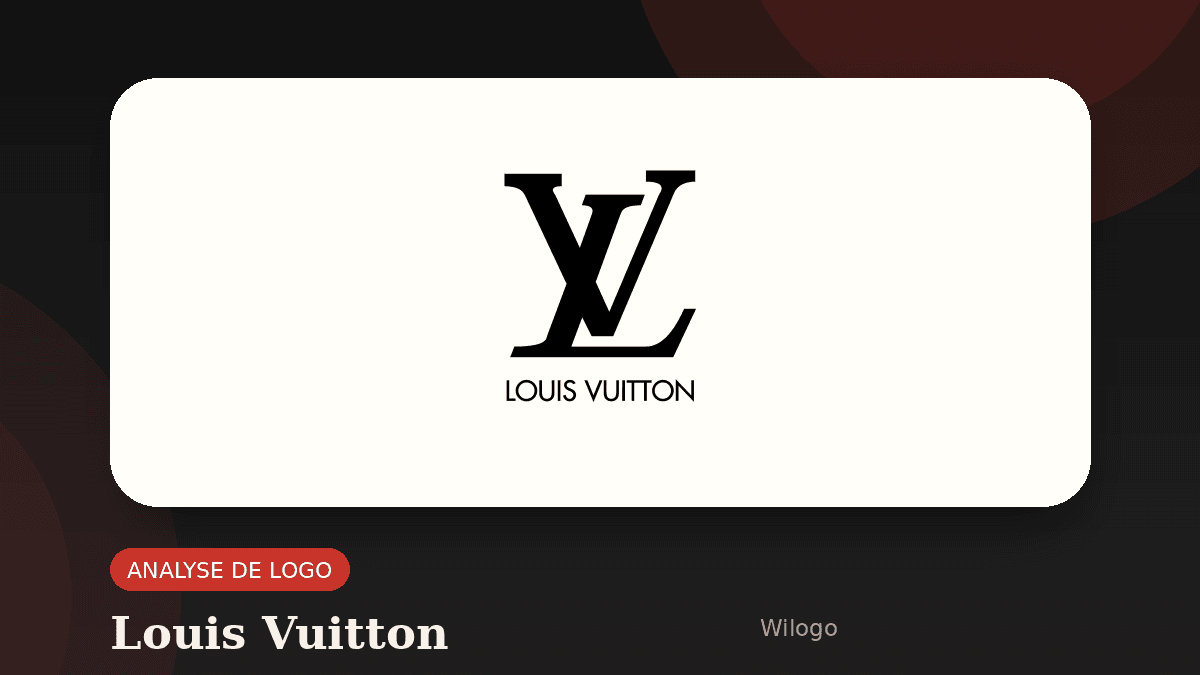
Real Louis Vuitton logo source
To avoid an invented or approximate visual, this article now uses the real logo artwork from the source below.

Source: Wikimedia Commons
The Louis Vuitton logo belongs to a very small category of brand signs: the kind people recognize before they even identify the product. A bag seen from afar, a textured canvas in a shop window, a repeated motif on a handle or travel accessory, and most viewers already know what brand universe they are looking at. In luxury, that level of immediate recognition is not just impressive. It is commercially decisive.
What makes this case especially interesting is that Louis Vuitton never relied on a single isolated logo in the narrow modern sense. The house built a visual system: initials, floral symbols, quatrefoils, repeated pattern logic, material cues, and long-term consistency. That combination is why the LV monogram became far more than a mark of origin. It became a cultural signal of heritage, travel, exclusivity, and status.
The timeline matters here. The house was founded in Paris in 1854, Louis Vuitton introduced his flat-topped trunks in 1858, and Georges Vuitton launched the now-famous Monogram canvas in 1896, in part to make the house's creations easier to distinguish in a market already facing imitation. Those landmarks are broadly documented in accessible sources such as Wikipedia and in multiple design retrospectives covering the brand's visual identity.
In this article, we look at why the Louis Vuitton logo is so powerful, how the monogram spread across global visual culture, why it gets copied so often, and what smaller brands can realistically learn from the case without imitating luxury codes blindly. If you enjoy this kind of analysis, you can also read our piece on the BMW logo, our article about the Chanel logo, and our breakdown of the Toyota logo.
Why the Louis Vuitton monogram still matters in 2026
Many famous logos are memorable simply because they appear everywhere. The Louis Vuitton monogram goes further than that. It acts like a cultural shortcut. It suggests luxury, travel, heritage craftsmanship, desirability, and a certain Parisian aura in a single glance. Even people who never buy from the brand often recognize the pattern instantly. That density of meaning is rare.
What is most striking is that the symbol does not depend on visual spectacle. The mark is not loud, narrative-heavy, or technically complicated. It is a restrained set of initials embedded in a repeated ornamental system. Yet because the house has used it with extraordinary consistency, the audience no longer sees only pattern. It sees brand value, continuity, and prestige.
In 2026, that strength still matters because the monogram performs well under modern conditions. It works on physical products, retail details, editorial photography, social media crops, resale platforms, and mobile screens. It survives changes of scale and context. In branding terms, that adaptability is a major strategic advantage.
Before the monogram: trunks, stripes, and checkerboards
To understand the Louis Vuitton logo, it helps to remember that the house did not begin as a contemporary fashion label. Louis Vuitton started as a trunk maker. His 1858 flat-topped trunk was a practical innovation: it stacked more easily and protected belongings more efficiently during travel. In other words, design and function were linked from the start.
As the company gained visibility in the nineteenth century, visual distinction became more important. Travel culture expanded, the house became better known, and copies started to circulate. Long before the famous LV monogram, the brand was already experimenting with surface identity. Histories of the house often mention striped canvases and then the Damier checkerboard introduced in the late 1880s. The logic was clear: make the product itself recognizable at a glance.
This is an important point for any branding discussion. The monogram did not appear as a random decorative flourish. It was the continuation of a deeper strategy about recognition, protection, and perceived value. The design was solving business problems, not just aesthetic ones.
1896: the birth of a sign built to last
After Louis Vuitton died in 1892, Georges Vuitton continued building the house. In 1896, he introduced the Monogram canvas that would become one of the most recognizable luxury surfaces in the world. Historical accounts generally agree on the central motivation: the design helped distinguish genuine Louis Vuitton products at a time when imitation was already a real issue.
Visually, the system combines the LV initials with floral and geometric ornaments arranged in repetition. Some commentators describe those motifs as reflecting late nineteenth-century interest in decorative influences associated with Japan and the broader East. Whether one emphasizes that reference or not, the essential point is simpler: Georges Vuitton created more than a badge. He created a branded skin.
That distinction matters. A single logo can be memorable, but a repeated pattern occupies more physical and mental space. It covers products, packaging, photographs, shop environments, and memory itself. When such a system is used with discipline, it can become much more powerful than an isolated wordmark.
Why the design works so well
The first reason is clarity. The LV initials are simple and easy to identify. The second reason is repetition. Instead of appearing once in a corner like a conventional logo, the sign spreads across the object's surface, which increases memorability. The third reason is color consistency. The brown-and-gold visual world associated with the monogram supports ideas of material quality, continuity, and long-term value.
There is also a more subtle strength at play. The design balances several registers at once: personal through the initials, decorative through the motifs, industrial through its repeatability, and symbolic through its heritage. That balance is hard to achieve. Many brands end up choosing between austere simplicity and ornamental excess. Louis Vuitton manages to hold both recognition and richness together.
Finally, the monogram works because it has not been forced to reinvent itself every few years. Longevity creates trust. Consistency creates familiarity. In luxury branding especially, restraint is often more powerful than visible change for its own sake.
A logo, or really a full brand system?
When people talk about the Louis Vuitton logo, they often mean only the two letters LV. In practice, the house's strength comes from a broader system: monogram canvas, Damier pattern, materials, product shapes, typography, boutique architecture, and the recurring travel narrative. The sign never operates alone. It is supported by an entire brand environment.
This is where many smaller businesses misunderstand famous logos. They expect a mark to do all the work by itself: positioning, reassurance, storytelling, credibility, and desirability in one instant. Louis Vuitton shows the opposite. A great logo becomes great because it is carried by packaging, product design, photography, retail experience, and repeated behavioral consistency.
So the success of the LV monogram should not be reduced to drawing quality alone. It is also the result of long-term application discipline, legal protection, product excellence, and careful staging. That lesson is far more useful than merely admiring the form.
Why it became one of the most copied monograms in the world
The Louis Vuitton monogram concentrates nearly every trait that makes a visual identity attractive to counterfeit markets. It is desirable, it is highly visible, and it is repeatable across surfaces. Counterfeit products tend to target symbols with strong perceived value that can be reproduced quickly on bags, accessories, or printed materials. The LV system fits that profile almost perfectly.
There is also a cultural factor. The motif no longer belongs only to the original product category. It has become a global social sign. Depending on context, it can signal success, aspiration, conspicuous luxury, collectible fashion, or inherited prestige. The more loaded a symbol becomes, the more it attracts copying, parody, appropriation, and imitation. That is one of the costs of true iconicity.
At the same time, this raises an important branding question: how do you remain desirable when recognition is almost universal, including through fakes? Historically, Louis Vuitton has answered through controlled scarcity in some lines, elevated craftsmanship, ongoing creative direction, collaborations, and aggressive protection of intellectual property. Once again, the logo alone is not enough. The entire brand apparatus has to support it.
What smaller brands can learn from it
The first lesson is not to imitate Louis Vuitton literally. A luxury monogram, ornate motifs, or a brown-and-gold palette will not make a smaller company feel premium by magic. The real lessons are structural.
1. Build an identity as a system. A logo works better when it comes with repeatable rules for color, material cues, layout, supporting patterns, and usage contexts. 2. Aim for memorability, not complication. The LV monogram is powerful because it is easy to recognize and applied consistently over time. 3. Design for real-world use. Branding must work on products, packaging, websites, business cards, and social crops, not only in a presentation file.
4. Protect what makes you identifiable. Even small brands benefit from organized assets, clear variations, and basic usage discipline. 5. Start with a strong brief. Most enduring visual identities do not begin with a random visual idea. They begin with positioning, audience understanding, and a defined brand territory. If you want to structure that process clearly, you can submit a logo brief on Wilogo before exploring directions.
FAQ: key facts about the Louis Vuitton logo
Who created the Louis Vuitton monogram?
The monogram is generally credited to Georges Vuitton, the founder's son, who introduced it in 1896 after Louis Vuitton's death.
Why is the Louis Vuitton logo so famous?
Because it combines simple initials, repeated pattern logic, long-term consistency, and global exposure. It works as a complete visual system, not only as a logo.
Why is it considered one of the most copied monograms in the world?
Because it is instantly recognizable, strongly associated with luxury, and easy to reproduce across repeated surfaces, which makes it a classic counterfeit target.
Has the Louis Vuitton monogram changed a lot over time?
Its core principle has stayed remarkably stable. That continuity is part of what strengthens its perceived value.
Should a small business take inspiration from this kind of logo?
Yes for the method, no for direct imitation. The useful lesson is to build a coherent, memorable identity system that fits your own market.
Should every brand aim for this level of iconicity?
The Louis Vuitton case reminds us that the strongest logos are not always the most complicated ones. They are often the ones supported by the most coherent systems, the most disciplined usage, and the longest time horizon. The LV monogram did not become iconic through one campaign. It became iconic through repetition, protection, and consistency.
For a smaller business, the right goal is not to create "the next Louis Vuitton." It is to create a sign that feels right for its audience, credible on its real supports, and strong enough to last several years without losing recognition. If you want to move in that direction, start by clarifying your positioning and then fill out a creative brief on Wilogo to turn your idea into usable design directions.