The BMW logo: what the roundel really means
The BMW logo is often reduced to a propeller story. The real history is more nuanced: Rapp heritage, Bavarian colors, advertising myth, and remarkably disciplined evolution.
The BMW logo: what the roundel really means
Reading time: about 10 minutes.
Real BMW logo source
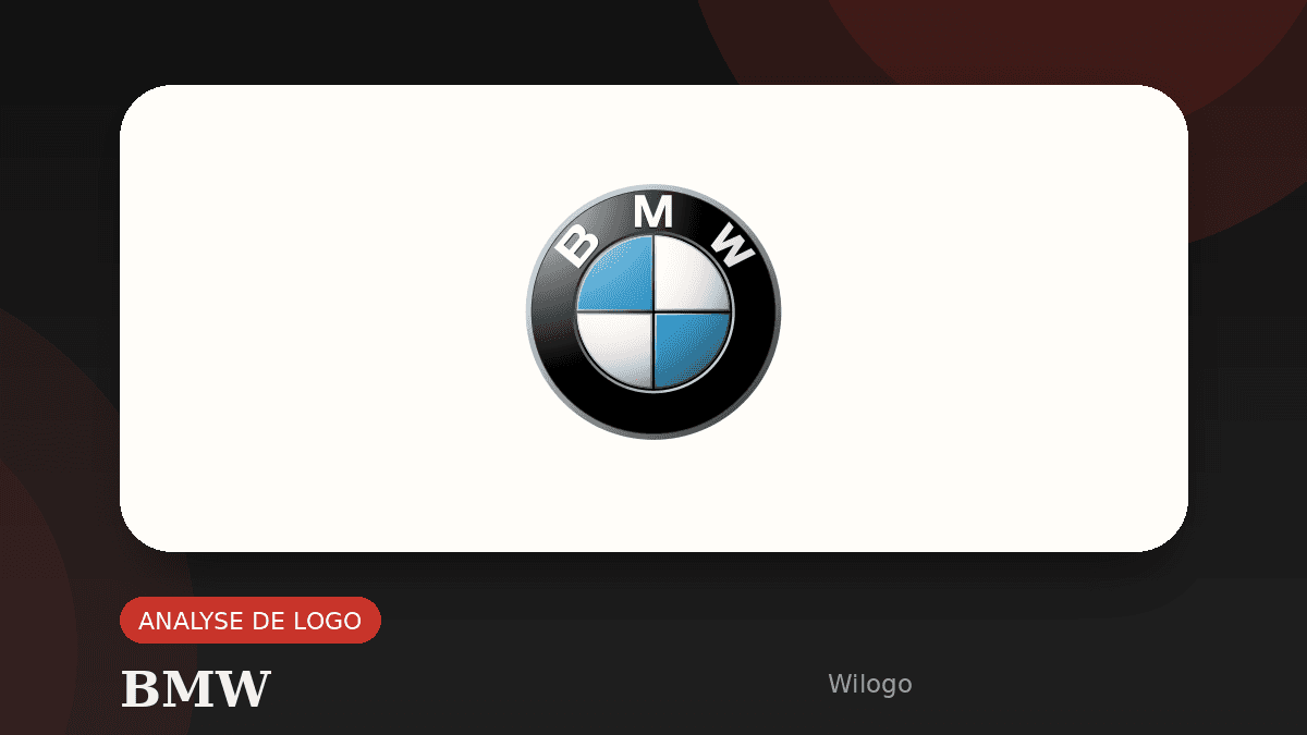
To avoid an invented or approximate visual, this article now uses the real logo artwork from the source below.

Source: Wikimedia Commons
The BMW logo is one of those symbols almost everyone can recognize instantly, even without caring much about cars. A black circle, blue and white quadrants, crisp lettering, and an immediate sense of engineering, status, and control. Yet when people are asked what it actually represents, the same answer keeps coming back: an airplane propeller. It is a memorable explanation, but not the whole story. The real history of the BMW roundel is richer because it combines industrial heritage, Bavarian identity, legal constraints, and a long tradition of careful design refinement.
The most widely repeated historical sources agree on a few core facts. The first BMW emblem appeared in 1917. It kept the circular structure of the earlier Rapp Motorenwerke badge, from which BMW emerged. And the blue-and-white center referred first to Bavaria rather than to aviation blades. The propeller interpretation became dominant later, especially after a 1929 advertisement showed the BMW emblem placed in front of a spinning propeller. In other words, the ad did not create the logo. It created the most popular way of reading the logo.
In this article, we will look at where the roundel comes from, why the propeller myth proved so durable, how the logo evolved across the twentieth and twenty-first centuries, and what modern brands can still learn from it. If you enjoy famous logo stories, you can also read our articles about the Mercedes-Benz logo, the Toyota logo, or the Google logo evolution to compare three very different branding approaches.
Why the BMW logo remains so fascinating
The BMW case is compelling because it combines two qualities that rarely coexist so well. On one side, the sign is extremely simple: a circle, a restrained sans-serif wordmark, two main colors, and a clean internal division. On the other side, it carries a huge symbolic load: precision, German engineering, premium positioning, driving culture, and heritage. Many logos aim for that balance. Very few keep it for more than a few years without becoming either generic or overdesigned.
Part of the logo’s strength comes from how well it travels across contexts. It has to work as a metal badge on a hood, a tiny icon on a steering wheel, a digital asset in a mobile app, a retail sign, an embroidered element, and a corporate communication marker. That means it cannot rely on a single material effect or a single environment. It has to be structurally strong first. BMW understood that early, and the roundel has benefited from that discipline ever since.
The logo is also interesting because it feels obvious once you know it, even though it was not inevitable. People recognize it instantly and often assume its meaning must be straightforward. But that impression is exactly what mature visual identity systems do: they hide the design decisions that made them work. The more natural a great logo feels, the more work is usually buried inside it.
1917: from Rapp Motorenwerke to BMW
To understand the BMW symbol, you have to start with the company’s industrial roots. BMW emerged in the orbit of Bavarian aircraft-engine manufacturing, and its visual identity did not appear out of nowhere. The first BMW logo, introduced in 1917, kept the circular form of the earlier Rapp Motorenwerke emblem. That is not a trivial detail. It shows that BMW did not begin by rejecting its lineage. It began by refining and reframing it.
The outer black ring gave the mark a strong frame, while the company name remained readable and central to the system. This is one reason the identity aged so well. The roundel is not just an abstract symbol detached from the brand name. It is a compact identity architecture where typography and emblem reinforce each other. Even when finishes, materials, and rendering styles changed later, the structural logic stayed intact.
Many historic logos feel improvised in their earliest form. BMW’s does not. From the start, it was distinctive without being complicated and formal without becoming stiff. That matters in a sector where engineering precision and manufacturing reproducibility already shaped the culture of the brand. The mark was not simply decorative. It was a visual base strong enough to support decades of recognition.
Blue and white: Bavaria before the propeller story
The most important point is simple: the blue-and-white center of the BMW logo is first and foremost connected to Bavaria. The quadrants echo Bavarian colors even though they are not presented as a direct state emblem. That distinction matters. It means the logo works as an identity anchor tied to place, origin, and regional industrial culture rather than as a literal machine illustration.
This Bavarian reference gives the mark more depth than the propeller story alone. In branding, origin stories are powerful because they make a company feel rooted. A rooted brand appears more credible, more coherent, and more memorable. BMW is not just saying “we build machines.” Through the logo, it also says “we come from somewhere specific, with a history and a craft tradition behind us.” That is a much stronger strategic signal.
There is another nuance that often gets lost in oversimplified retellings. At the time, direct commercial use of official state heraldry was constrained. BMW therefore did not just paste a Bavarian flag into a circular badge. The result was a transformed and ownable sign: recognizable enough to evoke Bavaria, distinct enough to function as proprietary brand identity. That balance is one reason the mark stayed durable.
Why the propeller myth survived
If the Bavarian reading is historically stronger, why does the propeller explanation still dominate casual conversations? Because it is visually brilliant and narratively efficient. In 1929, BMW used an advertisement showing the logo in front of a spinning airplane propeller. It linked the company’s aviation background to a symbol people already recognized and packaged the whole explanation into one memorable image.
People remember neat stories. Saying “the blue and white refer to Bavaria, filtered through brand adaptation and legal context” requires explanation. Saying “it is a propeller” takes two seconds. The myth survived because it was easier to retell, not because it was more accurate. That is a useful branding lesson by itself: the story audiences keep is often the one with the strongest visual hook, not the one with the best archival evidence.
Interestingly, the ambiguity did not really hurt BMW. If anything, it reinforced the brand’s technical aura for decades. The propeller reading still aligned with speed, engineering, and mechanical performance, so it remained compatible with the brand world. This is a rare case where a partially incorrect public interpretation still benefits the company because it strengthens the right emotional associations.
The major stages of the roundel’s evolution
The BMW logo did not remain frozen. It changed several times, but almost always through refinement rather than disruption. That is precisely what makes it such a strong benchmark. Instead of sacrificing recognition in pursuit of novelty, BMW adjusted contour thickness, blue tones, lettering style, metallic treatments, and later the amount of dimensional rendering. The brand evolved the badge without abandoning the badge.
The foundational step is of course 1917, when the core architecture of the roundel appears. In 1933, the emblem becomes more assertive and decorative, with stronger divisions and more visible contrast. In 1953, the badge is rationalized and softened. In 1963, the identity reaches a particularly stable and powerful balance that proves exceptionally resilient on modern vehicles. This phase sets the tone for decades of consistency.
In 1997, BMW embraces a more three-dimensional treatment, which fits the visual language of the late 1990s and 2000s when many automotive brands wanted badges to look more tactile and premium on screen. Then, in 2020, the communication system adopts a flatter, more open version for digital environments. The key point is that BMW did not throw away its visual equity. It adapted the sign to new media: print, interfaces, social, motion, and signage.
Why it still works in 2026
The BMW roundel still works because it satisfies nearly every test of a strong identity system. It is simple, which makes it memorable. It is distinctive, which helps it stand out among other automotive badges. It is modular, which makes it usable across surfaces and scales. And it is meaningful without depending on a single rigid interpretation.
The circle also matters psychologically. In visual identity, circular forms often suggest coherence, continuity, and control. BMW combines that circular stability with a sharp black frame and clean blue-white contrast. The result feels technical without becoming cold and premium without drifting into ornamental excess. That balance is hard to achieve, especially in categories where brands easily fall into either generic minimalism or old-fashioned prestige cues.
Another reason the mark still feels strong is strategic restraint. BMW did not confuse modernization with constant reinvention. It accepted that a powerful symbol gains value through repetition and disciplined updates. In a time when many companies redesign too quickly in response to interface trends or temporary aesthetics, that consistency looks increasingly intelligent.
Branding lessons worth keeping
The first lesson from the BMW logo is that a great symbol does not need to explain everything by itself. It needs to open a believable story. The roundel does not summarize every product line or every technological shift, but it gives the entire brand a stable anchor point. For smaller companies, the same principle applies: a clear, durable sign is usually more valuable than a logo trying to express ten ideas at once.
The second lesson is continuity. Many failed rebrands happen because a company tries to look more modern by deleting the very elements that created recognition in the first place. BMW shows that you can refresh a mark without erasing its accumulated meaning. The logic is similar to what we discuss in our article on the Google logo evolution: simplify when needed, yes; become interchangeable, no.
The third lesson is about usage. A logo is not successful in the abstract. It is successful when it holds up on a website, a social profile, a video, a business document, packaging, and signage. If you are working on your own visual identity and want to define those constraints clearly before creating anything, the simplest next step is to submit a logo brief on Wilogo. It helps turn style preferences, business context, and practical needs into a better creative direction.
The last lesson may be the most subtle one: perceived meaning matters almost as much as original intention. The public kept the propeller story alive; historical analysis points more strongly toward Bavaria; BMW grew stronger with both narratives in circulation. A robust logo leaves room for interpretation, as long as that interpretation remains compatible with the brand world.
FAQ
Does the BMW logo really represent an airplane propeller?
Not originally. The strongest historical explanation links the blue-and-white center first to Bavarian colors. The propeller reading became popular after a 1929 BMW advertisement used the emblem against a spinning propeller.
Why is the BMW badge called a roundel?
A roundel is simply a circular emblem. In BMW’s case, it refers to the round badge built from an outer ring carrying the brand name and a blue-and-white center.
Has the BMW logo changed a lot over time?
Yes, but through refinement rather than radical breaks. Major updates adjusted lettering, outlines, shading, 3D effects, and later flatter digital communication treatments while preserving the core structure.
What can brands learn from the BMW logo?
That strong logos are simple, distinctive, durable, and designed for multiple uses. BMW shows that long-term consistency often creates more brand value than frequent dramatic redesigns.