Neo-brutalism and logos: the anti-minimalist trend
Bold colors, heavy outlines, raw typography, and deliberate tension: neo-brutalism is becoming one of the clearest answers to branding fatigue caused by overly polished minimalism.

Neo-brutalism and logos: the anti-minimalist trend
Reading time: about 9 minutes.
For years, many brands moved toward the same visual destination: clean sans-serif wordmarks, soft neutrality, highly controlled grids, and polished minimalism. That shift brought clarity, but it also created sameness. In 2026, neo-brutalism is gaining attention because it offers the opposite energy. Instead of disappearing into the background, it pushes structure, contrast, and personality back to the surface.
In logo design, neo-brutalism does not mean “bad” design or random chaos. It means visible structure, bold choices, and a refusal to be overly smooth. Heavy outlines, punchy typography, direct compositions, strong color contrasts, and a little visual tension are all part of the language. Recent design commentary from Nielsen Norman Group, Digital Synopsis, and several independent studios points in the same direction: designers are reacting against over-refined digital aesthetics and looking for branding systems that feel more immediate, distinctive, and human.
That does not mean every brand should jump on the trend. Just like with 3D logos, the real question is not whether a style is fashionable but whether it supports the brand strategy. A neo-brutalist logo can make a company feel bold, independent, cultural, playful, or proudly non-corporate. It can also feel harsh, noisy, or mismatched if the brand needs subtlety and reassurance. Here is how to tell the difference.
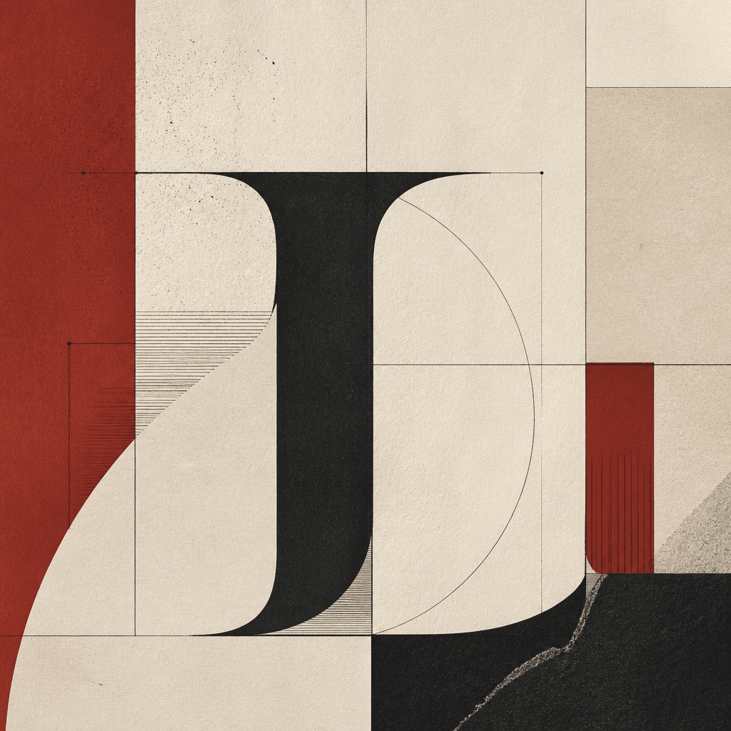
What neo-brutalism means in logo design
Neo-brutalism borrows from brutalist ideas of exposed structure and directness, then reinterprets them through a more contemporary digital lens. In practice, that often means strong contrast, visible borders, blunt geometry, oversized type, and a feeling that the brand is not trying to hide its skeleton. It is graphic design with the framework left in plain sight.
Inside a logo, this can show up as a dense wordmark, a symbol with strong contours, a deliberately raw type choice, or a broader identity system built around energetic contrast. The goal is not visual mess. The goal is memorability. If the design only feels loud, then it has missed the point.
Why the trend is growing in 2026
The first reason is saturation. After years of ultra-clean branding, many companies look interchangeable. When every logo is simplified in the same way, distinctiveness suffers. Neo-brutalism brings back edge and recognition.
The second reason is the return of expressive identity. Current design reporting shows a wider cultural shift away from sterile perfection and toward branding that feels more alive. Audiences respond to personality. Brands want to look less templated. Neo-brutalism answers that need by making visual confidence visible again.
The third reason is platform behavior. On social feeds, landing pages, event posters, and product launches, a more forceful visual language can win attention quickly. That matters in crowded digital environments. Still, force must be balanced with performance across sizes and devices, which is why our guide to the responsive logo remains relevant here too.
Another important factor is cultural timing. As AI-generated visuals become easier to produce, many brands are looking for identity systems that feel less generic and less frictionless. Neo-brutalism helps because it looks intentional. It signals choice, not automation-by-default. That does not make it automatically better than minimalism, but it explains why more teams are testing it right now.
The visual codes of a neo-brutalist logo
Most neo-brutalist logos rely on a small set of recurring signals. The first is typography: bold, compact, assertive, and often treated as the hero. The second is outline and separation: thick borders, clear framing, and obvious structural divisions. The third is color: saturated hues, primary-like contrast, or combinations that feel intentionally direct rather than elegant. The fourth is frontal composition: less atmosphere, less polish, more immediate readability. The fifth is attitude: the brand is clearly choosing presence over quiet refinement.
What matters is not using every sign at once. A logo does not become stronger just because it has a black outline, bright yellow, blue, red, and an awkward icon. Neo-brutalism still needs a strong concept underneath. A trend is not a substitute for meaning.
Where this style works best
This style often works well for creative brands, cultural projects, food concepts, youth-oriented products, community apps, design-led startups, media brands, events, and businesses that want to signal independence or energy. In those cases, a smoother identity can feel too anonymous.
It can also suit some tech brands, especially when they want to avoid the cold sameness of corporate SaaS visuals. But the dosage matters. A serious B2B product does not necessarily need a fully neo-brutalist identity. It may only need selected elements: more contrast, tougher typography, or a stronger graphic rhythm.
On the other hand, if a brand promise depends on calm, luxury understatement, institutional trust, or medical reassurance, this style can easily go too far. The logo might become more expressive than the brand experience itself, which creates friction.
Its limits and common mistakes
The first mistake is confusing impact with aggression. A logo should be memorable, not exhausting. If the typography becomes hard to read or the contrast becomes visually punishing, the brand loses authority instead of gaining it.
The second mistake is forgetting real-world use. A logo must work as an avatar, a favicon, a header, a product label, and a mobile asset. If the system only works at large scale, then it is not a strong identity system. It is just a poster idea.
The third mistake is using the trend without a strategic reason. If the brand stands for care, discretion, trust, or softness, an overly confrontational visual style can send the wrong signal. Good branding always starts with fit, not with novelty.
Finally, boldness should never undermine control. Test the design for small sizes, dark and light backgrounds, and accessibility. Distinctiveness is more valuable when it is also durable, consistent, and easy to protect over time. If you are building a stronger brand system, it is also worth thinking about legal clarity and recognition, which we discuss in our guide on protecting your logo against counterfeiting.
How to use it without hurting readability
The safest approach is to treat neo-brutalism as an influence, not always as a total doctrine. Start by defining the brand tone: should it feel radical, playful, creative, more direct, less corporate? Then choose one or two codes only. Maybe the typography becomes bolder while the symbol stays simple. Maybe the palette becomes stronger while the layout remains controlled. Restraint creates better longevity.
Next, test the logo in realistic situations. Put it on a phone screen, a social thumbnail, a landing page, a sticker, a sign, and a business card. If it survives all of those contexts, the idea has potential. If it collapses outside a hero mockup, it needs simplification.
Also remember that the logo and the wider art direction do not need the same intensity. A brand can keep a relatively stable logo while expressing neo-brutalist energy through campaigns, website sections, motion, posters, or editorial layouts. That hybrid approach is often smarter than forcing the entire identity to be extreme.
Neo-brutalism vs minimalism
Minimalism is not obsolete. It still works when a brand needs neutrality, global clarity, calmness, and strong multi-format consistency. The real issue is not minimalism itself but the way it sometimes led to interchangeable identities.
Neo-brutalism acts as a correction. It brings back visual matter, rhythm, and character. But in practice, many of the strongest contemporary identities mix both worlds: simple structure, bolder accents; clean forms, rougher energy; clarity first, polish second. That balance often creates the most durable result.
A practical validation checklist
- Does the style genuinely match the brand position?
- Is the logo still readable at small sizes?
- Do the colors and contrasts work on multiple backgrounds?
- Does the typography feel distinctive without becoming clumsy?
- Will the system still feel strong when the trend cools down?
- Is there a simplified version for icons and mobile uses?
If you want to test a more expressive identity without blindly copying a trend, the best starting point is a clear brief. You can write yours here: describe your project on Wilogo. That helps determine whether neo-brutalism should define the whole logo or simply influence part of the visual language.
FAQ
Is neo-brutalism just a passing trend?
The visual peak of the trend will eventually soften, but some of its lessons will remain: stronger contrast, more typographic personality, and less fear of expressive branding systems.
Can a small business use a neo-brutalist logo?
Yes, especially if the business is creative, cultural, digital, or community-driven. If the brand depends on reassurance and discretion, the style should be used more selectively.
Does a neo-brutalist logo have to be very colorful?
No. Color helps, but it is not mandatory. A logo can feel neo-brutalist through typography, border weight, layout tension, and direct composition even with a limited palette.
How do you avoid the “seen-it-already” trend effect?
By designing from the brand strategy instead of copying moodboards. Trends are useful as vocabulary. They become weak when they replace thinking.