Chrome and metallic logos: why they are returning in 2026
A practical analysis of chrome and metallic logo trends in 2026: meaning, readability, production, motion, print and durable identity systems.
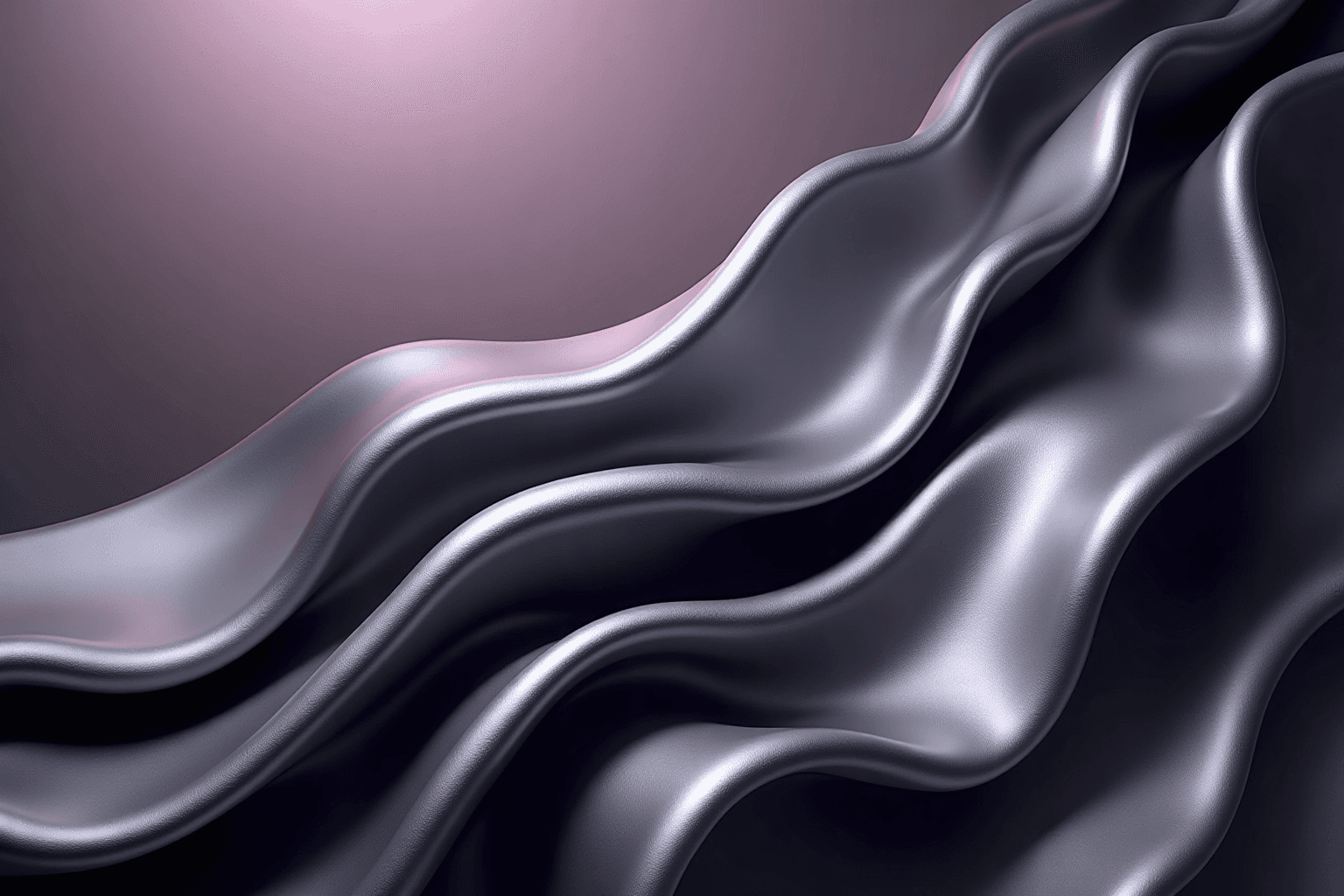
Chrome and metallic logos are back in the foreground in 2026. They appear in cultural identities, music, fashion, gaming, technology products and campaigns that want a more tactile presence. This return does not mean every brand should turn its mark into a shiny badge. It mainly reveals fatigue with perfectly flat, interchangeable identities that have no sense of material.
Today’s digital chrome is not merely the spectacular software effect associated with the early 2000s. It can look liquid, brushed, iridescent, almost white, dark like titanium or reduced to a very quiet reflection. Used well, it gives depth, motion and character. Used badly, it creates an unreadable, dated logo that is impossible to reproduce consistently.
This guide explains why chrome and metallic branding is returning, what separates a real identity system from an effect, where it can be relevant and how to keep it durable. The central rule is simple: the core logo must remain strong without the finish. Metal is an expressive layer, not structural support.
1. Why metallic design is returning now
Minimalism made interfaces and identities clearer, but it also encouraged visual sameness. Many brands now use similar simple geometry, neutral sans serifs and flat colors. A reflective material creates immediate contrast and gives a screen-based image the presence of an object.
The revival also connects with Y2K nostalgia without simply copying the 2000s. Designers reuse liquid reflections, iridescence and inflated volume with better restraint and rendering. Variable identities are more accepted too: one mark can stay flat in documents and become animated or metallic in a campaign.
Accessible 3D and compositing tools make these treatments easier to produce. That convenience also creates sameness. A chrome preset is not an identity. Distinction still comes from drawing, typography, rhythm and a meaningful relationship between material and brand position.
2. The visual language of contemporary chrome
Convincing chrome combines bright highlights, deep values and quick transitions that suggest a reflective surface. It is not limited to gray. Blue, violet, warm or green reflections can connect the material to a brand palette. Light should feel coherent rather than randomly distributed.
Brushed metal communicates precision, tooling and manufacture. Liquid metal feels more futuristic and organic. Dark titanium can suggest performance. Polished gold still signals prestige but can become a cliché very quickly. Each finish carries meaning and should be selected rather than collected.
This extends the questions discussed in our guide to gradient logos. A gradient can suggest volume, but a metallic material also needs a hierarchy of light and a clear surface intention.
3. Metallic logo versus metallic rendering
A metallic logo does not have to be drawn as a physical piece of metal. The strongest systems begin with a clean vector shape that can be identified in one color. That shape then receives a chrome treatment for selected uses such as posters, launches, stage graphics, cover art or social campaigns.
Separate the master from the expressions. The master holds official geometry, proportions, spacing and typography. Expression rules define approved materials, lighting angles, backgrounds and motion. This separation protects recognition while campaigns evolve.
Think of a metallic rendering like product photography. It stages the identity without replacing it. A quote, invoice, monochrome stamp or favicon should immediately switch back to the simple version.
4. Which brands can use the trend well?
Chrome naturally fits categories that speak about transformation, sound, speed, precision or the future: electronic music, festivals, gaming, experimental fashion, technical sport, hardware innovation and selected digital products. It can also create useful tension when a cultural brand combines a classic form with a radical material.
It is less obvious for organizations that must first communicate softness, proximity or administrative simplicity. A clinic, local association or family service may feel cold with a hard metallic finish. Metal is not forbidden there, but it needs restraint: a warm tint, soft reflection or small accent rather than a dramatic badge.
The right question is not whether the style is fashionable. Ask which promise the material strengthens. If the answer is only attention, the direction may age quickly. If metal embodies precision, energy, resistance or transformation, it can become coherent.
5. Readability, contrast and small sizes
Reflections create value changes inside letters and symbols. On a large screen they produce depth. At 24 pixels they can split a letter or erase an edge. Every proposal should be tested as an avatar, favicon, email mark, mobile header and office printout.
Contrast cannot be judged from one presentation image. A bright chrome area can vanish on white while a dark one disappears on black. WCAG guidance is aimed mainly at text and interface components, but its principle remains useful: never make people guess a form because contrast is unstable.
Prepare light, dark and monochrome versions. Define a recommended background for the premium rendering. A neutral backing area and clear space can be more reliable than an effect expected to work everywhere.
6. Building material without losing the drawing
Start in black and white. Check silhouette, counterforms, spacing and name recognition. Reduce the mark to its smallest realistic size. Only then should you add volume or reflections on a presentation copy. This sequence prevents the attraction of rendering from hiding a weak logo.
Build a simple light map with one main source, a secondary reflection and coherent shadows. Too many bright stripes feel plastic. Too little contrast feels like flat gray. On lettering, watch thin strokes and joins so the bevel never changes character structure.
Chrome often shares production methods with 3D logos, but extrusion is optional. A nearly flat treatment with two or three values and slight iridescence can be more memorable and much easier to deploy.
7. Creating a durable version system
A professional kit should contain the vector master, a monochrome version, a flat-color version and a high-resolution metallic expression. It may add a short motion loop, background textures and framing rules. Every file needs a clear purpose so teams do not paste the heavy rendering into every document.
Document prohibitions as well as permissions: no unapproved reflection colors, no automatic drop shadow, no random bevel, no stretching and no metal on an already busy background. Consistency comes from repeatable rules, not from one impressive image.
Plan print production separately. A CMYK simulation does not look like metallic ink, foil or stamped material. If physical shine matters, request proofs and work with the printer. A screen file cannot guarantee the final material result.
8. Motion and digital environments
Chrome becomes especially expressive in motion because reflections reveal the shape. A tiny rotation, a light sweep or slow shift is often enough. Rapid motion and bursts of glare turn the logo into a technical demo rather than a brand sign.
A useful animation should pause on a clean frame. It should respect reduced-motion preferences and should not block interface loading. For social channels, prepare a short loop and a coherent static thumbnail.
Dynamic identity does not remove the need for stability. The more the rendering changes, the more proportions and silhouette must remain constant. People should recognize the mark before they interpret the material.
9. Mistakes that make chrome look dated
The first mistake is using a recognizable preset without adaptation. The second is stacking chrome, extrusion, glow, grain, shadow and futuristic lettering. A trend becomes parody when every code is pushed at once. Choose one strong move and let the rest breathe.
Other failures include ignoring sector tone, delivering only a shiny PNG without vector sources and forgetting licensing for fonts, textures or 3D assets. A sober consultancy should not accidentally resemble nightclub artwork unless disruption is truly its strategy.
Metal can coexist with a raw approach, but it should not become extra noise. Our analysis of neo-brutalism in logo design makes the same point: visual disruption works only when it serves a clear intention.
10. How to brief and evaluate a metallic route
Begin the brief with the brand, audience, promise and touchpoints. Then define what metal should communicate: precision, energy, luxury, transformation, resistance or digital character. Add anti-references showing finishes that feel too gaming, too jewelry-like or too retro.
During evaluation, hide the rendering and inspect the flat form. Then test the metallic expression on several backgrounds and sizes. Ask whether material supports positioning, whether it can be reproduced and whether a simple alternative exists. A beautiful image is not yet a usable system.
Compare every route against the same criteria: recognition, legibility, distinction, coherence, use cases and production cost. This reduces the novelty bias that automatically favors the shiniest proposal.
Checklist before approving a metallic logo
- The mark remains recognizable in black and white.
- The metallic expression has a specific role separate from the master.
- Reflections follow coherent light and do not interrupt reading.
- Light, dark, small-size and print versions are planned.
- The rendering does not depend on unlicensed fonts, textures or assets.
- Material represents a brand promise rather than a trend alone.
- Any animation remains short, restrained and accessible.
- The delivery kit includes vector files and usage rules.
Build an expressive identity, not a temporary effect
Describe your brand, touchpoints and desired perception. Wilogo helps you compare solid logo routes before defining chrome or metallic expressions.
Sources and reference points
Sources reviewed to compare design trend reporting with practical contrast requirements:
- Adobe Express — Graphic design trends
- Canva Design School — Design trends
- W3C — Understanding contrast minimum
FAQ
Are chrome logos still a trend in 2026?
Yes, but the strongest work uses controlled material and variable systems. A generic chrome preset without strategic meaning already feels dated.
Can a metallic logo be printed?
Yes. It can be simulated with process inks or produced with metallic ink, foil and other special finishes. Each method has different cost and appearance.
Does chrome work at small sizes?
Detailed rendering rarely works very small. Provide a simplified, flat or monochrome version for favicons, avatars and office uses.
Do I need to redesign my logo to use this trend?
No. A brand can build a metallic expression around an existing mark if its geometry is strong and the expression has a defined use.
How can chrome avoid looking too futuristic?
Reduce effects, use sober type, choose soft light and combine the finish with neutral or warm colors.