Nokia: why the brand broke its historic logo
An analysis of Nokia’s 2023 rebrand: B2B strategy, fragmented letters, blue-wordmark heritage, design risks and practical lessons.
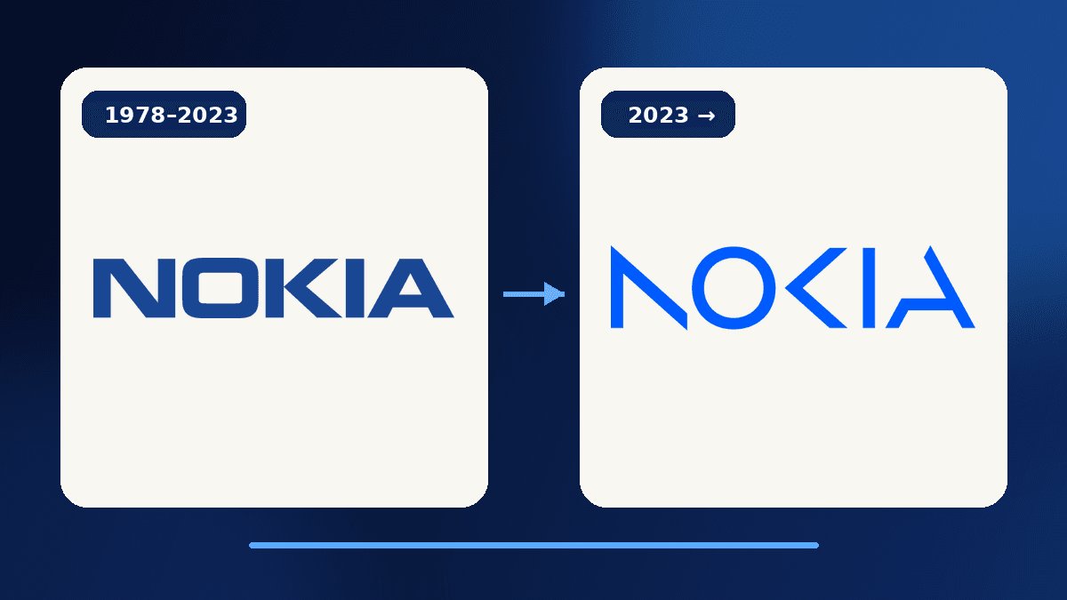
In February 2023, Nokia did what few established brands are willing to do: it replaced a wordmark that had become inseparable from public memory. The solid, blue, heavy letters gave way to five open shapes that the eye must complete. To some viewers, the new logo looked unfinished. For Nokia, that break was the point. The company no longer wanted its identity to be reduced to the mobile-phone maker remembered from the 1990s and 2000s.
The Nokia rebrand is therefore more than a lighter typeface. It supports a corporate shift toward networks, cloud technologies, critical infrastructure and B2B innovation. The task was unusually demanding: retain enough familiarity for instant recognition while weakening an association that had become too narrow. This analysis explains the strategic logic, the design mechanics, the risks and the practical lessons for any organisation considering a major identity change.
Why Nokia chose that launch moment
Nokia unveiled the identity on 26 February 2023, immediately before Mobile World Congress in Barcelona. The setting mattered. The event gathers operators, infrastructure suppliers, enterprises and technology decision-makers: the audience Nokia Corporation wanted to address. In its corporate announcement, Nokia introduced an updated company strategy, a technology strategy and a renewed brand at the same time. The logo was visible evidence of a broader change.
This was not the launch of another consumer handset. Nokia wanted to describe a world in which networks meet cloud computing and connectivity becomes infrastructure for manufacturing, transport, energy and services. That distinction is essential because the Nokia name still means mobile phones to millions of people. The corporate identity had to create distance from that memory without pretending the heritage never existed.
The timing demonstrates an important principle: a rebrand needs an editorial moment. A new shape released without a business story can look like cosmetic expenditure. A shape introduced with a strategy, an audience and operational evidence becomes a positioning shortcut. By choosing a global professional gathering, Nokia encouraged viewers to connect its new mark with B2B ambition rather than with a nostalgia campaign.
Why the old logo was so powerful
The previous wordmark used thick, compact and highly legible capitals. Its blue suggested stability, engineering and trust. During Nokia’s global rise in mobile phones, the mark appeared on devices, startup screens, packaging, shops and advertising. Recognition did not come from drawing alone. It came from an extraordinary volume of repeated encounters.
That success created a paradox. The more famous the logo became, the more strongly it trapped Nokia inside a historical image. For consumers, the letters could recall the 3310, Snake or the “Connecting People” line. For a company selling complex networking technology to operators and industries, that awareness remained valuable, yet it no longer described the present business accurately enough.
The authentic earlier artwork can be inspected on the Nokia wordmark file at Wikimedia Commons. Comparing it with the Nokia Corporation logo used since 2023 makes the break clear: weight, construction, rhythm and the role of empty space have changed. This article’s cover uses those two sourced vector works in a local editorial composition, without a generated imitation.
How the new mark works
The new logo keeps the five-letter name and a blue-led palette, yet removes parts of the strokes. The N becomes separated diagonals and a suggested vertical. The O stays almost complete and provides an anchor. The K retains angular energy. The I is reduced to a vertical segment, while the A remains open. The brain connects these fragments through proximity, order and familiarity with the name.
This construction turns connection into a visual action. One letter in isolation may look abstract; together, the five forms become Nokia. In its Nokia case study, Lippincott describes a more human, collaborative brand built around the purpose “At Nokia, we create technology that helps the world act together.” The empty areas are not decoration alone: they invite the viewer to participate.
The concept works because it keeps traces of the old identity. Geometry remains crisp, the name remains uppercase and the K keeps a recognisable character. Nokia did not replace a known wordmark with an unrelated icon or a generic geometric font. It created an evolution in which recognition comes from the collective structure rather than from fully drawn individual letters.
That decision also introduces a cost. At small sizes, on complex backgrounds or for someone unfamiliar with Nokia, fragmented letters can demand more effort. The mark therefore depends on disciplined rules for contrast, minimum size, clear space, monochrome use and motion. A clever effect in a launch presentation still has to survive product interfaces, trade-show signage, technical documents and video.
Strategy before style
Why break a historic logo? Because the old one communicated a story that had become incomplete too successfully. Nokia Corporation operates in telecommunications infrastructure and networks. Its stated ambition in 2023 was to be a B2B technology innovation leader. A visual identity full of consumer-phone memories could blur that message for talent, partners, investors and industrial customers.
The new drawing signals three ideas. First, the company faces forward rather than relying on nostalgia. Second, value comes from connections among technologies, organisations and industries. Third, Nokia wants to be understood as an innovation partner, not as a maker of one familiar object. The letter fragments become a metaphor for components that gain meaning when they work as a network.
It is still important to distinguish the corporate brand from consumer products carrying the Nokia name under licence. A corporate identity change does not automatically mean every phone, service or partner adopts the same mark at the same time. This brand architecture explains part of the confusion surrounding the launch. Any company planning a rebrand should state which entities are changing, which product identities remain and how long old and new systems will coexist.
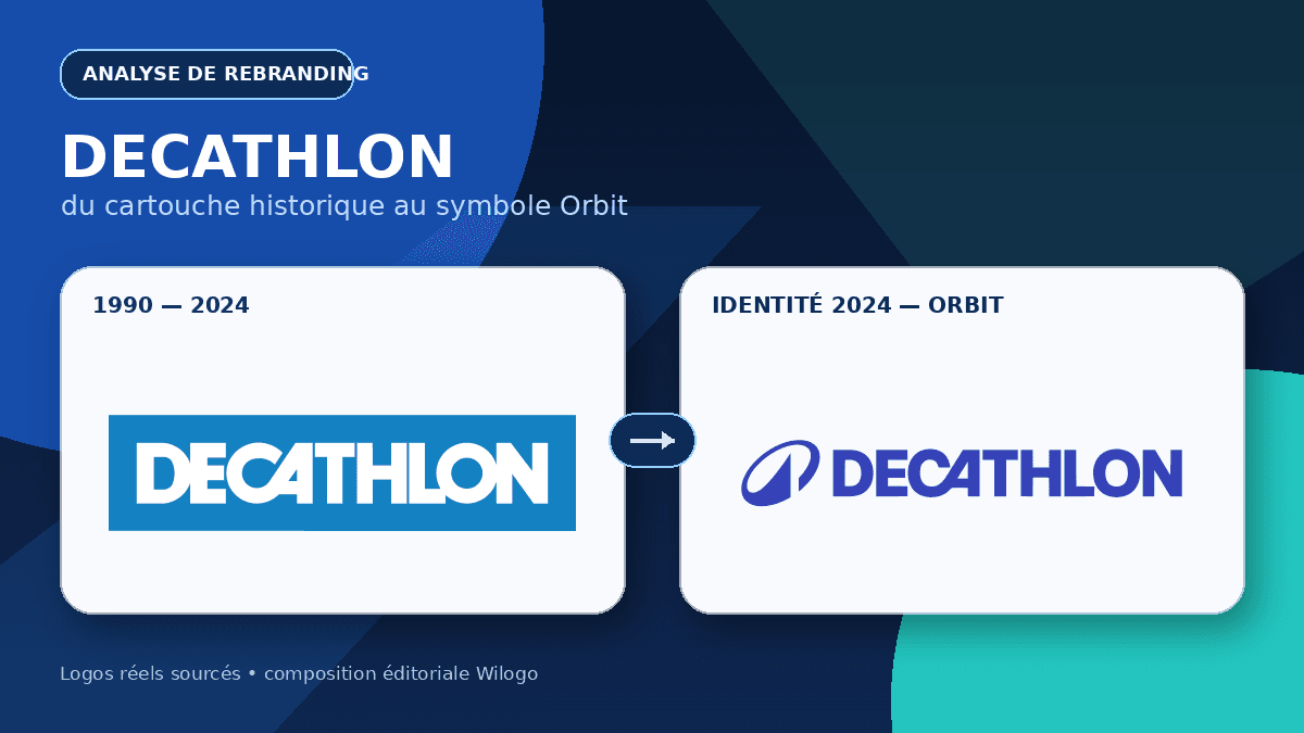
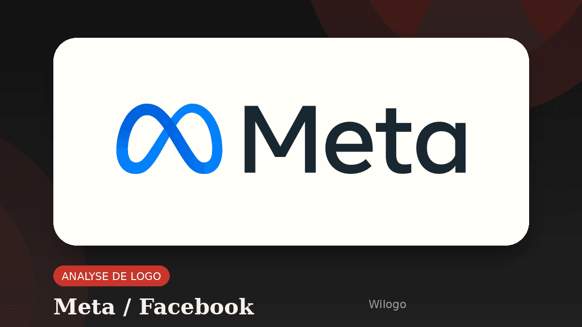
The move can be compared with other cases in our rebranding and news archive. The Decathlon Orbit rebrand makes a global ambition visible, while the move from Facebook to Meta attempts to shift corporate perception beyond one dominant product. In every case, visual form succeeds only when company actions confirm the story.
The identity beyond the logo
A corporate rebrand cannot live inside one SVG file. Nokia’s project develops fragments of the N, O and K as graphic assets, uses a brighter range of blues and gradients, and gives more space to human and technological imagery. The logo becomes the entrance to a visual grammar for presentations, campaigns, events, interfaces and internal communication.
This approach addresses a common weakness in minimalist redesigns. When a company simplifies its wordmark without enriching the wider language, every communication begins to look interchangeable. Nokia partly avoids that problem by reusing shapes that belong specifically to its letters. The cuts can frame photography, create motion or work as patterns. Distinctiveness no longer depends only on a logo in the upper-left corner.
Colour also creates continuity. Historic blue has not disappeared; it has been expanded into a more vivid digital spectrum. That choice protects recognition while giving the identity more range on screens and in immersive experiences. The history of the Samsung logo offers a related lesson: a stable colour can carry powerful memory even when form and business context evolve.
A complete system also helps internal adoption. Sales teams need templates, engineers need product diagrams, event teams need signage and recruiters need a coherent employer brand. If each group improvises, a new identity fragments quickly. By turning pieces of the logo into reusable components, Nokia provided building blocks rather than a single locked asset.
The risks of a sharp break
The first risk is legibility. A mark based on visual completion performs well when it is large, isolated and already familiar. It can become fragile in low resolution or in a busy environment. Real-use testing therefore matters more than reactions to one launch image.
The second risk is nostalgia. The former logo represented personal memories, not merely a corporation. Replacing it can feel like rejecting an emotional history. Nokia kept the name, capitals and blue, which preserves a bridge. Yet the company must accept that some viewers will always prefer the old version. A rebrand does not need to win an aesthetic poll on its first day.
The third risk is a gap between promise and experience. A futuristic wordmark cannot transform an organisation by itself. If offers, recruitment, customer experience and commercial messages remain unchanged, the new identity looks superficial. When the visual system accompanies visible decisions, however, it helps teams describe a shared direction.
A fourth risk concerns fragmented ownership of the name. Corporate branding, licensed consumer products and historical associations can send different signals simultaneously. This is not necessarily a failure, but it demands explanations and governance. Brand architecture is part of design because it determines what customers actually see.
Seven rebranding lessons
- Define the problem before drawing. Nokia’s issue was not weak awareness but an overly narrow association with a past business.
- Protect recognition cues. The name, capitals, blue and angular details maintain a family resemblance.
- Connect form to strategy. Separated shapes express networks and collaboration rather than applying an arbitrary fashion.
- Build a system. Colour, imagery, motion, layouts and patterns must extend the mark.
- Explain brand architecture. Customers should understand which company, service and licensed products use each identity.
- Test real conditions. Small sizes, monochrome applications, accessibility, projection, signage and technical documents expose weaknesses.
- Allow a transition period. Recognition grows through coherent repetition, not through one press release.
For a smaller company, the strongest lesson is not to confuse modernisation with destruction. Elements can be removed while protecting what customers value. The useful question is not “Does our logo look old?” but “Does it prevent people from understanding what our organisation has become?” If it does, the redesign should express a genuine, documented shift.
Plan a redesign that keeps the right heritage
Before choosing a visual direction, write down what the brand must preserve, what it must correct and where the identity will be used. A precise brief leads to relevant proposals instead of a temporary style effect.
Nokia rebrand FAQ
When did Nokia change its logo?
Nokia Corporation unveiled the renewed identity on 26 February 2023 around Mobile World Congress Barcelona, together with updated corporate and technology strategies.
Why are the letters in the new Nokia logo incomplete?
The missing strokes ask the eye to connect separate shapes. That visual action supports the themes of networks, collaboration and connection in Nokia’s B2B position.
Did the corporate logo automatically replace every Nokia phone logo?
Not necessarily. Nokia Corporation’s corporate identity and marks used on licensed consumer products belong to a brand architecture that can follow different rules and timelines.
Who designed the Nokia rebrand?
The identity was developed with Lippincott, a long-standing Nokia partner. The work includes the logo, colour, imagery, graphic devices and brand story.
What should another company learn from it?
Start with a strategic problem, preserve useful recognition cues, test real-world legibility and create a complete visual system rather than an isolated mark.