Decathlon and the Orbit symbol: analysing a global rebrand
An in-depth analysis of Decathlon’s rebrand: global strategy, Orbit symbol, brand architecture, strengths, risks and practical lessons.
The Decathlon rebrand unveiled in March 2024 is not simply a familiar name with a new icon attached. It expresses a broader ambition: turning a sports retailer known for accessibility and numerous product brands into a global sports brand that can speak with one recognisable voice. The new Orbit symbol is the most visible part of that change, but it only makes sense alongside the strategy, brand architecture and visual system built around it.
Two years after launch, the identity has been deployed widely enough to assess beyond polished presentation images. It appears on stores, products, campaigns, digital interfaces and partnerships. This analysis therefore asks three practical questions: what problem Decathlon wanted to solve, what the Orbit shape communicates in real use, and what smaller organisations can learn from a transformation carried out at global scale.
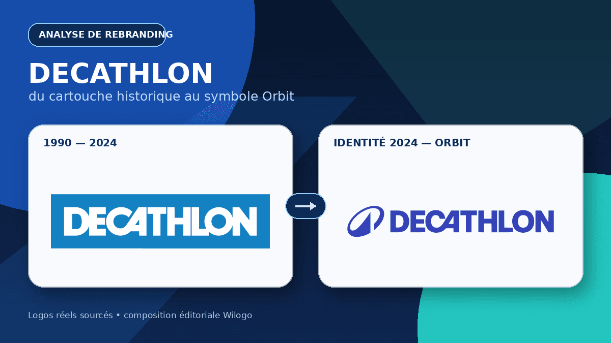
The logos shown in the cover are authentic source files, not generated imitations. The previous block comes from Wikimedia Commons — Decathlon logo used from 1990 to 2024. The new lock-up comes from Wikimedia Commons — Decathlon logo since 2024. Design explanations are cross-checked with the Decathlon case study published by Wolff Olins, the agency that worked on the transformation.
Why Decathlon needed to move beyond a retailer image
Since 1976, Decathlon has built an unusual position by designing, producing and distributing equipment for a very broad range of sports with an accessibility promise. That success also created a perception challenge. Customers knew the stores and prices extremely well, yet they did not always see Decathlon as a cultural, emotional, global sports brand in the same way they saw major specialist players.
Wolff Olins describes the assignment as transforming a retailer brand into a global sports brand able to adapt across many markets, disciplines and ability levels. The strategic starting point is not victory or elite performance, but wonder: enjoyment, connection, adventure, setbacks and progress that keep people moving. The line “Move people through the wonders of sport” gives that idea a clear verbal form.
The choice addresses a real tension. Decathlon must remain credible for a beginner purchasing first equipment without appearing limited to entry-level products. It also has to convince expert users, support increasingly technical products and reach younger audiences who may first encounter the brand on a screen. The rebrand is therefore less about rejecting heritage than giving that heritage a more emotional and international reach.
Scale makes the task harder. Decathlon’s official figures at 31 December 2025 report 1,902 stores, a presence in 82 countries or regions and €16.8 billion in net sales. At that scale, identity is not decorative advertising. It must organise thousands of touchpoints, remain legible across writing systems and survive industrial production constraints.
From the historic blue block to a new system
The previous logo placed the DECATHLON name in white capitals inside a blue rectangle. Its strongest asset was immediate recognition. The open A, distinctive cuts in the wordmark and high white-blue contrast formed a robust signature that worked from a distance on large stores. The block behaved like retail signage in the most literal sense: compact, economical and easy to repeat.
Its limitation came from that same boxed logic. The rectangle tightly framed the brand and could evoke a distributor more readily than a moving sports universe. It also offered little room for a stand-alone mark suitable for an avatar, favicon, product stamp or motion sequence. A global brand increasingly needs a recognisable silhouette before its full name can be read.
The 2024 version protects the most valuable equity: blue, the name and several distinctive wordmark features. It does not chase a dramatic break. Letterforms are refined and integrated into a broader system, while Orbit sits to the left. This continuity reduces the cognitive cost of change. Customers still recognise Decathlon, then gradually learn the additional symbol.
This is more cautious than several recent high-profile transformations. The 2024 Jaguar rebrand created a highly polarised conversation because tone, codes and intended audience appeared to shift together. The move from Twitter to X discarded a globally remembered visual asset. Decathlon follows a third route: adding a new capability without destroying the established cue.
What the Orbit symbol means
Orbit is an oval gesture interrupted by a pointed peak. Wolff Olins describes movement and circularity, an angle inspired by the wordmark and a summit linked to outdoor activity. The name suggests trajectory, energy travelling around a centre and continued motion. Yet the symbol does not literally draw a ball, runner or mountain.
That ambiguity is productive. Depending on context, viewers may see an orbit, a sweeping arm, a track, a stylised letter or a peak. No single interpretation is required to remember the shape. A global symbol should allow several associations without turning into a puzzle. Orbit remains simple enough to embroider, print at small size, mould into equipment or animate on screen.
The pointed interruption is crucial. Without it, the oval would be generic. With it, the mark gains direction and visual tension. The angle also echoes cuts in the DECATHLON lettering, preventing the impression that an unrelated icon was attached after the wordmark had been completed. Symbol and name speak the same visual language even when they appear separately.
The ultimate test is recognition without the name. At launch, very few people could attribute Orbit to Decathlon without context, so pairing it with the wordmark was sensible. Repeated appearances on products and campaigns can gradually reduce that dependence. An icon does not become famous on the day it is drawn; it becomes famous through consistent exposure and the quality of experiences attached to it.
A simplified brand architecture
The project goes far beyond a corporate logo. The agency says a portfolio of 85 brands was streamlined under one unified Decathlon brand. That statement does not mean every product name vanished overnight. It describes a clearer hierarchy: Decathlon becomes the main sender, while specialist and expert brands serve defined roles instead of fragmenting recognition.
This tackles a classic “house of brands” problem. A customer can value a bike, tent or shoe without realising that each comes from the same group. Every sub-brand then has to fund its own awareness. A visible masterbrand pools trust, encourages customers to move between sports and gives greater weight to services such as advice, repair, resale and product support.
Simplification still involves a trade-off. Some established labels have their own communities and technical credibility. Absorbing them too abruptly could remove useful language for enthusiasts. The system must make Decathlon obvious while giving expert offers enough personality. It will work when unification improves navigation without flattening meaningful differences between sporting practices.
The shift offers an interesting comparison with the move from Facebook to Meta, which also created a corporate level above familiar products. The situations are different, but the lesson is similar: changing a name or sign is not enough. Relationships between parent brand, products, services and audiences must be made understandable.
Colour, typography, motion and imagery
Blue remains Decathlon’s foundation, refreshed and supported by a more flexible palette. Retaining it protects memory built through stores and products. Blue communicates accessibility, reliability and energy without forcing the brand into aggressive elite-competition codes. Secondary colours can then distinguish topics, practices or information levels.
The project introduces Decathlon Sans, a typeface designed by Grilli Type. Wolff Olins describes a clean grotesque with alternate characters that bring movement and disruption. This matters because a global identity appears more often as text than as a logo. Prices, product pages, signs, apps, campaigns and service information all need one coherent typographic voice.
Motion is part of the system rather than an optional effect. Orbit can draw a trajectory, frame an image or create a transition instead of sitting passively in a corner. Photography focuses on participation, joy, authentic effort and different ways of playing. That imagery gives substance to the “wonders of sport” promise and stops the identity becoming only a catalogue of products on white backgrounds.
Consistency does not require sameness. A system for many sports must move from the quiet rhythm of hiking to the intensity of a match, from technical advice to emotional storytelling. The rebrand’s real value therefore lies in rules for composition, tone and behaviour, not just in the Orbit vector file.
Why rollout matters as much as the logo
A worldwide organisation cannot replace every store sign, package and interface overnight. Gradual rollout is realistic and avoids unnecessary waste, but it creates a period when both identities coexist. During that phase, guidelines must explain when an existing support can remain, when the new lock-up should appear and how to avoid poorly proportioned hybrid versions.
Product is the decisive medium. If Orbit appears only in corporate campaigns, it remains an advertising device. If it is applied consistently to equipment, apparel, interfaces, services and store experiences, it becomes a mark of origin. The brand promise must then be confirmed by availability, quality, advice and repairability; no symbol can compensate for a disappointing experience over time.
Digital use accelerates learning because the icon repeats across apps, social channels, websites and video. It also imposes strict discipline: legibility at tiny sizes, contrast, clear space and monochrome versions. Orbit has a suitable silhouette, but its pointed opening and internal space must remain clean in the smallest applications.
Strengths of the rebrand
The first strength is continuity. Decathlon keeps its name, blue colour and wordmark personality. The project adds a symbol rather than asking audiences to forget decades of visual memory. This helps internal and external adoption while giving the brand a more flexible asset for products and digital environments.
The second strength is alignment between strategy and form. Movement is not confined to manifesto copy; it appears in Orbit’s trajectory, alternate letterforms, photography and animation. The third strength is architectural ambition. By making Decathlon more visible as the masterbrand, the organisation can clarify its offer and accumulate trust across disciplines.
Finally, the project treats inclusive sport as a positive position rather than a compromise. Emotion is not reserved for champions. Play, trying, progress, connection and enjoyment receive value of their own. That is a meaningful distinction in a category where leading brands often dominate the imagery of exceptional performance.
Risks and limitations
The first risk is the familiarity of abstract symbols. Orbits, loops and arrows can belong to many industries. Distinctiveness will come less from a secret meaning than from proprietary use: stable proportions, recognisable motion, consistent colour and repeated exposure. If applications drift, Orbit could become one more dynamic-looking device among many.
The second risk concerns the promise. “Wonders of sport” raises expectations beyond price and availability. Stores, products, digital services and environmental commitments need to embody the idea. A gap between ambitious emotional language and a purely transactional customer experience would be easy to notice.
The third risk is organisational. Simplified architecture requires difficult choices about sub-brands, ranges and local exceptions. Design can show the direction, but governance has to maintain it for years. Global rebrands rarely fail because of a logo alone; they weaken when teams bypass the system or each market recreates its own rules.
Lessons for a smaller business planning a rebrand
The first lesson is to define the business and perception problem before drawing. Decathlon was not simply asking for a “more modern” logo. It wanted to be understood as a global sports brand, unify its portfolio and increase cultural impact. A smaller company should be equally precise about what customers need to recognise, understand and feel differently.
The second lesson is to protect recognised assets. A colour, letter shape, name or speaking style may be worth more than dramatic novelty. An audit should separate elements that merely look old to an internal team from cues customers actually use for recognition. Modernising while retaining memory is often more effective than a complete reset.
The third lesson is to design and test a complete system. A logo has to work small, in monochrome, on invoices, store fronts, email signatures, products and video. Typography, colour, photography, voice and offer hierarchy must also be specified. Rollout costs belong in the original brief, because an excellent identity applied inconsistently produces a weak result.
Plan a coherent rebrand from brief to real use
Before selecting a shape, clarify what your audience must recognise, understand and feel. A precise brief helps preserve useful equity while creating a more flexible system.
Decathlon rebrand FAQ
When did Decathlon launch its new logo?
The new identity and Orbit symbol were unveiled in March 2024. Rollout continues progressively across products, stores, campaigns and interfaces.
What does the Orbit symbol represent?
According to Wolff Olins, Orbit conveys movement and circularity. Its angle echoes the wordmark, while its pointed peak connects to outdoor sporting activity.
Did Decathlon completely abandon its old identity?
The historic block is giving way to the new lock-up, but the name, blue colour and distinctive wordmark characteristics remain. This is a recognisable evolution rather than a complete break.
Why add a symbol to the Decathlon name?
A stand-alone symbol works on products, avatars, apps, small surfaces and in motion. It also gives the masterbrand a clearer way to sign a very broad portfolio.
Is the Decathlon rebrand successful?
The strategy and visual system are coherent, and continuity limits recognition loss. Long-term success still depends on rollout quality, sub-brand governance and the customer experience delivered under the new promise.