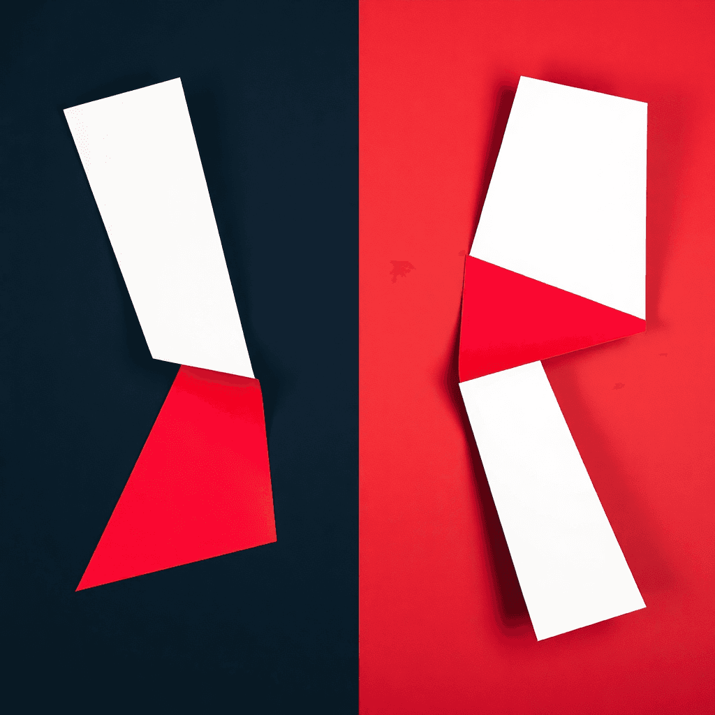
Rebranding 2026: why logos are becoming more discreet, more adaptive and more human
In 2026, rebranding will become more sober: adaptive logos, flexible systems, AI under control and the return of a more human identity.

Rebranding 2026: why logos are becoming more discreet, more adaptive and more human
This article was prepared with the help of an AI assistant, then proofread and edited for publication. The objective is simple: to sort out fashion effects and what really matters for a brand identity.
Why the 2026 rebranding looks less like a revolution than like an adjustment
We have long associated rebranding with splashes of brilliance: new logo, new palette, new tone, sometimes even new name. In 2026, the logic changes. Brands no longer necessarily seek to break everything and start from scratch. Above all, they want to become more readable, more flexible and more credible in an environment where the logo appears everywhere: mobile app, favicon, social networks, videos, AI assistants, print, signage, packaging.
The real subject is therefore no longer “should we do a spectacular rebranding?” ", but rather: how to make an identity more robust without emptying it of its personality?
This is exactly what several underlying trends published at the start of 2026 show. The keyword that comes up everywhere is adaptability. Brands that are making good progress are no longer looking for a single, fixed star logo. They build systems capable of living in several formats, several contexts and several reading levels.
And there is another force in the background: artificial intelligence. Not as a gadget, but as a production accelerator. This pushes brands to set clearer rules, because producing faster without a framework is the best way to obtain a vague, incoherent and quickly tiring identity.
What the 2026 trends say
The signals are quite clear. In its overview of 2026 branding trends, The Branding Journal explains that 2026 is not starting from scratch: the trends of 2025 continue, but amplified by AI, and more precisely by “agentic AI ". Their reading is organized around three movements:
- Agentic AI, which changes the way we produce and decide
- Personal branding, which moves from performance to ownership and direct relationships
- Visual identity, which evolves towards adaptive systems and sensations more than towards a simple static visual
For its part, Creative Bloq sums up the spirit of the times very well: brands are less likely to redo the entire logo than to tweaker, adjust it, modernize the layouts, refresh secondary palettes, rework the composition and variations.
Finally, the Venngage 2026 report gives a figure that sums up the situation perfectly: 70% of marketers say they have integrated AI in one form or another, but only 8% describe it as systemic. And above all, 43% cite keeping AI output consistent with the brand as the main problem.
Concrete translation: we know how to produce faster. The challenge now is to remain recognizable.
Why logos are becoming more discreet
The flashy logo has a simple problem: it gets old quickly. The more a sign tries to do too much, the more fragile it becomes as soon as it has to live in small format, in black and white, in motion or in a dark interface.
In 2026, brands live in a world of fragmented use. Their logo must be:
- readable in 24 pixels
- understandable in a round avatar
- available in light and dark version
- animate in short video
- consistent with a charter shared by the entire team
As a result, many rebrands are moving away from the spectacular object logo towards something more humble, but also more solid. We simplify superfluous details, we strengthen the structure, we work on the geometry, we expand the typographic family, we prepare variants.
This movement does not mean “banal”. It means functional. And a functional logo is not a bland logo. It’s a logo that knows how to shut up at the right time to last better.
From fixed logos to identity systems
The real paradigm shift is here. We no longer just design a logo. We design an identity system.
This system may include:
- a main logo
- a compact version for small screens
- a monogram or an icon
- main and secondary pallets
- typography rules
- recurring patterns, shapes or frames
- principles of motion or animation
Why is this important? Because a brand is no longer expressed only on a facade or a business card. It exists in a continuous flow of touchpoints. A good system allows you to keep the same brand feel, even when the medium changes completely.
This is also where adaptive logos become important. The logo is no longer a fixed block; it becomes a family of versions. Depending on the context, you can display the full name, a short version, a single symbol, or a more expressive variant for campaigns. This is what design 2026 values: the stability of the base, the flexibility of the form.
The trap, obviously, is to multiply the variants too much. An adaptive identity must remain framed. If each medium tells a different story, we no longer have a system: we have a chic bazaar.
The return effect of truth: authenticity, material and personality
There is another very clear movement in 2026: the reaction to the visual standardization produced by certain AI tools. Interfaces improve, renderings smooth out, compositions become clean. Too clean, sometimes.
Result: brands seek to add substance, relief, character. We see more textures, grains, more embodied typographies, details that give the impression that a human has really made decisions, and not just validated a standard rendering.
This return to reality is not a return to DIY. It's a way of reminding us that a brand remains a matter of taste, choice and positioning. AI can accelerate execution, but it doesn't decide a brand's personality on its own.
The Venngage report is interesting on this point: when asked what's wrong with AI, teams first talk about brand consistency, then timeliness, then quality. In other words, the debate is not “is AI useful?” ", but "how can we prevent it from smoothing out what makes us distinct? »
This is an essential question for any logo redesign. Because a successful identity doesn't just need to be pretty. It must be recognizable, defensible and consistent over time.
Mistakes to avoid when rebranding
Failed rebranding almost always has the same symptoms.
1. Oversimplify
Removing noise, yes. Remove any singularity, no. Many brands fall into lazy minimalism: a generic shape, a neutral typeface, a consensual color, and ultimately a logo that you forget in three seconds. Minimalism is not an excuse for the absence of ideas.
2. Change without strategy
A logo cannot be redone because you have to “make it modern”. It is being redone because there is a real problem: positioning, readability, evolution of range, merger, internationalization, transition to digital, need for a more flexible system. Without a clear objective, rebranding becomes a cosmetic expense.
3. Breaking recognition too quickly
A successful rebranding keeps anchor points: a color, a structure, a letter, a shape, a rhythm. If everything changes, customers have to relearn the brand from scratch. And that’s costly in terms of attention.
4. Neglecting real uses
The logo must work in the most boring cases, not just in the launch presentation. That means: favicon, social avatar, light background, dark background, low-end printing, embroidery, video, very small screen. If it breaks there, it will break everywhere.
5. Confusing rebranding and fashion
A trend is not a strategy. The logos of 2026 are more adaptive, yes. But if everyone copies the same slick style, even the trend ends up smelling like photocopying.
The simple method to prepare for a rebranding in 2026
If you need to evolve an identity, this is a clean approach.
- Starts with usage: where does the logo really live? mobile, site, packaging, signage, networks?
- List what must stay: a color, a shape, an idea, a tone, an initial?
- Define what needs to change: readability, flexibility, modernity, consistency, accessibility?
- Design a family of versions: full logo, compact, icon, monochrome, inverted
- Test micro-reading: if you see it very small, is it still standing?
- Documents the rules: colors, margins, minimum sizes, prohibited uses
This method seems simple because it is simple. And precisely, this is often what is missing. Many rebrands fail because we move too quickly to the final result without articulating the principles. A good graphics system is first and foremost a discipline.
If you want to start from a healthy base, you can also start at the beginning: protect your brand at the INPI, clarify your positioning, then build your visual identity with clear logic. And if your issue is the readability of the sign itself, also reread our article on logo typography.
What to remember
- In 2026, rebranding becomes more adaptive than spectacular.
- Logos benefit from being thought of as systems, not as a single design.
- AI is speeding up production, but brand consistency remains the real issue.
- Good rebranding keeps recognizable landmarks while improving readability and flexibility.
- Personality matters as much as graphic cleanliness.
To put it bluntly: in 2026, a strong brand is not the one that makes the most noise. It is the one that remains clear, coherent and identifiable, even when everything is moving around it.
And if you want to create or redo an identity without falling into too many generic logos, Wilogo can help you set a clean brief and explore serious avenues, without pretending that AI replaces human judgment.
FAQ
Do we necessarily have to redo our logo in 2026?
No. Many brands do not need a new logo, but a better identity system, more readable typography or variants better designed for digital.
What is the big logo trend of 2026?
The big trend is adaptability: logos that are more flexible, easier to use, and better integrated into complete visual systems.
Will AI standardize all logos?
It can do this if used without a frame. But used well, it especially speeds up variants and tests. The brand personality must remain human-driven.
Is a minimalist logo necessarily better?
No. A minimalist logo is only good if it remains distinctive, readable and consistent with the brand. Minimalism without ideas quickly becomes interchangeable.
How do I know if my rebranding is successful?
If the brand gains in readability, consistency and flexibility without losing what makes it recognizable, you are on the right track.