Tactile visual identities: grain, material and controlled imperfection
How grain, paper, print and controlled imperfection can give a visual identity depth without sacrificing clarity or production quality.
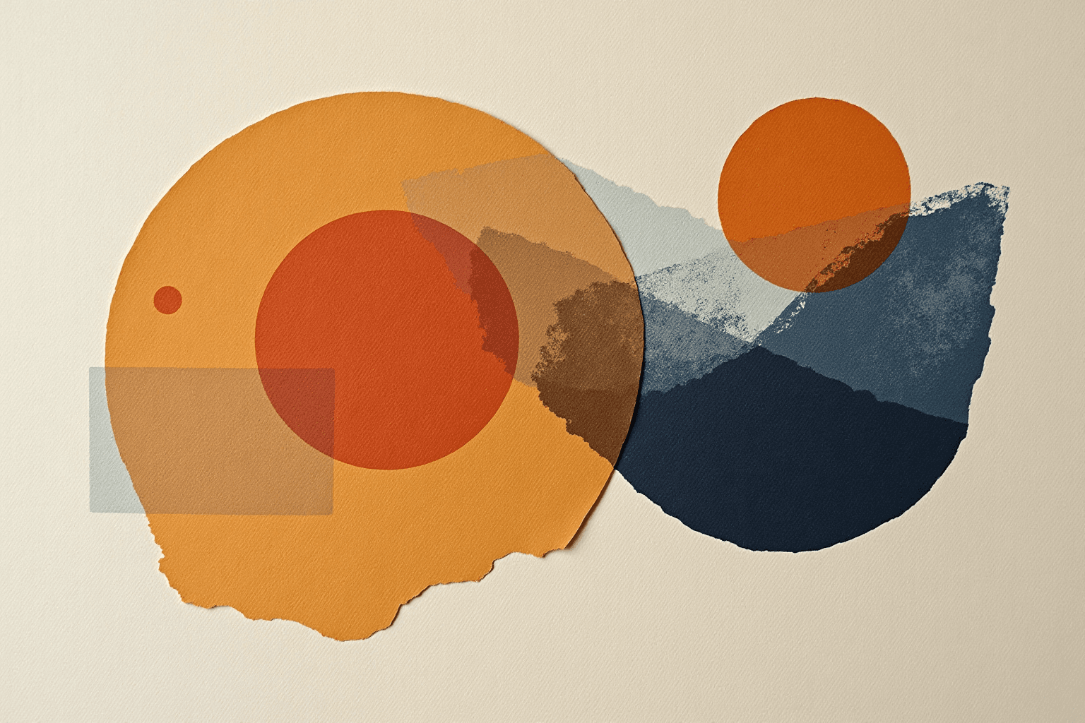
After a decade dominated by spotless flat colors, frictionless grids and polished interfaces, visual identities are regaining depth. Photographic grain, fibrous paper, uneven ink, embossing, visible halftones and gently imperfect edges are reappearing across brand systems. This does not mean professional design is abandoning precision. It reflects a desire to make images feel more embodied, memorable and less interchangeable.
A tactile identity is not created by dropping a grain filter onto a logo. Material qualities must support a story, remain repeatable and preserve legibility. Used well, they create an almost physical sensation on screen and genuinely enrich printed objects. Used carelessly, they add noise, date quickly or make production difficult. This guide explains how to separate a useful direction from a decorative effect.
Why tactile visual identities are returning
The return of materiality first answers a sense of saturation. Digital tools make technically perfect compositions easy, while templates can push unrelated brands toward the same visual language. Against that sameness, an ink trace, paper fiber or cut shape introduces perceptible specificity. The eye understands that a gesture, a surface and an intention exist behind the image.
This direction belongs to a wider appetite for human, expressive and less clinical creative work. A 2026 overview by Creative Boom, based on the Stills trends report, highlights bold, tactile and human-centered imagery. It is not a recipe for every brand, but it confirms an important expectation: audiences increasingly want to recognize sensitivity, not only flawless execution.
Materiality also slows the eye down. A uniform color is read immediately; a nuanced surface invites closer attention. That small friction can be valuable in an environment crowded with content. It gives depth to packaging, posters and editorial pages. Yet it must never delay access to the brand name, the message or the primary action.
Grain, halftone, fiber and relief: choose the right language
The word “texture” covers very different families. Grain may recall analog photography, sprayed ink or porous paper. Halftones refer to printing, screen printing and newspapers. Fibers steer an identity toward nature, craft or heritage. Embossing and debossing create real relief. Irregular edges can suggest collage, cutting or a manual gesture.
These signals do not mean the same thing. Rough paper may suit a local food brand but feel theatrical for a service promising clinical accuracy. A vivid halftone can energize a cultural festival, while a financial firm may prefer restrained relief and tightly controlled material cues. Before choosing an effect, name the strategic quality it should make visible: warm, experimental, responsible, precious, energetic or approachable.
Avoid stacking effects. Grain, shadow, folds, halftone, gradient and rough outlines in one composition compete for attention. Choose one primary material and, if needed, one secondary accent. Clear hierarchy lets the logo and typography remain stable anchors. For a related example of effect-based systems, read our analysis of gradient logos.
Connect materiality to brand positioning
A successful texture starts with positioning, not an effects library. Ask what the brand makes, how it works, what pace it follows and what relationship it wants to create. A bakery might begin with flour, wrapping paper or kneading gestures. A music studio could explore breath, vibration and print screens. A technology company might use an imperfect grid to humanize rigor without pretending to be handmade.
Materiality can reveal a productive tension. A luxury brand does not have to rely only on smooth paper and gold foil: a refined natural fiber can express rarity differently. An institution can pair stable typography with slightly uneven color fields to feel closer to people. The contrast matters when it is intentional, relevant and easy to explain.
Write a principle such as: “our identity combines a clean foundation with organic material to express precise but approachable expertise.” This sentence becomes a decision filter. If an effect supports neither precision nor approachability, remove it. That discipline prevents empty styling and makes discussions among the brand team, designer, printer and developer far easier.
Should the logo itself become textured?
Not necessarily. In many effective systems, the logo stays simple while texture lives around it: backgrounds, frames, illustrations, photography, patterns and physical surfaces. This separation protects recognition. The primary mark works in one color, at small sizes and in constrained settings, while the wider visual world carries the tactile sensation.
If texture is built into the mark, create at least one simplified version. An uneven contour may be distinctive on a poster but collapse in a favicon, embroidery or a tiny print mark. Define an expressive master, a clean compact version and a monochrome version. Coherence comes from shared proportions and construction, not from forcing every irregularity into every size.
The renewed interest in imperfection shares some energy with neo-brutalism in logo design, especially its rejection of excessive neutrality. But a tactile identity can be quiet, elegant and subtle. It does not require aggressive colors, thick frames or intentionally abrupt compositions. Materiality is a language rather than one fixed style.
Create a material sensation on digital touchpoints
On screen, texture is a visual illusion. For credibility, begin with real material when possible: scanned paper, ink impressions, fabric photography or rubbings. Clean the source without erasing every variation. Uniformly generated noise often feels synthetic because real surfaces include quiet areas, accidents and changes of scale.
Optimize assets carefully. A full-screen high-resolution texture can slow the page without improving the mobile experience. Use modern formats, appropriate dimensions and repeatable patterns where useful. Test compression because fine texture can create artifacts or moiré. On smaller screens, reduce intensity instead of preserving every microscopic detail.
Materiality must never weaken functional contrast. Body text needs a sufficiently calm background. The W3C’s WCAG explanation of minimum contrast includes ratios of 4.5:1 for normal text and 3:1 for large text in the covered cases. Measure the least favorable areas, rather than comparing text with an average background color that hides local variations.
Turn visual effects into a credible printed experience
Print can go beyond visual simulation. Paper choice, spot varnish, embossing, debossing, foil, screen printing and die cutting create real touch. Every process has limits involving line weight, registration, quantity and cost. Talk to the printer early and request a prototype. A screen mockup predicts neither ink absorption nor the shadow made by physical relief.
The substrate participates in color. The same ink changes on coated white stock, brown kraft or recycled fiber. Small letters may fill in on an absorbent surface; very fine embossing may disappear. Prepare files that clearly separate technical layers, and retain a version without specialty finishing for routine production and low-volume applications.
Environmental choices need evidence rather than green-looking decoration. A recycled-paper texture proves nothing on its own. If forest traceability matters in the specification, the explanation of FSC labels clarifies what different marks certify. Our guide to logo design for packaging also covers color, size and production constraints.
Controlled imperfections, not accidental mistakes
“Imperfect” does not mean careless. A strong irregularity is selected, tested and repeatable. Define its range: how much grain, how many variants, which areas may distort and which clear spaces must remain untouched? Without rules, every application reinvents the style and the identity fragments.
Create a small approved library: perhaps three core textures, two intensities, several cut shapes and a few examples of combinations. Document forbidden uses, such as texturing the body of the logo, placing fine type on strong grain or mixing unrelated paper families. Constraints make the system easier to use because teams do not reopen every visual decision.
Test ordinary touchpoints, not only the hero image. A spectacular cover must coexist with invoices, email, presentations, social avatars and office printing. If the brand vanishes whenever texture is removed, the system lacks structure. Typography, palette, composition and the mark should remain recognizable on their own.
A seven-step design method
- Clarify intent: name the human or material quality the identity should express.
- Collect reality: gather papers, inks, fabrics or surfaces that genuinely fit the brand.
- Build a clean base: validate logo, typography and grid before adding effects.
- Test one material: compare several intensities on screen and in print.
- Plan versions: expressive, simplified, monochrome and small-size.
- Document rules: define approved textures, contrast and production constraints.
- Prototype: check real touchpoints before full rollout.
This sequence prevents a trend from masquerading as strategy. It also ensures the material layer can be reduced without breaking recognition as contexts evolve. A strong tactile system is not trapped by its signature effect: sensation remains an expressive layer supported by solid fundamentals.
Give your future identity the right material character
You may already know the tone, surface or feeling you want without having a finished visual direction. Turn those impressions into clear constraints and explore coherent routes.
FAQ
Does texture automatically make a logo original?
No. A generic texture can make it more predictable. Originality comes from the connection between material, positioning, composition and real uses.
Can grain be used in a digital logo?
Yes, but provide a clean version for small sizes. Grain often works better in the surrounding identity system than inside the primary mark.
How do you preserve legibility on a textured background?
Keep a calm zone behind text, reduce material intensity and measure contrast in the least favorable parts of the surface.
Should a brand specify certified paper?
It depends on its goals and product. If environmental claims matter, use verifiable criteria and discuss available certifications with the printer.
Will the tactile trend last?
Specific effects will change, but the desire for humanity, differentiation and material presence extends beyond one season. Strategy-led identities will age better than a fashionable filter.