Lacoste logo history: René’s crocodile
From René Lacoste’s nickname to the iconic polo: the story, design logic and branding lessons behind the famous crocodile.
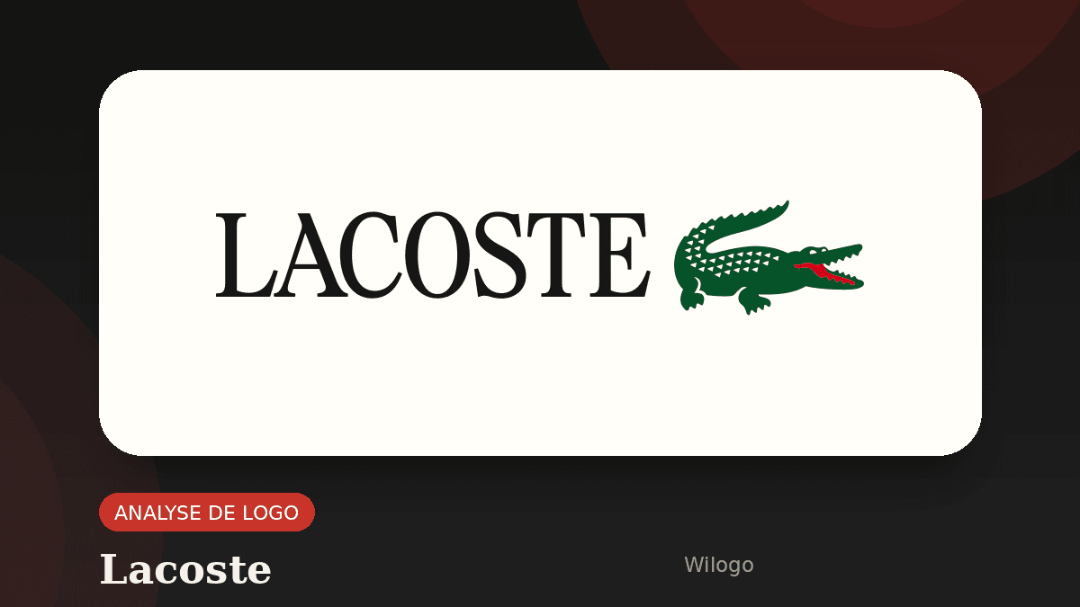
The Lacoste logo belongs to the rare group of symbols that can be recognized without reading a brand name. A small green crocodile on a white polo instantly suggests tennis, French sportswear, and relaxed elegance. That recognition did not appear by accident. It grew from a personal story on the court, then became a global code for clothing and lifestyle.
Real Lacoste logo source
To avoid an invented or approximate visual, this article now uses the real logo artwork from the source below.

Source: Wikipedia
Lacoste’s official history gives the key scene. In Boston in 1923, René Lacoste noticed a crocodile leather suitcase. His captain promised to buy it for him if he won his next match. Lacoste lost, but the nickname remained. American journalists saw his tenacity and called him “the Crocodile.” A few years later, artist Robert George drew the animal for Lacoste, who had it embroidered on his blazer. In 1933, when René Lacoste and André Gillier launched a lighter tennis shirt in petit piqué cotton, the animal moved from a personal nickname to a commercial signature.
That path explains the lasting strength of the emblem. It is not a random mascot placed on a garment. It compresses a nickname, a competitive attitude, a product innovation and a vision of elegance into one small sign. At a time when brands simplify their identities for screens, the crocodile reminds us that a strong logo is not only a readable shape. It is a story that fits into a few centimeters.
Where does the Lacoste crocodile come from?
René Lacoste was a champion before he was a fashion founder. As one of the French “Musketeers,” he won major titles in the 1920s and helped France win the Davis Cup. His playing style was famous for patience, precision and pressure. The crocodile nickname captured that personality: a player who never let go, waited for the right moment and forced the opponent to work for every point.
The suitcase anecdote matters because it makes the symbol easy to remember. Many famous logos have rational explanations, but fewer have a scene so simple to retell: a player, a bet, a suitcase, a nickname. That short story makes the mark transferable. You can explain it in a minute, and that minute gives the brand more emotional depth.
The next important step came when Robert George turned the nickname into a drawing. The crocodile was no longer only a word used by the press. It became a personal image worn by Lacoste before the brand became industrial. This movement from language to clothing changed the sign. The animal became a visual proof of character, almost an athlete’s signature.
A short timeline of the logo
1923 is the birth of the nickname. The Boston story enters brand history and connects the animal with persistence. There is no commercial logo yet, but the idea is already strong. Sometimes an identity starts with a personality trait rather than a product category.
1927 is often cited as the year Robert George drew the crocodile for René Lacoste. The champion had it embroidered on his white blazer. In branding history, this detail is important: the sign appeared on the outside of the garment, visible to others, while many clothing labels were still hidden inside.
1933 turned the emblem into a brand asset. René Lacoste and André Gillier launched La Chemise Lacoste and introduced a flexible, breathable tennis polo. The crocodile accompanied that innovation. It was not decoration only. It signaled a break from the stiff tennis clothing that preceded it.
After that, the emblem crossed decades with limited changes. Lines were refined and proportions adjusted, but the core remained stable: a profile crocodile, green with red and white accents, paired with a restrained wordmark. This continuity is extremely valuable. When a sign remains legible for almost a century, each generation adds recognition instead of forcing the brand to restart.
Why the mark works
The first strength is silhouette. Even at a small size, the crocodile keeps a distinctive outline: long body, tail, open mouth and short legs. A useful pictogram must be identifiable before it is detailed. That is the difference between an illustration and a logo. An illustration can tell a long story; a logo must stay clear when it is embroidered, printed, reduced or seen quickly.
The second strength is contrast. Tennis suggests control, white clothing, fair play and restraint. The crocodile adds tension. It brings combativeness into an elegant world. That tension makes the brand less flat. It also explains why the sign can work on a classic polo and on more urban collections.
The third strength is placement. The crocodile sewn on the heart side of the shirt became a code. It does not cover the garment and it does not shout, yet it is visible. This balance is difficult. A mark that is too discreet cannot build recognition; a mark that is too large becomes tiring. Lacoste found a social size that works in a tennis club, on the street, in a creative office or at the weekend.
Finally, the logo benefits from verbal coherence. “Lacoste” is the founder’s name, the crocodile is his nickname, and the polo comes from his sport. The complete system fits together. That is different from a brand that adds a symbol only because it looks attractive. Here, symbol, founder and product reinforce each other.
What the crocodile says about the brand
Over time, Lacoste moved beyond tennis into fashion. Yet the crocodile keeps the athletic origin alive. It allows the brand to expand without losing its starting point. This is one of the most useful functions of a historic logo: it supports evolution without erasing memory.
The crocodile also communicates accessible luxury. It is less cold than a pure monogram and less formal than a coat of arms. It feels alive and almost affectionate, but it is stylized enough to remain premium. That middle position explains why the mark can speak to several audiences: tennis fans, teenagers, polo collectors and customers drawn to French style.
Like the BMW logo, Lacoste’s symbol is supported by a story that the public often simplifies. Like the Chanel logo, it shows how repetition on products can turn a small sign into a cultural marker. And like the Louis Vuitton monogram, it proves that a strong symbol has to be protected, maintained and used with discipline.
There is also a strategic lesson in restraint. The crocodile is figurative, but it is not overly realistic. It gives enough information to be understood and removes enough detail to become a sign. That balance is exactly what many young brands miss: they either choose a generic icon with no story, or they commission a complex drawing that cannot survive small formats.
The Lacoste case also shows that brand heritage is useful only when it remains active. The company can collaborate, change collections and speak to new generations because the core emblem stays recognizable. Heritage is not nostalgia when it helps customers connect past and present in one glance.
Lessons for your own logo
The first lesson is to find the story before the shape. An animal, a letter or an icon does not become memorable because it is decorative. It becomes memorable when it expresses something true: an origin, a promise, a difference or an attitude. If your company has a founding anecdote, a craft gesture, a customer nickname or a distinctive value, that may be a stronger starting point than a generic trend.
The second lesson is practical simplicity. The crocodile works because it can be embroidered, reduced, isolated, paired with the name and used as a product cue. Before approving a logo, test it on a card, invoice, social profile, dark photo, garment, favicon and email signature. A beautiful logo that fails on real touchpoints remains fragile.
The third lesson is consistency. Lacoste did not reinvent its emblem for every graphic fashion. The brand refined it, modernized it and adapted it, but did not destroy its recognition. For a small business, independent professional or young brand, that discipline matters. It is usually better to evolve a good sign carefully than to change identity whenever a new trend appears.
If you want to create an identity that can last, start with a clear brief: history, audience, constraints, uses, tone, competitors, colors and media. Wilogo can help turn that brief into coherent visual routes. Create your logo brief to move from a vague idea to a usable direction.
FAQ
Why does Lacoste use a crocodile logo?
The crocodile comes from René Lacoste’s nickname in the 1920s. It referred to his tenacity on the court and to a story about a crocodile leather suitcase.
Who drew the first Lacoste crocodile?
The original drawing is attributed to Robert George, a friend of René Lacoste, before the emblem was embroidered on his clothes and adopted by the brand.
Why is the Lacoste logo so recognizable?
Its simple silhouette, constant position on the polo, real founder story and long-term stability make it highly recognizable.
Do you need an animal to create a memorable logo?
No. An animal works only if it expresses a real brand quality. An abstract shape, a letter or a craft-related symbol can be just as effective.