McDonald's Logo: Why the Golden Arches Are the Most Recognized Logo in the World
From the architecture of a restaurant in San Bernardino to the most recognized symbol on the planet: a look back at the fascinating history of the McDonald's logo and the Golden Arches, designed by Jim Schindler in 1962.
From Architectural Arches to a Global Symbol
Few logos in the world are as instantly recognizable as the golden “M” of McDonald's. According to a frequently cited study, the Golden Arches are recognized by more people on the planet than the Christian cross. Whether this statistic is accurate or exaggerated, it illustrates a reality: the McDonald's logo transcends cultures, languages, and generations.
But what makes this story truly fascinating is that this logo was not designed by a major design studio. It originated from an architectural element — two yellow parabolic arches planted on either side of a small restaurant in San Bernardino, California. And it almost disappeared before it even became famous.
Before the M: Speedee, the First Face of McDonald's
When brothers Richard and Maurice McDonald opened their first restaurant in 1940 in San Bernardino, branding was not their priority. Their obsession was speed of service. In 1948, they invented the “Speedee Service System” — a production line applied to food service that reduced wait times to just a few seconds.
Their first mascot, adopted in 1948, was named Speedee: a small chef character whose face was a hamburger. He embodied the speed of service, not gastronomy. It was a friendly logo, but not memorable — it resembled dozens of other diner mascots from that era.
The real aesthetic turning point came in 1953 when the McDonald brothers hired architect Stanley Meston to design a new type of restaurant. Meston designed a red and white building featuring two enormous yellow parabolic arches. The idea was purely architectural: the arches served as a visual structure to attract the attention of motorists from the road. No one yet imagined they would become a logo.
Jim Schindler and the Birth of the Golden M
In 1961, a businessman named Ray Kroc bought the company from the McDonald brothers for $2.7 million. Kroc had a much more ambitious vision: he wanted to make McDonald's a national brand, then a global one. And for that, he needed a real corporate logo.
Fred Turner, then president of McDonald's, attempted to design a new symbol himself. He sketched a stylized “V” — which did not convince anyone. The project was then entrusted to Jim Schindler, head of engineering and design at McDonald's.
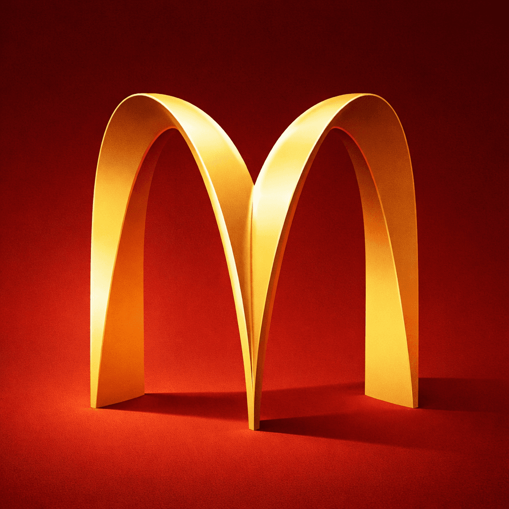
Schindler's idea was simple yet brilliant: he took Turner's sketch, but instead of a V, he extended the lines to form an M — directly inspired by the silhouette formed by Meston's two architectural arches when viewed from the side. He added a diagonal line crossing the M to evoke the roof of the restaurant.
On September 13, 1961, McDonald's registered the trademark for this new logo. In 1962, it was officially adopted: the Golden Arches logo was born. Two overlapping arches forming a golden M on a red background — a shape that is both simple, bold, and immediately identifiable.
Louis Cheskin: The Man Who Saved the Arches
The story could have ended there. But in the 1960s, Ray Kroc seriously considered abandoning the golden arches in favor of a more “modern” and corporate design. He found the arches too tied to the architecture of the old restaurants — a legacy of the McDonald brothers that he wanted to distance himself from.
That's when Louis Cheskin, a design consultant and consumer psychology expert known for his work on the unconscious impact of shapes and colors on purchasing decisions, intervened. Cheskin insisted to Kroc: the golden arches are not just an architectural element; they carry a deep symbolic weight.
According to period documents, Cheskin argued that the arches unconsciously evoke a “maternal” and protective shape — a Freudian interpretation that, as surprising as it may seem, convinced Kroc. The main argument was more pragmatic: for American consumers, the golden arches are McDonald's. Removing them would be like erasing years of visual recognition.
Ray Kroc sided with Cheskin's opinion. The Golden Arches were retained and became the heart of the brand's identity. This decision is undoubtedly one of the most important in the history of modern branding — and it was made on the advice of a psychologist, not a graphic designer.
Red and Yellow: A Calculated Color Duo
The colors of the McDonald's logo — golden yellow and bright red — are not random. They constitute what food marketing specialists call the “ketchup and mustard” palette, and their psychological effects are well documented.
Yellow: Visibility and Happiness
Yellow is the most visible color from a distance, especially in bright sunlight. This is why taxis, traffic signs, and… fast-food signs use it extensively. In color psychology, yellow is associated with happiness, optimism, and warmth. It attracts attention without being aggressive — exactly what you want when a motorist is driving at 50 mph and needs to spot your restaurant.
Red: Urgency and Appetite
Red, on the other hand, is an action color. It increases heart rate, stimulates appetite, and creates a sense of urgency. That's why it's found in Coca-Cola, KFC, Burger King, and many other food brands. Combined with yellow, it forms a visual signal that is almost impossible to ignore.
Color psychology expert Karen Haller has demonstrated that this red-yellow combination stimulates both hunger and a sense of comfort — prompting customers to enter, order quickly, and leave satisfied. A mechanism perfectly aligned with the fast-food business model.
To delve deeper into the topic of colors in branding, check out our comprehensive guide to color psychology for logos.
The Evolution of the Logo from 1968 to Today
Since its creation in 1962, the McDonald's logo has undergone several evolutions — but always in the direction of simplification. It is a textbook case of progressive minimalist design.
1968: The Simplification of the M
The diagonal line that crossed the M (evoking the roof of the restaurant) was removed. The logo became a more streamlined golden M, accompanied by the name “McDonald's” below. This version laid the groundwork for the visual identity that would last for decades.
1970s-1990s: The Red Takes Over
The red background became dominant. The golden M on a red background established itself worldwide, accompanied by minor local variations. It was during this period that McDonald's transitioned from an American chain to a truly global brand — and the Golden Arches traveled with it.
2003: “I'm Lovin' It”
On June 12, 2003, McDonald's unveiled a significant redesign coinciding with the launch of its “I'm Lovin' It” campaign. The logo was modernized with volume and shadow effects, following the design trends of the 2000s. The slogan, composed by producer Pharrell Williams and performed by Justin Timberlake, became inseparable from the brand.
2006-2020: The Flat Design
Following the general design trend, McDonald's gradually phased out 3D effects to return to a flat M, sharper and better suited for digital screens. The logo became what it has always been at its essence: two golden arches, without embellishment.
Today
The current version of the logo is of almost abstract simplicity: a golden M, without text, without shadow, without mandatory background. It works in monochrome, in miniature, on any medium. It is the culmination of 60 years of progressive simplification — a journey shared by many great brands, as seen with Apple, Nike, or Coca-Cola.
The European Green Shift
If you've ever compared an American McDonald's to a European McDonald's, you've probably noticed a striking difference: in Europe, the logo background is not red, but dark green.
This change, initiated in 2009, is not trivial. It is part of a brand repositioning strategy in the European market, where environmental and nutritional concerns are more pronounced than in the United States. Green evokes nature, sustainability, and more responsible eating.
McDonald's France was one of the first countries to adopt this palette, accompanied by interior renovations (wood, natural materials, soft lighting) and adapted menus (salads, fruits, local products). The golden M on a green background has become the norm in most European countries.
This is a fascinating example of cultural adaptation of a logo without changing its shape. The M remains the same — only the chromatic context changes to suit local sensitivities. A lesson in international branding that many brands could reflect on.
What the McDonald's Logo Teaches Us About Branding
The story of the Golden Arches contains several fundamental lessons for anyone creating a logo or visual identity:
1. Physical Origin Creates Authenticity
The M of McDonald's is not an abstract concept that came out of nowhere. It comes from a real architectural element — the arches of the first restaurants. This connection to the physical world gives the logo a depth and history that purely graphic logos lack. When creating your logo, ask yourself: is there a concrete element of your business that could become a symbol?
2. Simplicity Always Wins in the Long Run
In 60 years, every redesign of the McDonald's logo has removed elements — never added. The diagonal line, 3D effects, text… everything has been gradually eliminated until only the essential remains. This is the golden rule of logo design: if you can remove an element without losing recognition, remove it.
3. Colors Carry a Message
The choice of red and yellow is not decorative — it’s strategic. Each color plays a specific role in brand perception. And the shift to green in Europe shows that you can modify the message of a logo without touching its shape.
4. Protect Your Identity, Even Against Yourself
Ray Kroc almost eliminated the golden arches. Without Louis Cheskin's intervention, the most recognized logo in the world might have disappeared. The lesson: before making any changes during a logo redesign, carefully measure what you risk losing in terms of acquired recognition.
5. A Logo Lives with Its Brand
The McDonald's logo has evolved continuously — but has never broken away from its fundamental identity. Each change has accompanied a transformation of the brand (global expansion, digital shift, green repositioning). A good logo is not static: it grows with the company it represents.
Create Your Professional Logo with Wilogo →
FAQ
Who designed the McDonald's logo?
The Golden Arches logo was created in 1962 by Jim Schindler, head of engineering and design at McDonald's. He was inspired by the architectural arches designed by Stanley Meston for the chain's first restaurants in 1953, and a sketch by Fred Turner, then president of the company.
Why is the McDonald's logo yellow and red?
Yellow is the most visible color from a distance and is associated with happiness and warmth. Red stimulates appetite and creates a sense of urgency. Together, these colors form a powerful visual signal, perfectly suited to the fast-food model. In Europe, red has been replaced by dark green to evoke a more responsible image.
Why is McDonald's green in France?
Since 2009, McDonald's has used a dark green background instead of red in most European countries, including France. This change accompanies a brand repositioning around sustainability, responsible eating, and a more “premium” setting. The golden M remains the same — only the background changes.
Has the McDonald's logo changed a lot since 1962?
The fundamental shape — two arches forming an M — has never changed since 1962. However, elements have been gradually removed: the diagonal line evoking the roof (removed in 1968), 3D effects (abandoned in the 2010s), and the text “McDonald's” (now optional). Each evolution has simplified the logo.
Did the golden arches almost disappear?
Yes. In the 1960s, Ray Kroc wanted to abandon the arches in favor of a more “corporate” logo. It was consumer psychology consultant Louis Cheskin who convinced him to keep them, arguing that the arches had a powerful symbolic weight and that consumers already strongly associated them with the brand.